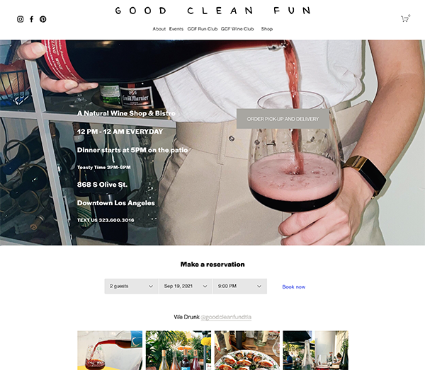
The restaurant that I have chosen is Good Clean Fun. It's a natural wine shop, bar, and restaurant in DTLA. Currently their website is pretty simple in design, but imagery and info is also kind of all over the place. The website is repsonsive and imagery is high quality.
The landing page has a CTA to order wine directly and they also have a reservation widget on the home page. There are social tags as well as a shopping cart as well.
The website features a standard menu top bar underneath the logo which is their header.
I think the goal for them is to sell more wine from the shop as that is the main CTA on their home page. They also have a wine club to sell wines and offer pickup/local delivery via third party apps. I think the website need a cleanup with clear directions on different CTA. One for bottle shop (purchasing wine to go/for delivery) and one for the restaurant portion. At the moment information is scattered and a lot is going on. Emphasis needs to lay on selling wine DTC.
The mobile website is fully repsonsive, and keeps the exact same widgets and boxes as the computer site have such as reservation box, their most recent instagram images, and product for their merch. The menu turns into a burger menu and has the same navigations
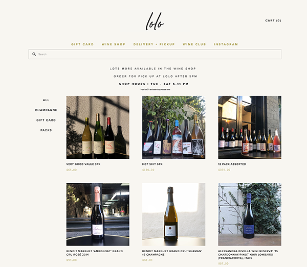
Lolo Wine Bar has a much easier navigation, clean cut design on each page and is clearly focused on selling wines from the moment you enter their landing page. Information such as address, contact informaiton, and opening hours are clear and straight. You are able to purchase wine directly via their website, or via a third party delivery service which are both linked in the main top bar menu. There are less menu options/sub-pages which makes direction much clearer of what the intentions of the website is. The site is fully responsive.
The mobile website looks pretty much like the desktop version. It is fully repsonsive and so are the imagery that they are using. Isntad of a side-to-side design the content is stacked. But the minimal design makes it easy to find all the informaion.
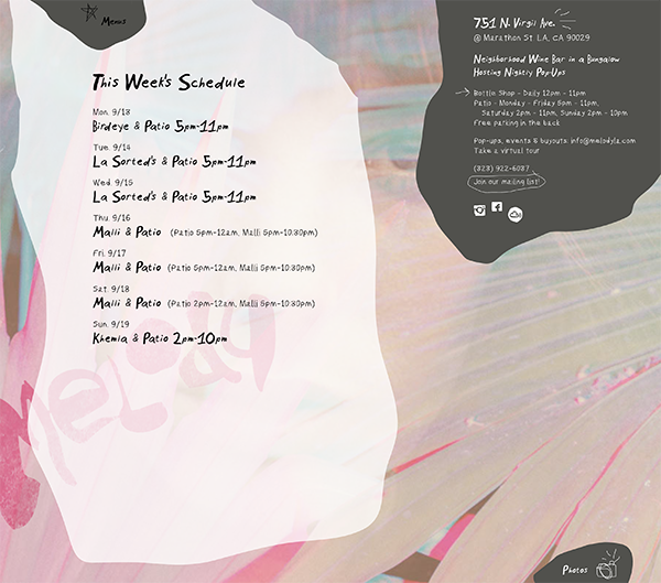
Deisgn is more fun and interactive. Very creative! Emphasis heere however lays on their food pop-ups and what happens at the restaurant. There are only 3 menu options and the menu is interactive and not traidtional with each link being in a corner of the website. Contact info and social is clearly displayed on the "info" site.
The mobile site is similar to the desktop version, with the address and hours being a button that you have to click for it to display. It is a fun design that focuses mostly on promoting the weekly/nightly events and food trucks.
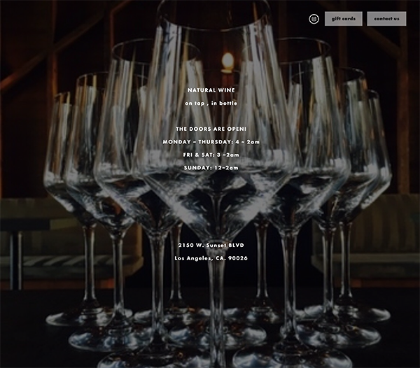
Bar Bandini has the most simple website of them all, with just a Picture background and opening hours/info. The images are however quite loq quality, and when seeing it on a phone the image is not cropped to fit phone, instead it just shows the same size as on the screen just more narrow. No additional pages are preent, and they just have a pop-up contact form. Here the focus is solely to bring people in to the bar rather than trying to sell anything at all online. Instagram link is present but no other social links. The mobile site is just as simple as their desktop version and showcases opening hours and address as their main focus.
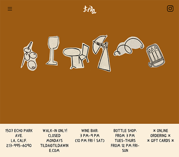
Tilda has a cretive site with a lot of colors and a lot of imagery. A burger menu is present to not take away from the design. the birger menu is basically a colelction of the front page's sections as you scroll down. The website is informational but simple in the way that it's being delivered. Only the essential informaion is rpesented. Nothing is sold online and there is only a small not very apparent link to ordering wine online. Allthough responsive, this website is extremely hard to read online, you have to scroll an infinite amount to find the information youre looking for, and when you find it the tezt is not optimized for mobile.