La Paz Mexican Resturant
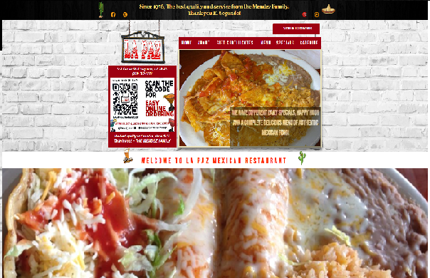
The Visual Design in the website is very cluttered and disorganized, the contant change of fonts is very jarring and really detracks from the way that it looks.
The content is there and it is really front and center which is the food. Which is good, but it could be done better.
The "call to action" on the page is there and I think it is something I'd draw inspiration from.
Navigation is there but I think having it spread across the entire top bar of the page is better than what they have right now.
Functionality works fine, I did not find anything that didn't work on the site.
Community building is not really a thing here. There are links to their social media. But there is no real draw to them.
Goal and Target Audience
Questions that need to be answered are
In order to successfully design a website there needs to be a solid form to build the website on. As well as apealing content with a call to action and interaction with their target audience. And of course just a good looking site.
There's a lot of issues that need to be solved with the site, such as the content, the call to action, the style of the site, amoungst a myriad of other things.
The target audience for this site is also people who enjoy eating mexican food, especially local residents to build that bond with the customers and keep them comming back.
Competition
Fantasic Cafe
When compared to La Paz, it is much better looking and there is a more streamline line of process when scrolling down the site. There is also not a really clear call to action. But the looks and navigation of the site really makes up for it.
Ali'i Fish co.
This is just such a clean website arguably the best from the ones that I viewed in the area. Its works really well and it makes the food look so apealing and makes it more tempting to go and visit the resutrant. There is no call to action that is really there. However, the design of the site doesn't show really who they are trying to apeal to. The design is very safe and its paletable for any kind of person. Which makes it look good. But not really stand out in the sea of websites that look like it, and do a better call to action which is what I think resturant websites should more so focus on.
Chef Hannes Italian Restaurant
This is also a good website. However, it could use some work. It is 100% better than La Paz's site. But as with both there is work to be done here. There is a cohesive theme to the site but has ocasionally aspects of the site that breaks that and its kind of jarring. But here there is more of a call to action that is more in your face. But here I think they are apeaking more to their target audience with their design. The food is more high end and fine dining style of eating and the design in the website reflects that.