What tasks do we need to complete in order to successfully design this website?
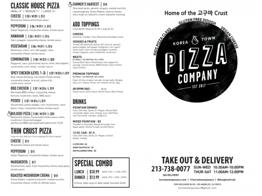
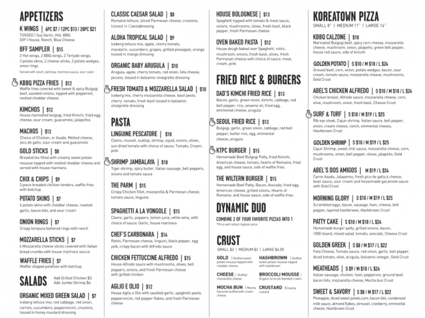
KTPC website has menu page but it displays only picture that looks like stick the menu on the wall. It barely legible also when I see the page on my phone the size of picture was too big. I think this should be fixed to make the page easly manipulate.
Menu page reference
What issues need to be solved?
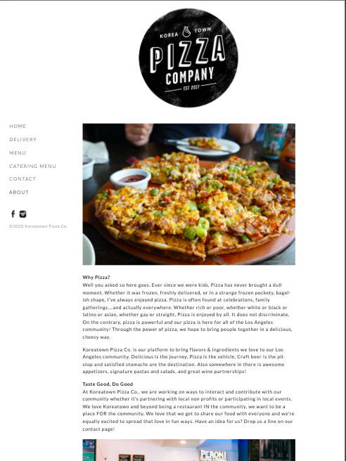
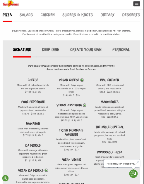
About page could make more atractiv. They have savory and appetizing food pictures on yelp page. I think drag those pictuers to About page and display them like gallery would be good.
About page reference
Goals & Target Audience
Korean Pizza Co. Target Audience is 20-40 years old by guess. Photos their uploaded on yelp app looks savory, but when I checked their website it looks so plain. I thinkk on of the reason is the website is using white background, and font color is just black. Also their logo is black/ white base so in my viewpoint I felt dull. Also, menu and delivery page should be redesgined because on the menu page, it heard to see their menu and price. Delivery page would be better to fix layout. 20-40 is their target audience, the website should be more playful and colorful.