Things that didn't work well
1. Sort out current logo
2. Reduce text on the iphone
3. Reduce text on the ipad
4. The two images don’t work well with 3 images in the web home page
5. Change the footer at the bottom
6. Remove the title if it shows in the top corner
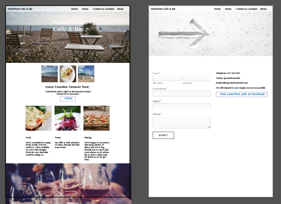
7. Font doesn’t match on the contact page to the rest of the site.
8. Hamburger menu has too many lines
9. Nav bar looks a bit plain and bland
10. Menu button looks a bit out of place
Things that do work well
1. Header image looks well
2. Like the small images, they collapse really well
3. The use of fonts works well
4. White space is well used
5. Contact page is well represented
6. Food images look tasty
7. Images represents well to the style of restaurant
8. Good hierarchy of text on the web page
9. The layout looks good on the mobile page
10. Footer image is nice but needs a purpose

