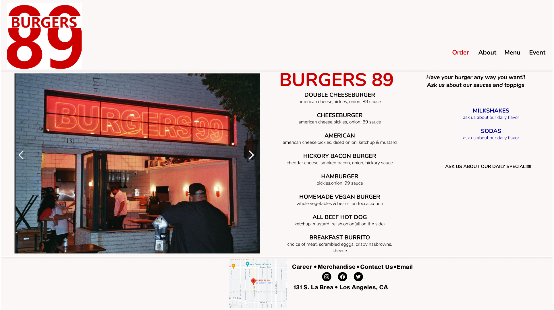
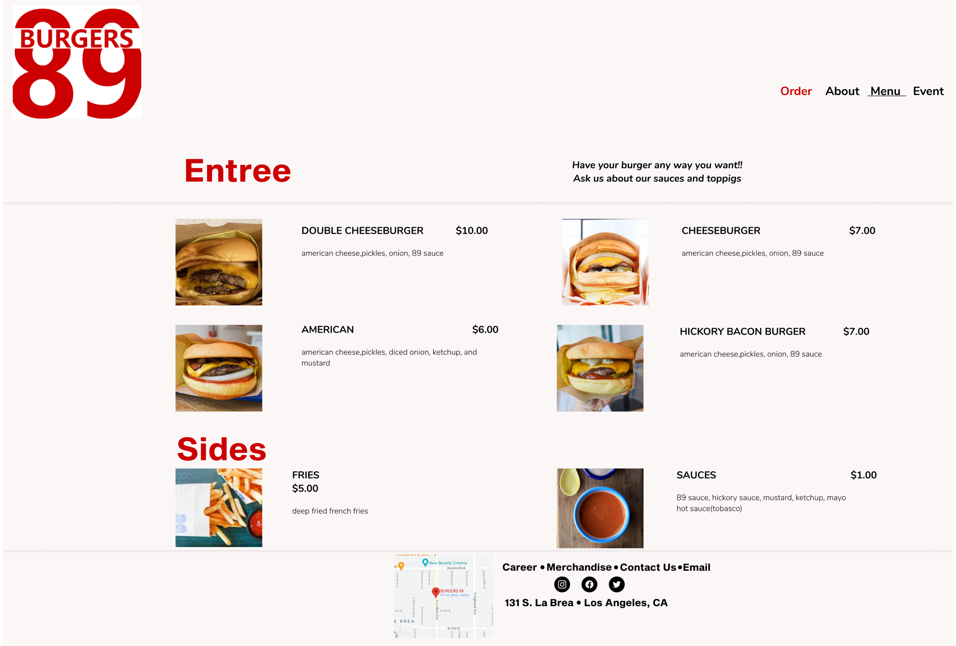
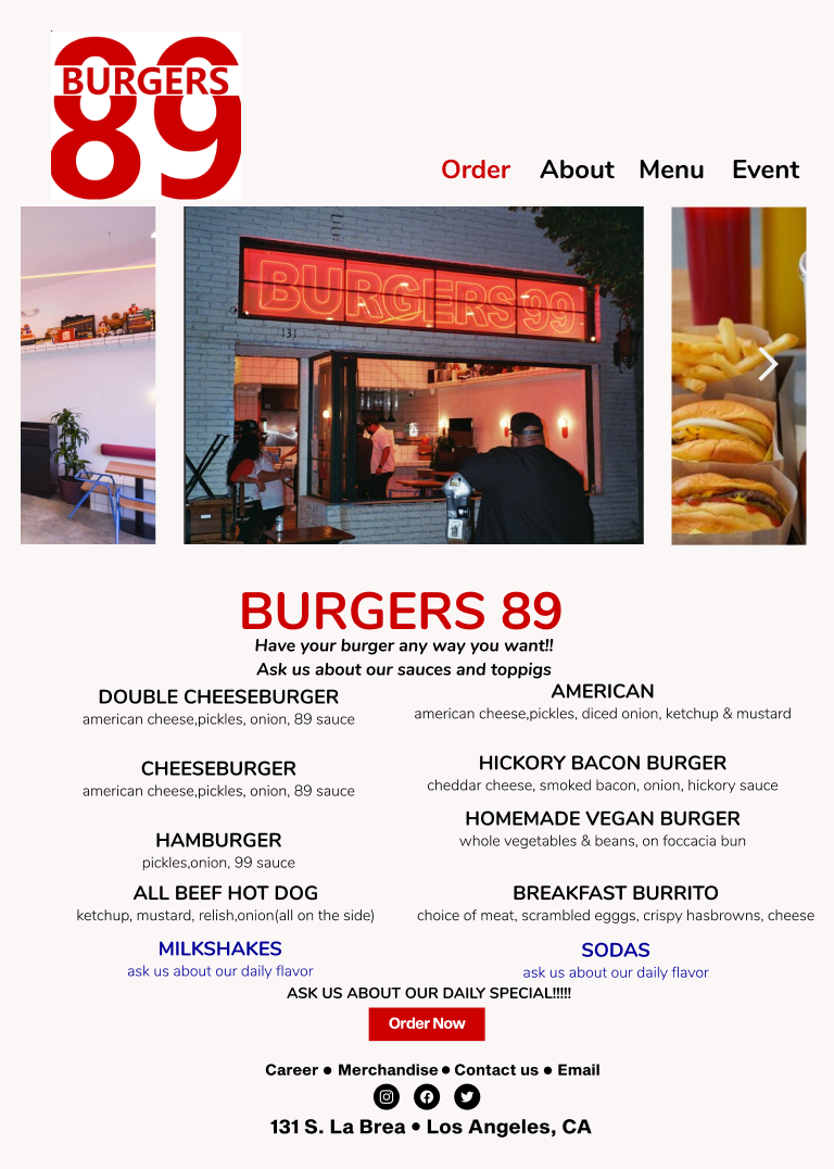
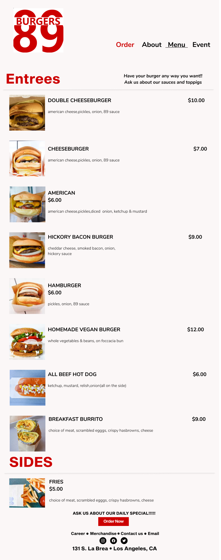
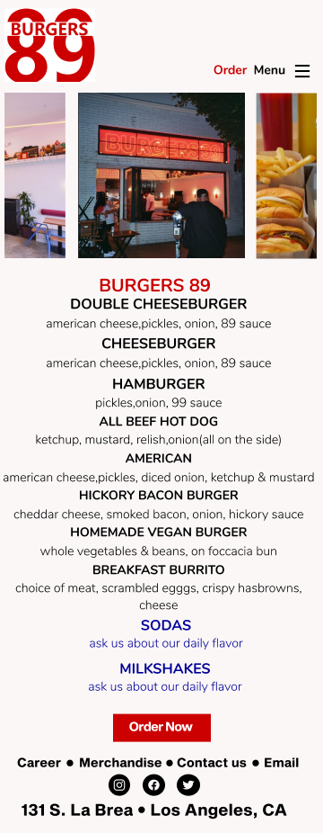
I did change how the menu is displayed on different display screens. I made the mistake on the first prototype to adjust for 1920x1080 screen but not laptop which was dumb of me because I did adjust for tablet and mobile. I do plan to correct that. I did change the fonts to Nunito and Sequel Sans. I still want to look for other fonts but I feel comfortable with the current ones. I did get feed back that it looks simple but I also don't want to take away from the menu maybe I'll make the order button on top a bigger priority by making it look like a button like it does at the bottom
