Design comprehensives
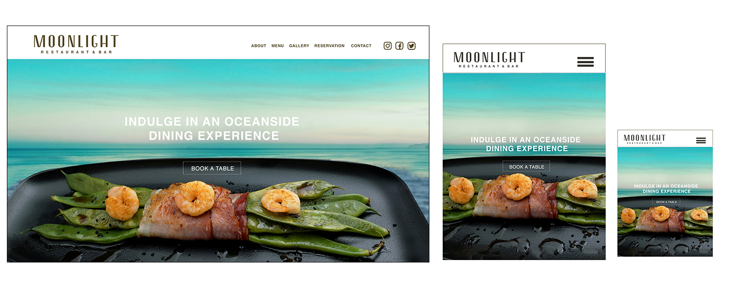
Home

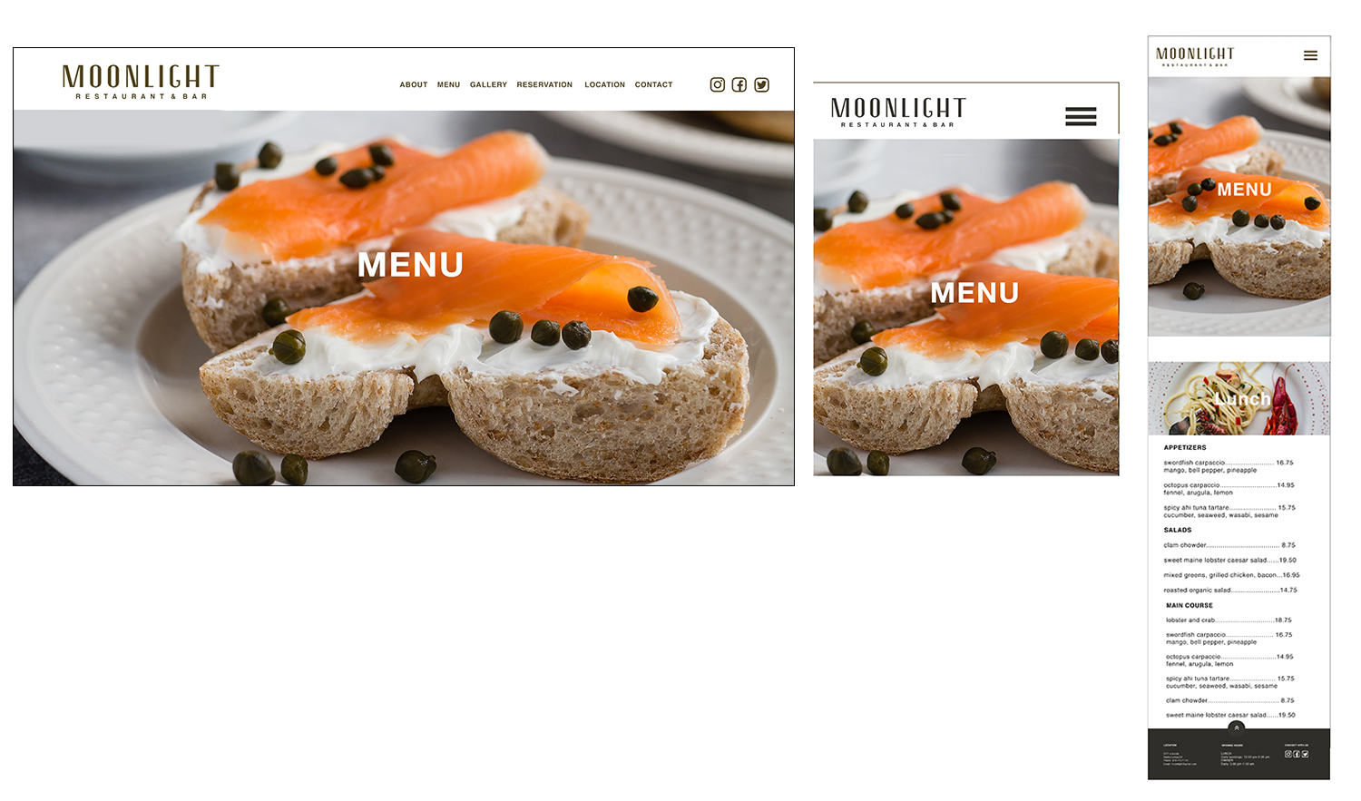
Menu

- POSITIVES
- Text over photos nicely positioned
- clean and consice
- Great image choices,reflect the location
- Strong layout
- The menu looks grat and easy to read
- Like the menu listing
- grat color choices
- Everything feels cohesive
- Easy navigate site
- Good seperation of meals with image bars
- NEGATIVES
- Logo gets washed out in mobile
- different type face on menu and lunch,dinner
- footer seems to be small
- White font on some menu images is hard to read
- Hamburger button on mobile could be smaller
- The hamburger menu might be easier to see if its white.
- Add some space above each menu heading so it's easy to see
- lunch,dinner,drinks header is small
- desktop menu font is so small
- It was nice if you knew which page you're on++
