Design comprehensives
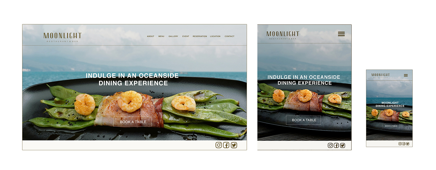
Home

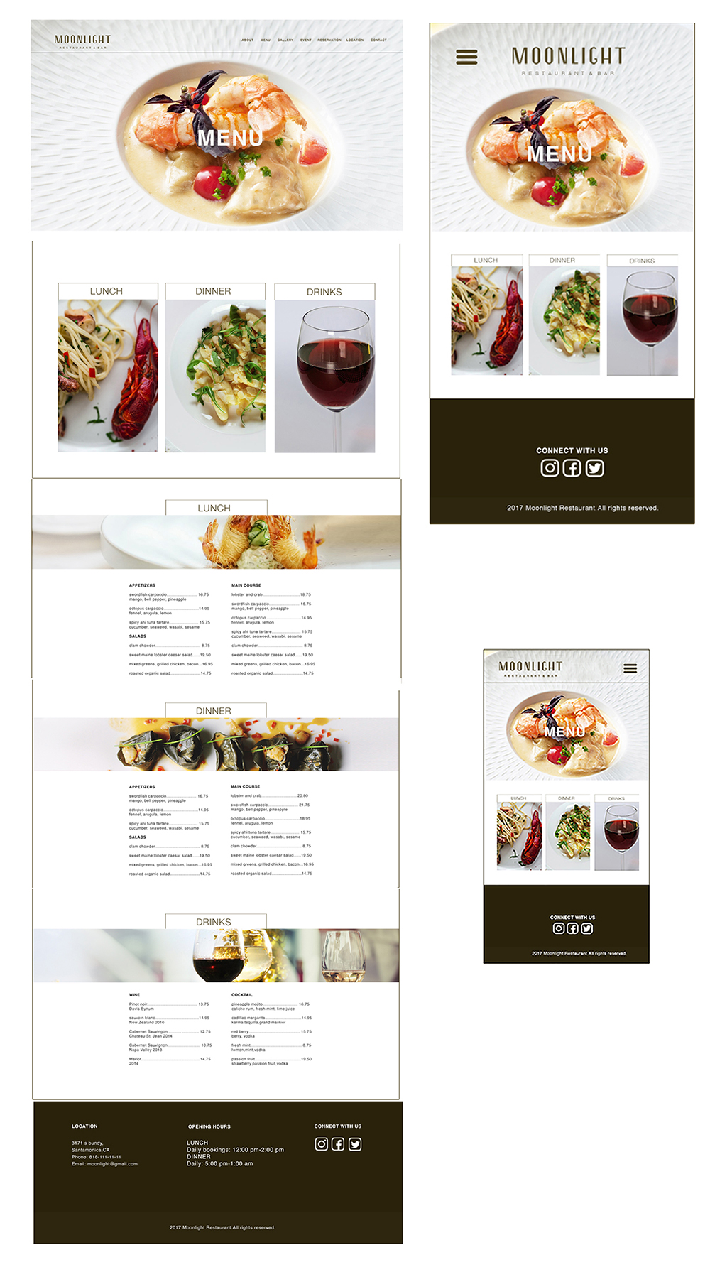
Menu

- POSITIVES
- The hero image is so appealing and makes you go in the site
- Like the book table button on page
- Looks like a fun place to go
- Its good that the design is not boxed in
- The social media icons are cohesive
- The design is cohesive
- The color palette looks nice
- The logo is simple and modern
- The call of action is strong and inviting
- the menu layout is clever
- NEGATIVES
- Continue having the block on the home page on other pages
- The wine image needs to be changed
- The drinks page in menu is not fitting
- The logo is not readable on blue
- Align the social media in mobile design to corner
- In tablet bring the image up,there is an empty space
- Align the hamburger menu to right in mobile
- The fonts in menu could be larger
- The menu font on the image could be larger
- The sky could be lighter
