My client for this project is Tierra Mia Coffee .
I decided to go with this café because i live close to the Echo Park location so I am a frequent customer! I feel like their website could use an update since it does not contain a lot of information and isn't very responsive.
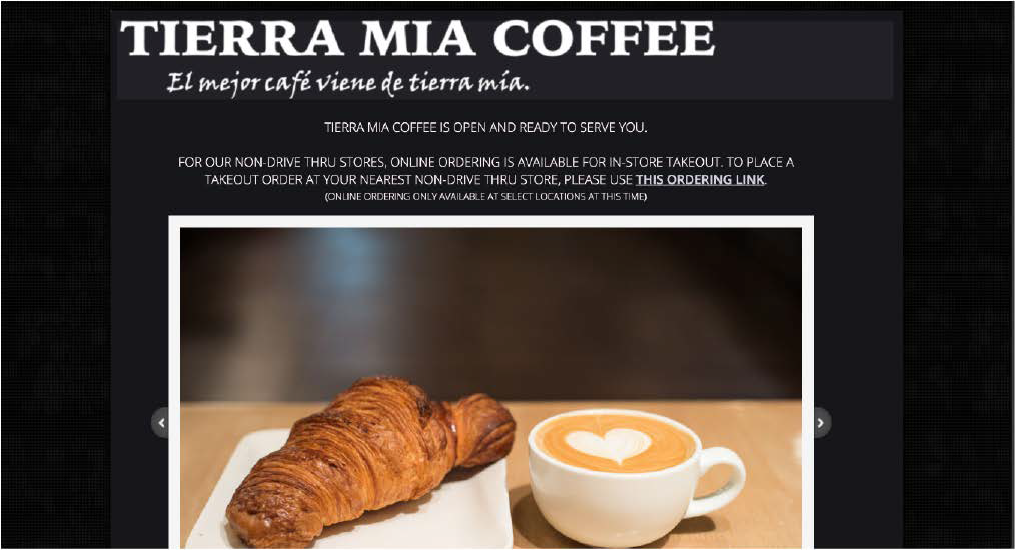
First of all they have zero navigation or any type of option to look at menu, opening hours, gallery etc on the tierramia.com website.They do have a link to order that takes you to another website that looks like a mobile order site. This is where they have their whole coffee and food menu. The visual design is pretty bare and the only name or logo of the café is on the top of the website and is very low res, also it's not connected to a home button. (Probably because you can't get anywhere to go home from) There isn't any logos or graphics anywhere except for images that they show briefley in a slideshow at the top, they aremainly focusing on their other locations and not on what they have to offer. The functionality on Tierra Mias website needs some work.
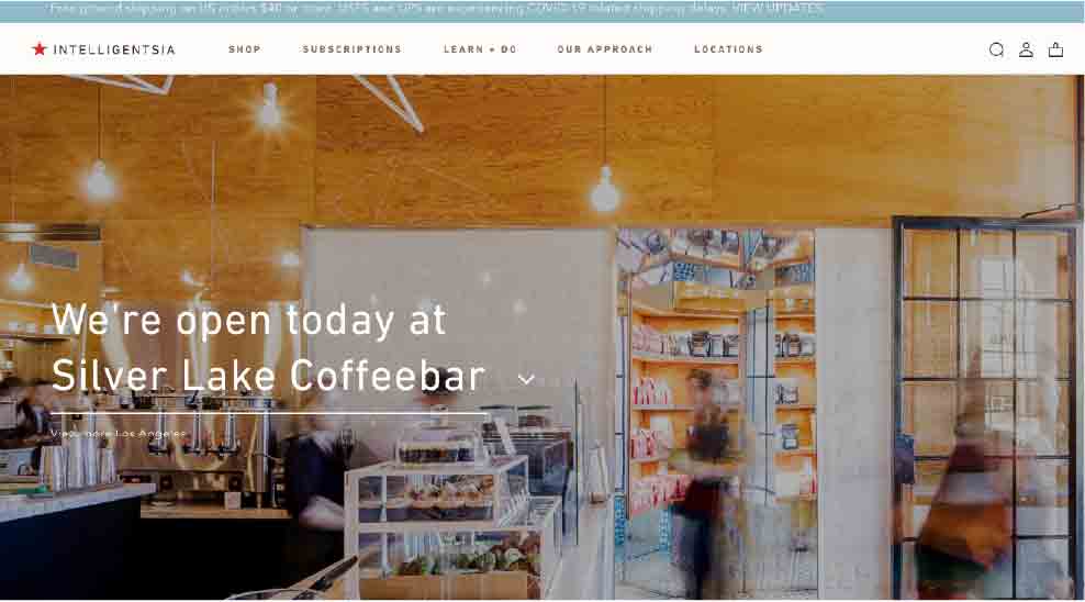
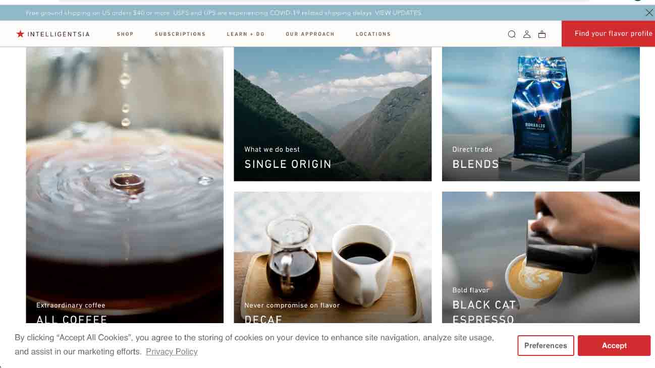
Intelligentsia Coffee has a layout with blocks of navigation through photos but also navigation on top of the website. The style is minimalistic and airy but still feels packed with content. The navigation through out the website is easy and user friendly. Sans serif typography works well with the bright but minimal color palette. I like the "find your flavor profile" feature where you get to a quiz to help you find the right coffee. Their menu or "shop" only focuses on coffee bean blends and merchandise but it would be nice to be able to find the menu of the actual café and what kinds of drinks pastries and sandwiches they offer for lunch etc.
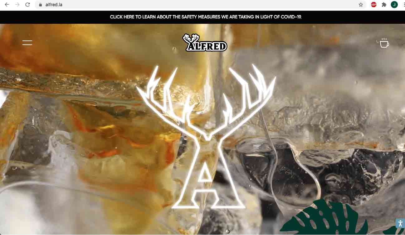
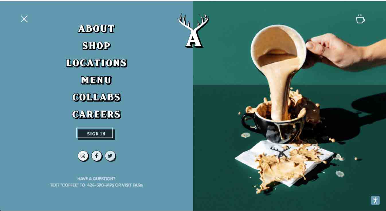
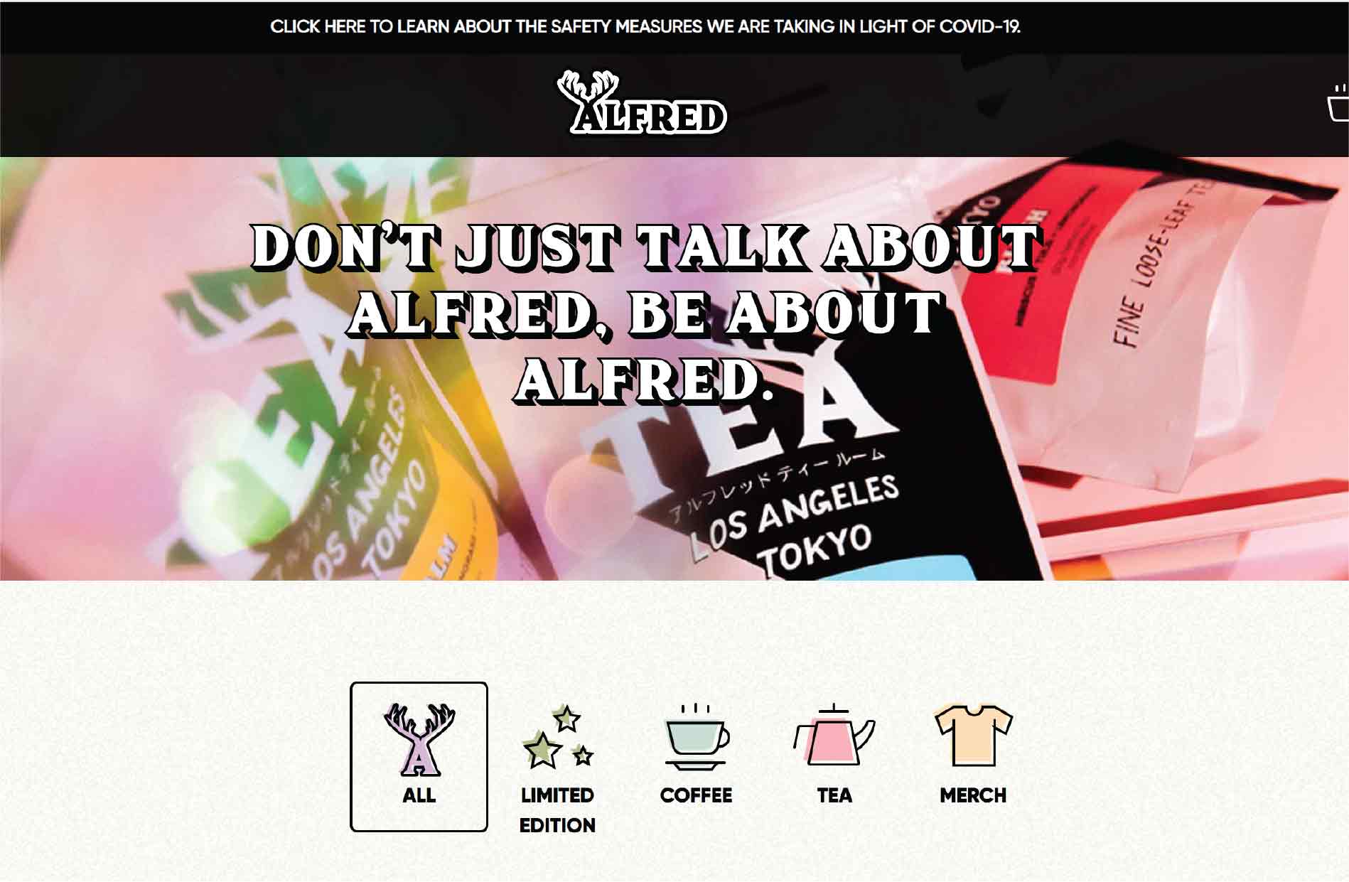
My favorite thing about Alfred's Coffee is the color palette. Green, blue and especially teal are my favorite colors and i like that they added a light pink as an accent color to emphasize and create contrast and rhythm. Their typography has a similar style as the Alfred's logo and the connection to the logo works. They have little graphic symbols that are cute and playful and i like that little extra that helps the user to navigate the website in a simple and aesthetic way. The hamburger navigation menu for computer layout isn't my favorite style of navigation so i would not use that except for in a mobile version.
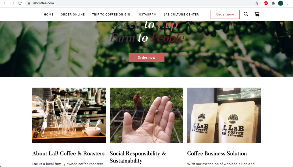
LaB Coffee has a very "normal" looking website with coffee origins, sustainability and product in focus. They're going with a very minimalistic layout with a small logo at the top. Not my preferred style to use in Tierra Mia's new website, i want to add some personality and character using more graphics and colorful backgrounds or typography. The lack of color palette on this website makes it not as visually pleasing i would want it to be. I do enjoy the use of negative space that they have, and would want to have that kind of airy feel to my design.
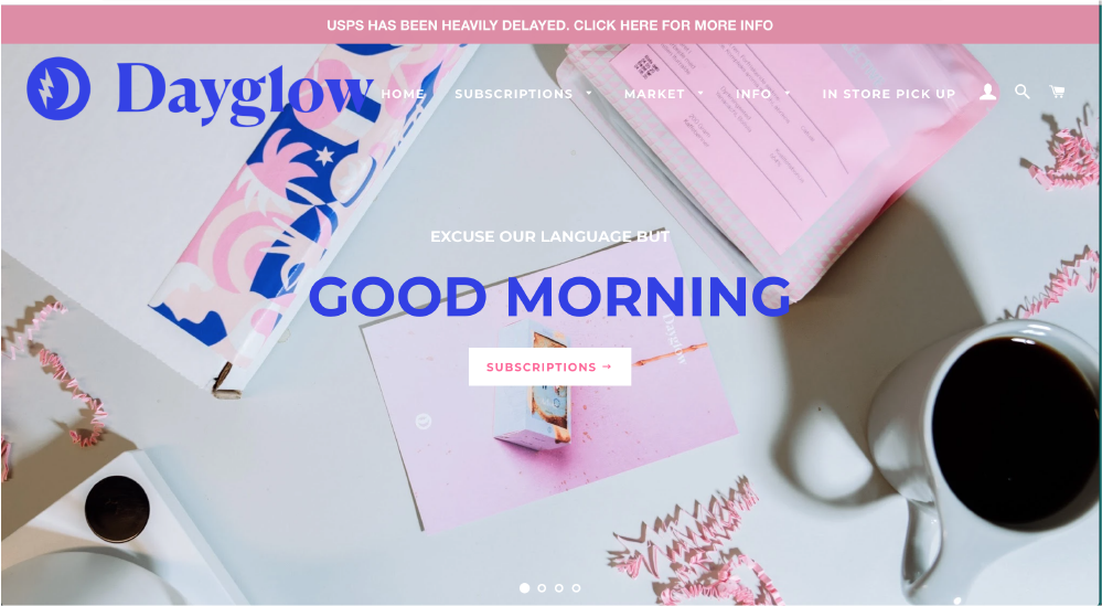
Dayglow has a very modern and fun design, but a sort of untraditional look for a coffee brand/company. I do think it works beacuse it really stands out compared to the brands that focus only on information about the origin of the product etc (even though that is important as well). I would want to add something similar to this to my own redesign of Tierra Mia Coffee, with just a few strong contrast colors and typography that stands out. But i would want to add more imagery than they have on the Dayglow website, i think it is needed to not forget the product and what they offer.