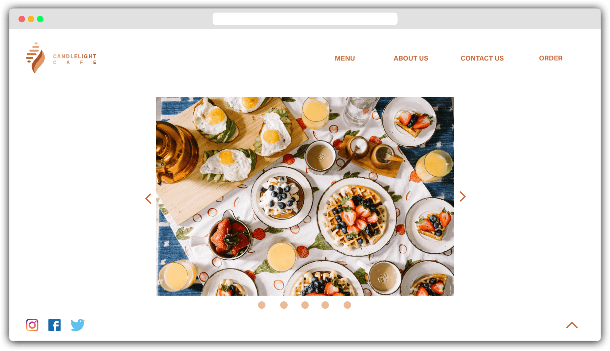
DESKTOP : HOME
DESKTOP : MENU
TABLET : HOME
TABLET : MENU
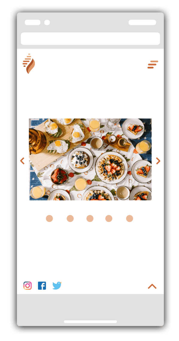
MOBILE : HOME
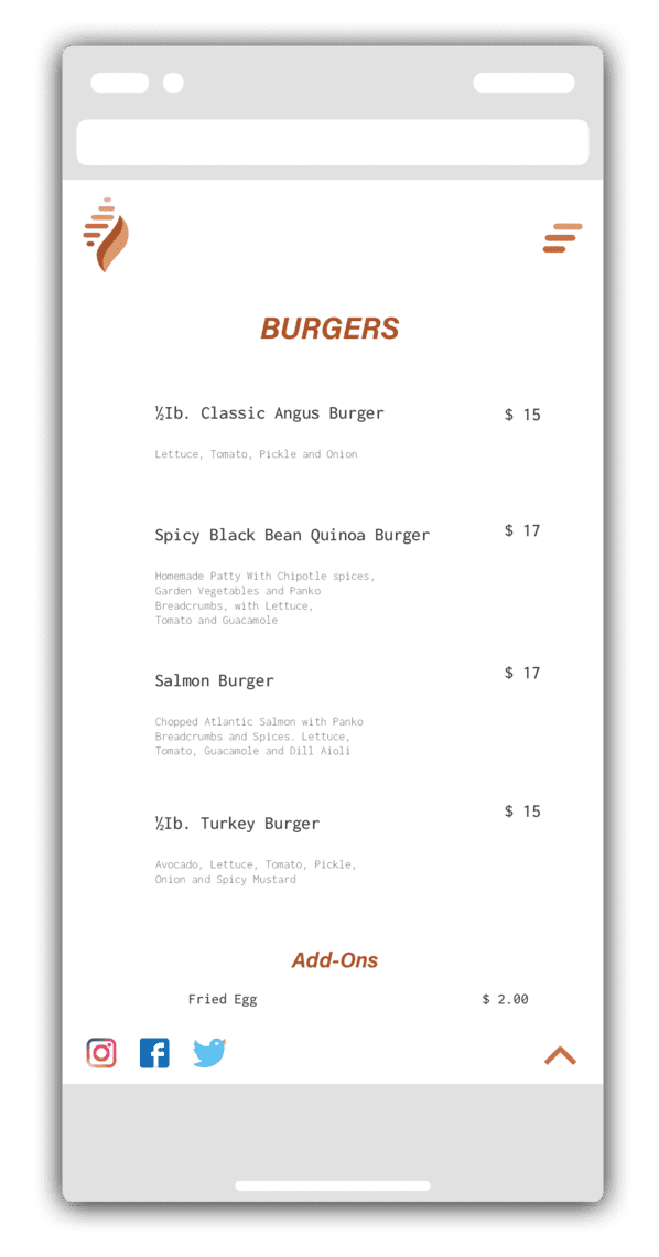
MOBILE : MENU
I didn't get any reviews on this assignment, so please understand that it was based on my development of the design. :(
First of all, I changed the color of the navigation label to a brighter color, and the color of all buttons to match the overall logo atmosphere. I added an underline on the navigation labels. When selecting the upper nav. label, the underlined line made it easier for users to understand where they are now. The left navigation also added a hover, and the font of the title and the text was different so that users would not feel bored with the homepage. I changed the bottom of the carousel on the first page to make it more recognizable. It used to be a bar shape, but we changed it to a circular shape, and we are going to add a hover that changes color when the cursor touches.