REBECA'S AWESOME WEBSITE
Project #1: Market Research
Market Research
The website I chose to redesign is:
Visual Design
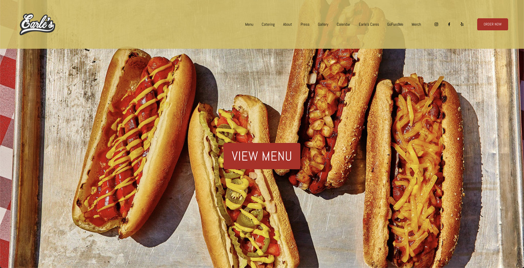
- There is no color balance; there is too much red and yellow that strains my eyes.
- The photos of the get-togethers are repetitive, making it seem like they do not have other happy customers.
- There needs to be more hierarchy throughout the page. Tab titles tell me why I am there. The text in the body is too plain.
Content
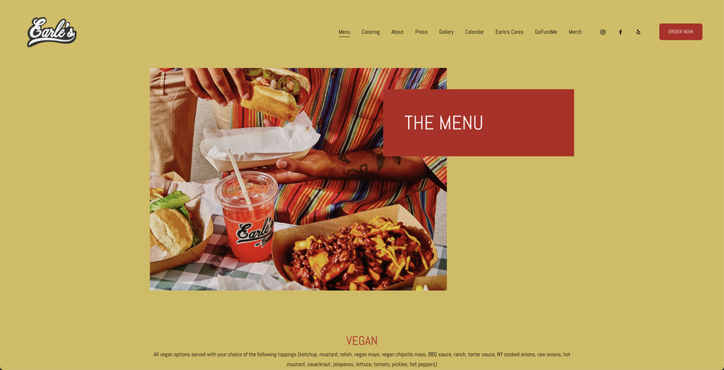
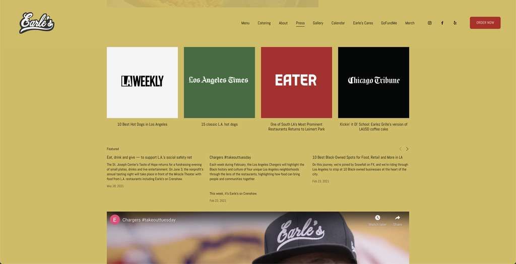
- Their gallery only has five photos. Only one image has a caption about the community. The other four need more stories behind them.
- I like that they have a calendar for the special of the day, but it would help to highlight the special of the day on their homepage.
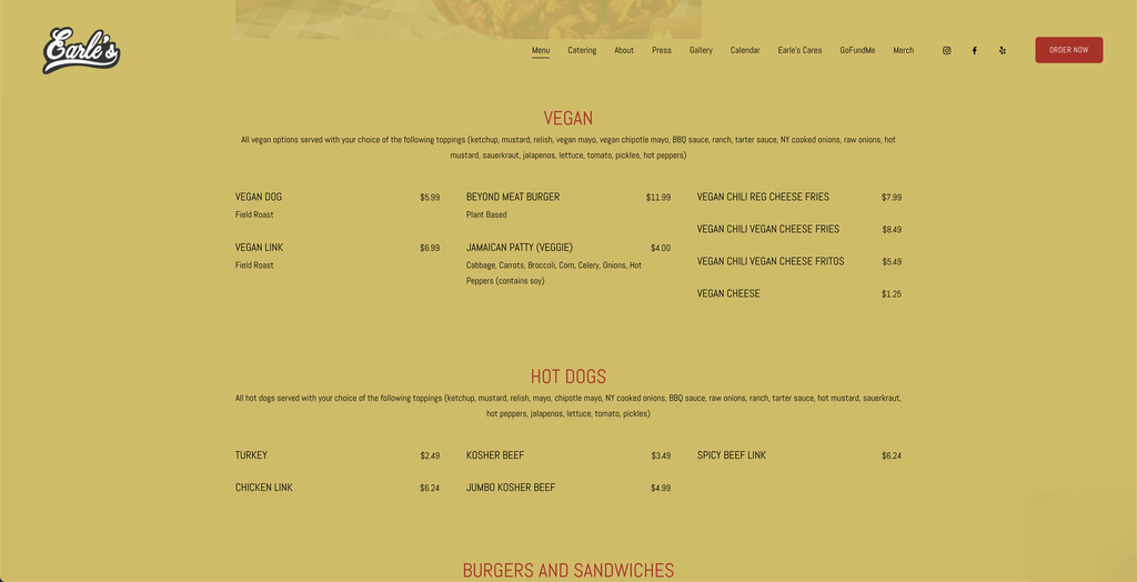
- Their prices are great, especially if it is a community-driven business.
- There should be more merch available for their community fans.
- Press highlights would work well on the homepage.
- They need photos in the menu of items so that customers know what they can expect to eat.
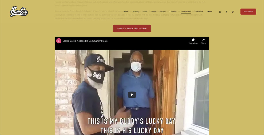
- Creating Earle’s Care Non Profit to help vulnerable customers at this time is excellent. It displays that they are community-driven and helps build trust.
- They need to highlight their old-school LAUSD coffee cake and Vegan options to continue connecting original customers with a new, diverse clientele.
Call to Action
- The “order now” calls to action first due to contrast with the navigation bar.
- The “view menu” button does call to action to see all food options, but the button blends in with the background.
- The navigation bar allows the customer to explore more about the company.
- The customer has easy access to enquire about catering.
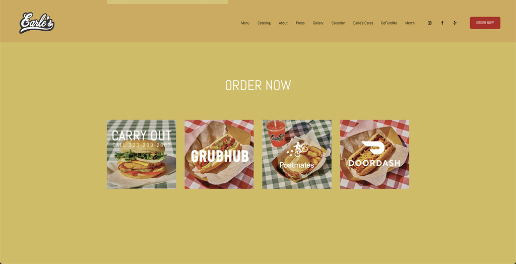
- Again, the customer is prompt to “order now” for the second time by having multiple food delivery service options.
Navigation
- Mostly, it is easy to navigate the website with the navigation bar.
- Under the tab, Press, are multiple links to articles that kick you out of the restaurants’ webpage.
- The GoFundMe tab also kicks you out of the website.
- The photos at the bottom of their homepage have broken Instagram links.
Functionality
- The page functions the same whether you use a desktop browser, tablet, or iPhone.
- The table and iPhone open the delivery service apps.
- The Desktop browse kicks you out of the page.
Community Building (Social Media)
- They are consistent with posting on Instagram and Facebook.
- They reply to yelp Reviews.
- They share photos of the diverse clientele they cater too even celebrities.
- They have provided food for underprivileged families, the elderly, and sick people that could not provide for themselves during covid.
- They have partnered with politicians, LAPD, and other businesses to help their community. That inspired them to build a non-profit and create a GoFundMe account to continue helping.
- They donated over 100 N95 masks to local hospitals.
- They have Meatless Mondays to showcase healthier lifestyle choices, local vegan vendors, and fresh produce.
- They have participated in the LA Marathon for many years and Vegan Street Fair, Los Angeles.
What questions need to be answered in order to complete this project?
What are the client’s business goals for the site?
- Based on their content throughout the website and social media, their most important goal is to empower the black and brown community by offering an old-school staple food with healthier choices and welcoming a new diverse community.
- Create community by building relationships with other local businesses and catering for different events.
Who is the target audience?
- Children
- Old-School Customers
- New Customers
What tasks do we need to complete in order to successfully design this website?
- Create a new name and logo that will invite old-school and new customers.
- Display exciting community and current news on the home page along with deals.
What issues need to be solved?
- The photos should have a story and be interactive.
- The pages should not kick you out of the website.
What is our schedule?
- Sept 13 - Project #1: Market Research
- Sept 27 - Project #2: Sitemap
- Oct 18 - Project #3: Style Tiles
- Oct 25 - Project #4 Wireframes
- Nov 8 - Project #5 Design Comprehensives
- Nov 22 - Restaurant Website Redesign Prototype
- Dec 6 - Project #6: Revised Design Comprehensives
- Dec 21 - Final Project: Responsive Restaurant Website
Competitive Analysis
Visual Design
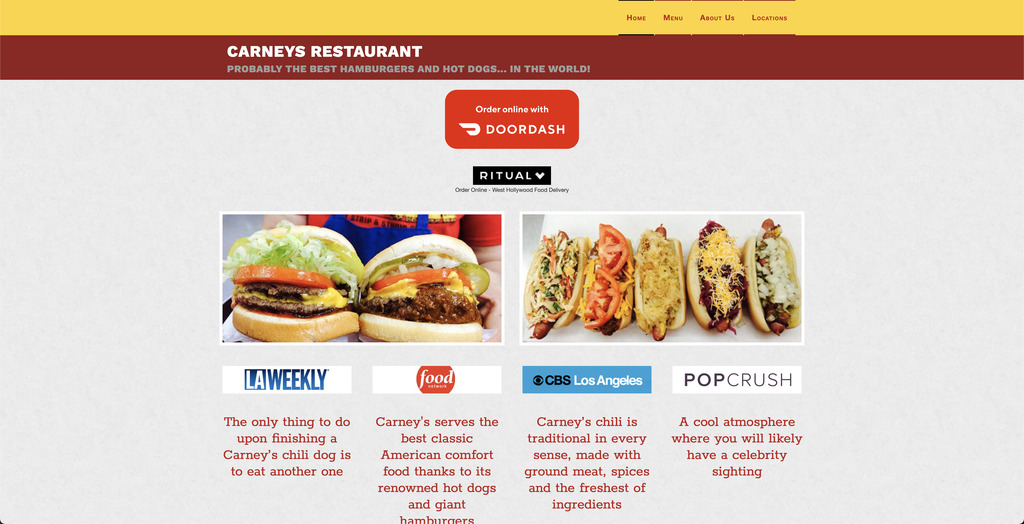
- This website has some yellow and red also, but they soften it with a light grey background.
- The quality of the adjustments of the photo is much better.
- Their logo is not displayed anywhere.
Content
- They show press quotes about their restaurants.
- They label the contents on each food selection while including more photos of the options, except they do not add an "order now" button.
- They display their motto, "PROBABLY THE BEST HAMBURGERS AND HOT DOGS... IN THE WORLD!" below the restaurant name.
Call to Action
- The first two large images pick your cravings and make you ignore the surroundings, but once you exit that trance, you can spot the Doordash button.
- The navigation bar is the next thing you see to explore what more do they offer.
Navigation
- The press logos do not take you to the article.
- Most of the clickable items direct you to another website, so it keeps you from navigating further.
- The only smooth navigation starts and ends on the navigation bar.
Functionality
- Their "Top" button does not take you to the top.
- When you navigate to the "About Us" tab, the history slider to the left of the text box does not display.
- When you click on the @carneytrain on the Twitter link above the footer, it does not direct you anywhere unless you press on the link of the date posted.
Community Building (Social Media)
- They include their recent tweets on their homepage.
- They have a business relationship with The Anaheim Tour Company and share an ad on their website.
- They also have a business relationship with The Forum by serving their food there and advertising them.
Other Areas that play important part in the redesign
- The map is an excellent addition to help customers visualize the location.
Visual Design
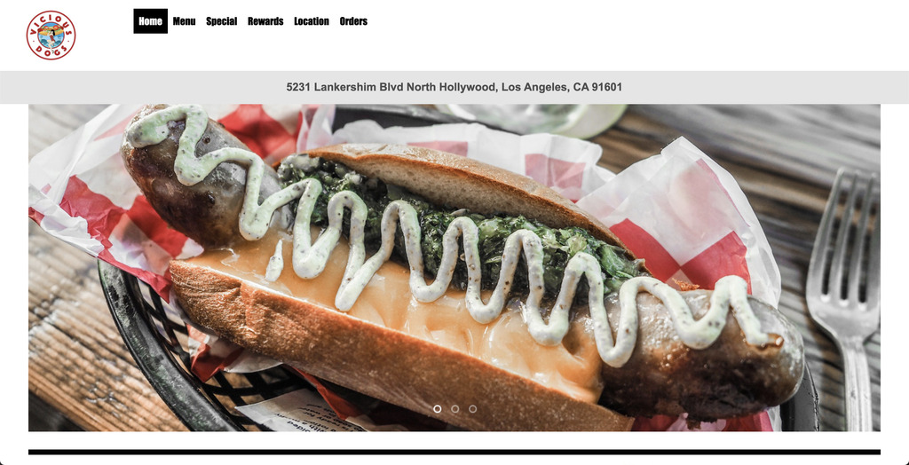
- The background color is white, so the images and text pop.
- The menu is centered and divided into different sections with fun titles like first-timers, spice it up, adventurous, back for more, and I'm hungry. When you click on any label, you get the options of that section along with the ingredients.
Content
- This website does not link with other delivery services.
- You can log in to this site to earn points in the reward program. With those points, you get free food.
- They offer vegetarian options.
Call to Action
- The first call to action item you see is "order online."
- The photo slide makes you want to click through all the photos.
Navigation
- Only the menu, rewards, and order tabs have the login and create your account button, and it makes the navigation confusing because the home, special, and location do not.
- The special tab explains the rewards tab, making it confusing also. The navigation can work better if they combine the information on both tabs.
Functionality
- Under the "menu" tab, when you click on "Full Menu," only the popular items section opens.
- When you go to the "orders" tab to check on an order, the current orders button gives the option to continue as a guest, but it fails to do so by asking you for your username and password again.
Community Building (Social Media)
- They do not have any social media icons any place on their website.
- They have Facebook and Instagram accounts but posted last in February, which made me think they might be closed.
Other Areas that play important part in the redesign.
- They have a "Bookmark this Page" button under the login so that the customer finds them quicker.
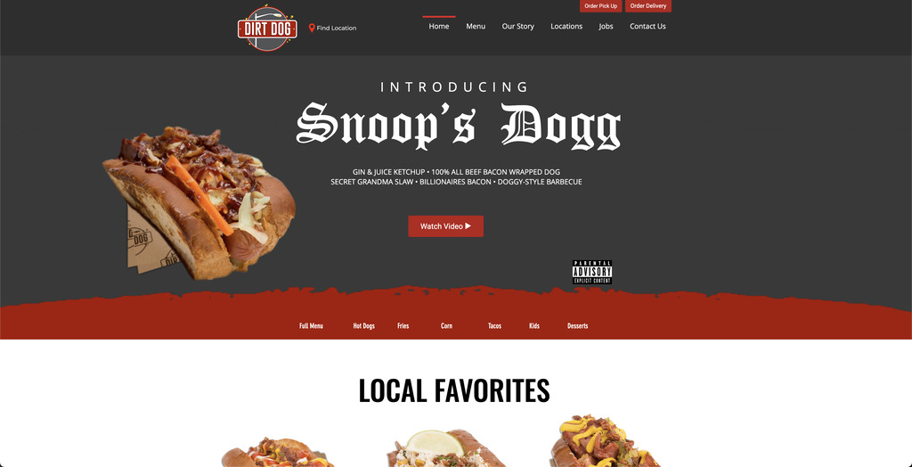
Visual Design
- They display the order delivery and order pick up with a transparent screen per selection, making ordering easy.
- The social media icons at the bottom look odd with different edges and colors.
Content
- Their story connects with the residents of millions of LA residents.
- Their food is named after traditional street vendor food.
- There is an accessibility statement to welcome everyone.
Call to Action
- When you first enter the page and scroll up, you see the "see complete menu" button.
- The button next to their logo drives to the "find location" button that directs you to a map and locations easily with "order pickup" or "order delivery."
Navigation
- Their navigation is pretty smooth.
Functionality
- The yelp reviews do not open when you click on "Read Full Review on Yelp" because they are photos in a slideshow. The reviews seem like you can click on them.
Community Building (Social Media)
- They named food after a local rapper who is an idol to the community.
- The first photo you see represents their staff, which gives them a sense of care.
Other Areas that play important part in the redesign.
- They have a contact box under the "contact us" tab that reads, "We'd love to hear from you." It is welcoming, like the customer's input matters.
- They added a "subscribe for updates" box.
- They have a "useful to know" list that highlights Parking Available, Wheelchair Accessible, Kid Friendly, Delivery, Takeout, Accepts Credit Cards and Vegetarian Options for their Los Angeles Location.
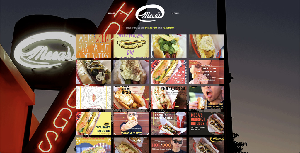
Visual Design
- They have a "useful to know" list that highlights Parking Available, Wheelchair Accessible, Kid Friendly, Delivery, Takeout, Accepts Credit Cards and Vegetarian Options for their Los Angeles Location.
- They played with photos and background photos, but it only worked with the menu because it was subtle.
Content
- Their about content is repetitive and does not say much other than what year they opened.
Call to Action
- The call to action buttons is hidden with no hierarchy below the logo when you press the menu tab in the navigation button. It makes it challenging to figure out how to order.
Navigation
- You do not need much navigation because everything is on one page, but you have to scroll a lot when you do not see the navigation options appear fast at the top.
Functionality
- Everything functions as I expect.
Community Building (Social Media)
- They have not posted much in a while on social media.
- The most activity I see is on yelp.
Other Areas that play important part in the redesign.
- Do not randomly place photos to have content. Make it meaningful.