Jinhui's Website
Project 1 Research
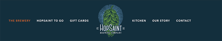
Hopsaint Brewing Company
Current Status
Visual Design
Overall clean and straightforward. The main page banner with the logo looks simple yet still effective, the color scheme works, but some choices are not coherent, some font images have a resolution that is too low.
Content
Very simple. A brief introduction of the brewery and its menu is all.
“Call to action” on home page
There is only one button on the main page to see the beer and wine menu. There is an email sign-up button at the bottom.
Navigation
Navigation is simple enough because there isn’t much content, but some options are redundant, and the whole navigation can be even simpler.
Functionality
It gives you the menu, basic information such as the address, hours, and phone number, and a link to Grubhub for delivery. Not much else.
Community building (social media)
Hopsaint has an Instagram and a Facebook account. The last post on Facebook was posted in March so it doesn't seem to be used much. Instagram account has 5,000 followers. It has photos of beer, beer making, food, and people at the brewery with some news and information.
Goals & Target Audience
What questions need to be answered in order to complete this project?
What can we get out of the website as a brewery/restaurant? Do we need to develop an online presence through social media? Is wine important in this brewery? As a customer, I’d like to see an online reservation system, but is it necessary for the brewery(which is already popular)?
What tasks do we need to complete in order to successfully design this website?
Need more photos of the venue and food. Think of a better way to present the menu and get rid of the pdf links. It’ll be good to have an online reservation option.
What issues need to be solved?
Redundancy of the content, giving out menu pdf, no pictures of the food or the venue. Not sure about the beer images.
What is our schedule?
It needs to be done for the final term for this semester.
Competitive Analysis
King Harbor Brewing Company
Visual Design
King Harbor’s web page’s design has a similar feel to Hopsaint’s, but it uses more photos. The hero image works. The design is simple, and the color scheme is coherent. But all the rest of the images look like they are carelessly thrown on a grid.
Content
When you first open the webpage, it asks if you are over 21. When you say yes, it goes to a page that shows a hero image with three buttons for each location. If you say no, it sends you to an outside link, “thekidshouldseethis.com,” which is actually quite interesting.
“Call to action” on home page
There is only one button on the main page to see the beer and wine menu. There is an email sign-up button at the bottom.
Navigation
Simple and easy to follow.
Functionality
The delivery button doesn’t work. Successful in that the page effectively shows the hours and the menu. You can’t miss the contact box if you’re looking for it.
Community building (social media)
There is an Instagram account, and it has about 13,000 followers! Photos of beer, people, and their merchandise are put up every day.
Scholb
Visual Design
Messy and not very well organized. I can’t tell what the overall theme is with all kinds of different fonts. Most items seem to be in the wrong place.
Content
The main page has hours, a link to the menu, and a mailing list sign-up box. On other pages, there is a short story of the brewery, info on the new Long Beach location, and a contact form.
“Call to action” on home page
There is a link to the menu in the center and a mailing list sign-up box awkwardly next to it. An Instagram and a Yelp page link are on the top right of the page.
Navigation
Navigation is straightforward.
Functionality
It works to provide information about hours of operation and the menu.
Community building (social media)
The Instagram account has surprisingly about 13,000 followers. One photo every one to two weeks.
Project Barley
Visual Design
The color scheme, fonts, and the hero image all match and are consistent. The main page is a bit too busy; it seems like they have a lot to say.
Content
This website offers a lot, probably because the brewery itself provides a variety of services. It offers subscription options, gift baskets, an online order system for delivery, a merch store, a calendar for events at the brewery, a gift card delivery service, an about page, a contact page, and an FAQ page.
“Call to action” on home page
On the main page, you can join subscription programs, buy gift baskets, order to be delivered, and buy a t-shirt.
Navigation
The main navigation bar at the top is easy to follow, but most of the items are already on the main page.
Functionality
The webpage focuses on online shopping and subscriptions. It offers accessability options. Everything works.
Community building (social media)
Project Barley seems like a relatively new place, and their Instagram page has about 3,000 followers. More than one post a day with pictures of food, people, drinks, and musicians, and events they are having. It seems like a fun place to visit.
Smogcity Brewing
Visual Design
Busy with a lot of images and information, but the organization isn’t terrible. Information hierarchy isn’t working very well, hard to focus on anything.
Content
The main page has hours, a link to the menu, and a mailing list sign-up box. On other pages, there is a short story of the brewery, info on the new Long Beach location, and a contact form.
“Call to action” on home page
It has big buttons for each navigation menu option. Newsletter sign-up box is under the menu buttons, and there are link buttons for the food truck schedule, current beer list, online pick-up order for each location, depending on the services each provides. There are also featured items for shopping.
Navigation
Navigation is simple and easy but redundant with the top menu bar and the menu buttons right under the hero image.
Functionality
The webpage works well as an online ordering and shopping system and a general information hub. It offers an accessibility toolbar.
Community building (social media)
The Instagram page has about 60,000 followers and a new post every other day.