2118 N Broadway, Los Angeles, CA 90031
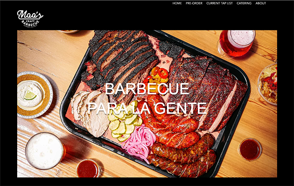
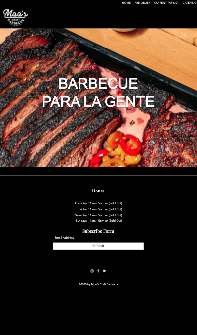
Very nice home page image and logo at the top, over a black background. The menu needs to be adjusted and the text over the main image isn’t strong enough to stand out, it should be bold and bigger. A few other pictures are throughout the site over black background, overall, very simple. I like the simplicity but the type and content need improvement, with a black background they can have the opportunity to stand out.
No address or contact information on the home page, or anywhere else on the site except when you click pre order. Pre order tab opens up a link to toast tab to place orders, and the and current tap list takes you to business.untappd. Overall, I don’t think the content is working and it needs to be totally redone.
None.
Loads quickly, really basic: Home, Pre Order, Current Tap List, Catering, About. It’s missing some tabs such as contact us, press, and I think adding more info about the owners in the about section could make the website and business seem more friendly and inviting.
Site loads quickly, images load and scroll quickly, overall no glitches or issues noted.
Very strong presence on Instagram with 45.1k followers. Instagram link goes to their link tree which has an order online button at the top. Lots of press links listed in the link tree, they have a Facebook and Twitter but are not as active and do not have large followings on those platforms.
Bringing customers in to pick up their pre-placed orders and enjoy the tap room. Based off their Instagram marketing, they emphasize and encourage pre-ordering because the style of BBQ because it takes time to cook and they sell out. Their goals for the site should be to improve the UI experience to increase pre-order business while bring more customers to the restaurant to enjoy the tap room.
Millennial to older male, families, upper to middle class, carnivores, sports fans, beer enthusiasts.
The current site does not reflect the business goals and is very plain and simple. In order to get the website to where we would like it to be, we need to:
Obtain updated photos of the space, and updated graphics.
Improve and overhaul the UI overall and pre-order experience.
Conduct research with current Moo’s customers who use the pre-order option.
Contact info added throughout, add contact page, yelp link, press page, add reviews to site, add an about page.
Clear messaging regarding promotion of pre-orders and any specials.
Update the navigation menu with functional, working links.
Create merch, stickers and add to an online store for the site.
VISUAL DESIGN:
Black and white, simple design. Big, beautiful images are prominent on the home page. It does look as if something was thrown together without much thought to content. The website leaves a lot to be desired and needs work all around, from improving the layout to adding calls to action with direction.
CONTENT:
Content in Menu sub page looks very clean and organized. On Homepage the words “our menu” and “catering menu” in bold text, but there’s no links or menu listed after that. Contact on Contact page should be better organized. They tell a little bit about their story on the top of the homepage so more content on an about page would be great.
“Call to action” on home page:
None.
NAVIGATION:
Simple and organized. There are only 3 subpages listed in navigation, overall could use more subpages.
FUNCTIONALITY:
Menu links work and logo takes you back to home page. Order now button under the menu subpage does not currently have the functionally to place orders, the button takes you to the contact page.
COMMUNITY BUILDING (SOCIAL MEDIA):
None, there are no links to indicate a social media presence.
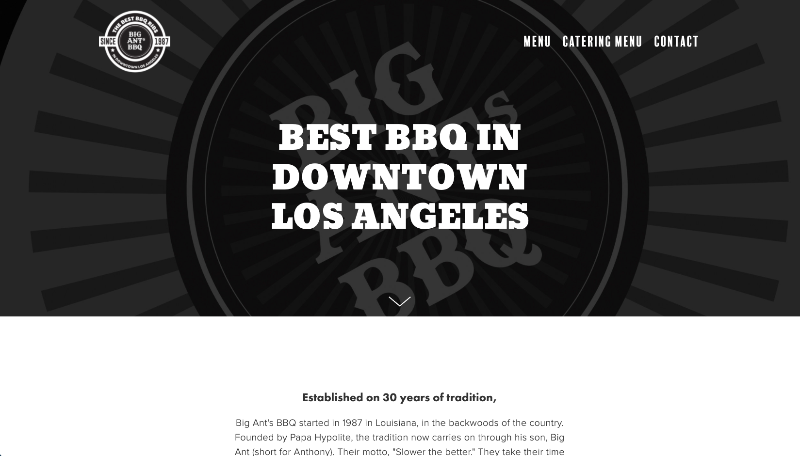
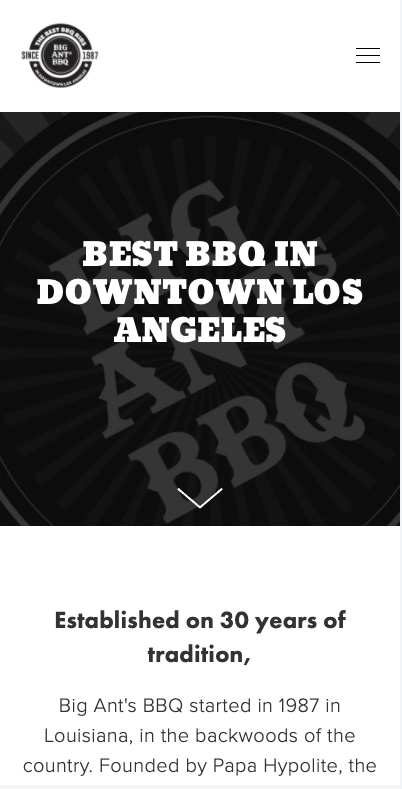
VISUAL DESIGN:
Big, beautiful images with a minimalist, clean look. Doesn’t feel very friendly, it’s just a very simple website.
CONTENT:
Hours and locations are clearly listed at the bottom of the home page. Menu items are listed as you scroll down the home page and it looks disorganized. There are buttons at the top to order, other than that no other sub pages or content.
“Call to action” on home page:
None.
NAVIGATION:
Extremely simple, there are just two buttons at the top to place orders at their two locations. It could use an about and contact menu to help increase SEO.
FUNCTIONALITY:
All buttons work properly, and pages load quickly.
COMMUNITY BUILDING (SOCIAL MEDIA):
None.
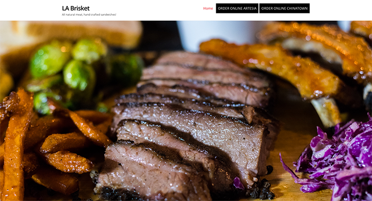
VISUAL DESIGN:
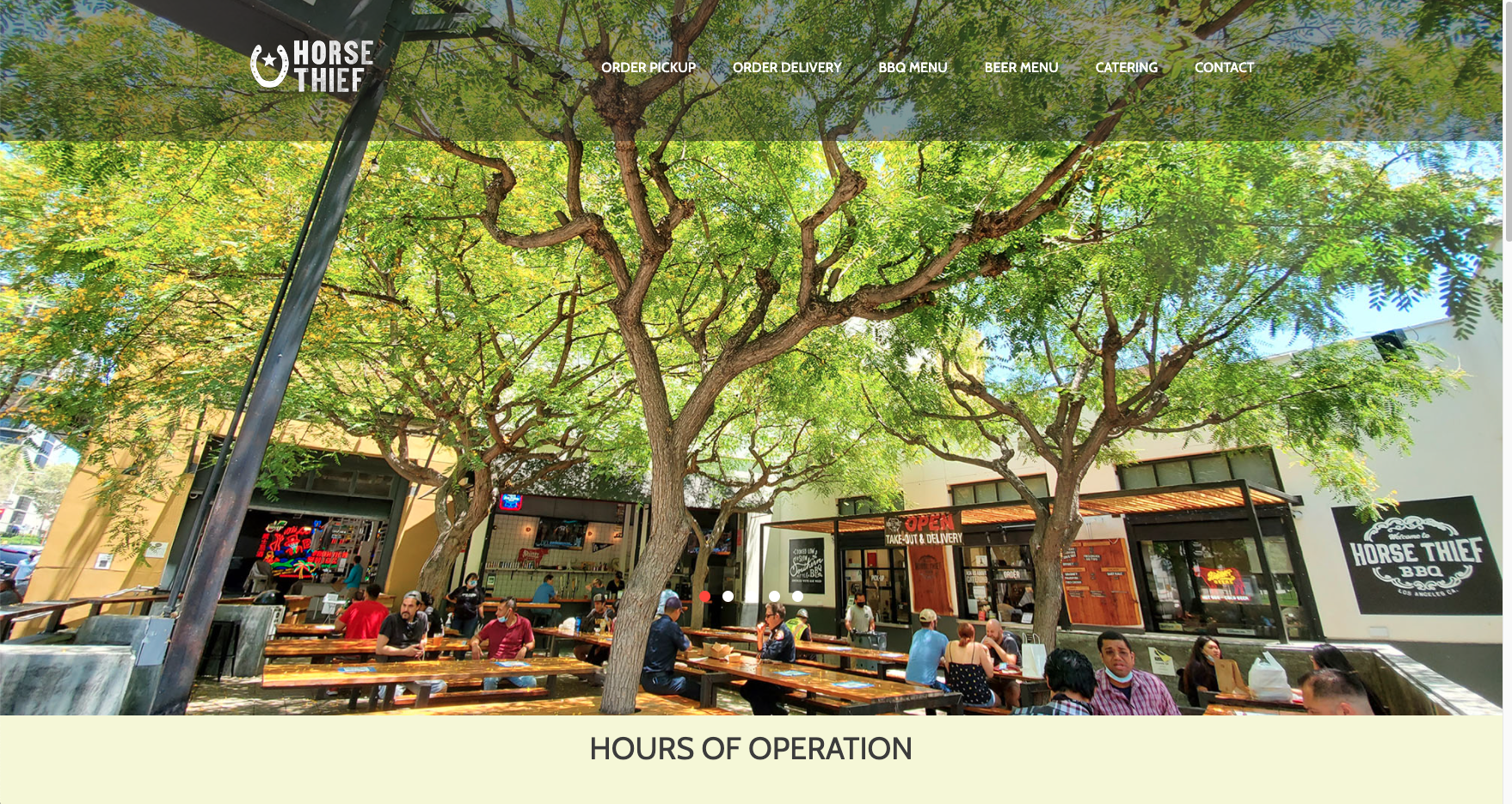
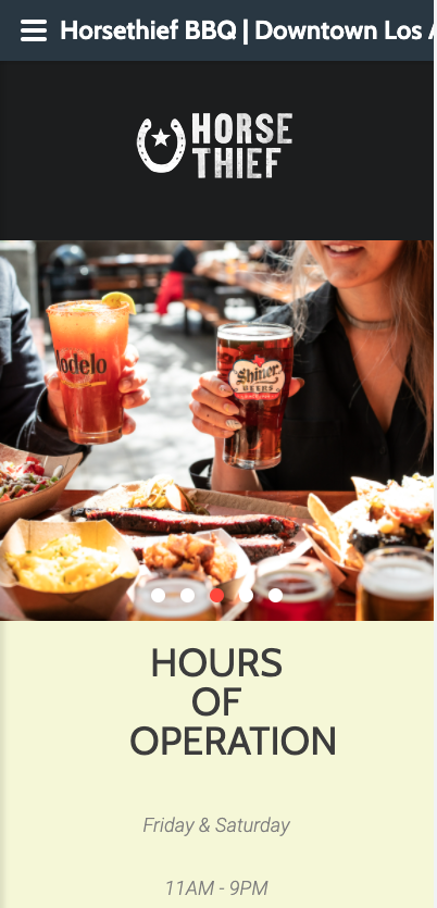
Overall it looks great, pleasing UI that makes you want to stay and explore the website. Very nice images used and branding throughout. Color palate is high contrast, clean design, friendly.
CONTENT:
Order Now button takes you to a screen asking you to choose a location, it’s not clear which locations may now be permanently closed. That should be clarified. I like the look of this website and think the content is in a great direction it just needs to be flushed out.
“Call to action” on home page:
There are 2 “order now” buttons at the center of the page, and the top right in the navigation.
NAVIGATION:
I really like the navigation, something about it feels very friendly to me and makes me feel safe to explore. I like the blue order now button on the navigation bar, great reminder to the customer for what we want them to do next.
FUNCTIONALITY:
All the buttons work, taking you to where you’re going. The MENU button and the ORDER NOW button take you to the same page so that’s kind of redundant.
COMMUNITY BUILDING (SOCIAL MEDIA):
Social media buttons at the bottom of pages. They have social media pages but haven’t been active in a long time, modest followings on Facebook, Instagram, and twitter.
VISUAL DESIGN:
This was one of the better websites, photos are intriguing and visually appealing. The images going across the home page make me want to check it out and just hang out in the city. It looks like a vibe. Nice, clear unpixellated images.
CONTENT:
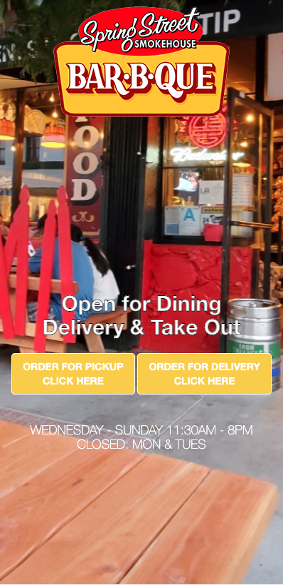
Too much information on the home page, and appears disorganized. It feels like I’m scrolling down for a little too long, and they just jumbled a lot of content together onto the homepage. Feels messy.
“Call to action” on home page:
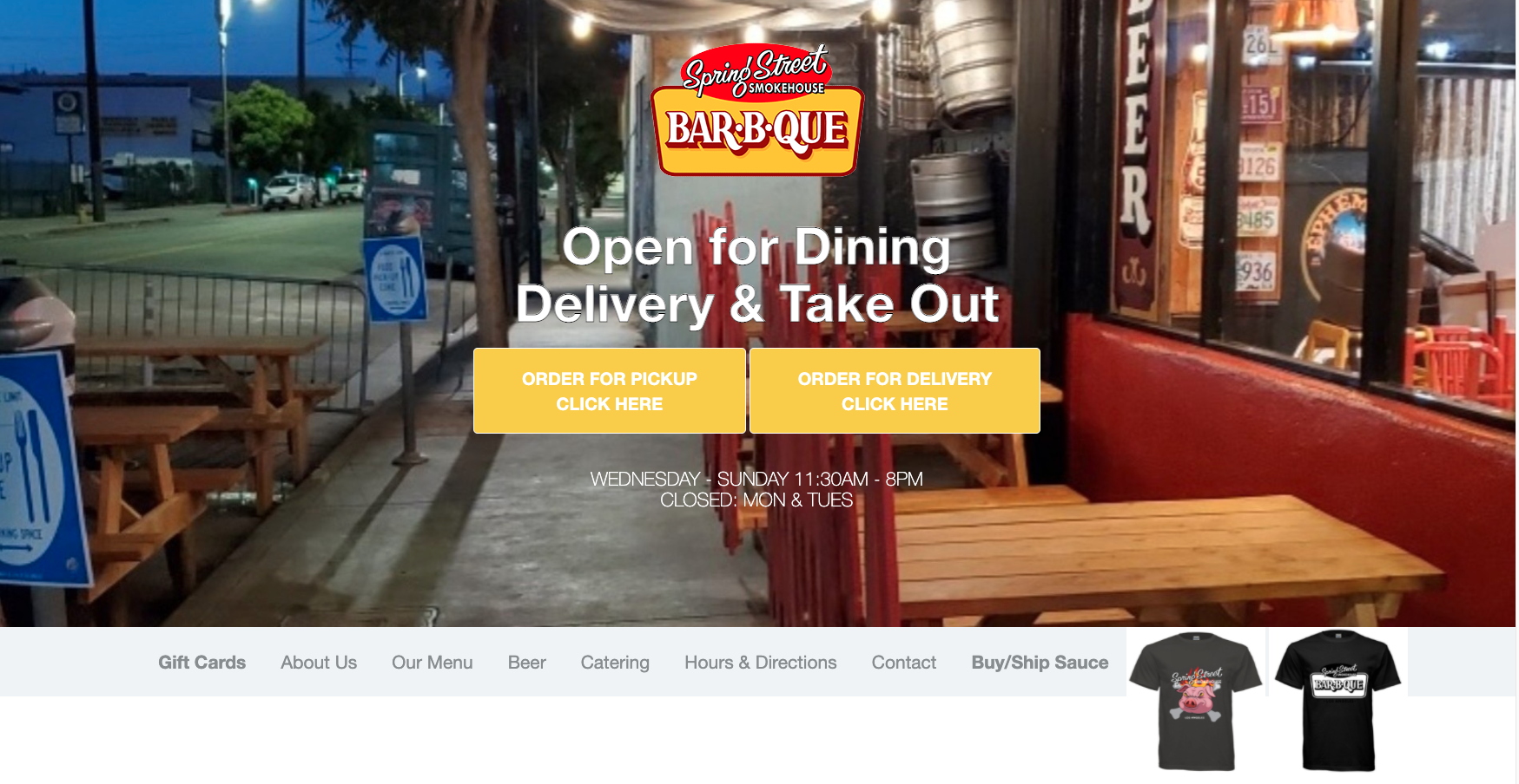
Yes, very big clear buttons to place orders are the first thing you see on the home page.
NAVIGATION:
Navigation bar doesn’t take you to subpages. When you click a button what it does is scroll the page down to where the content is on the main page. It’s all there, that’s why the home page feels so long. The Buy / Ship Sauce button doesn’t go to a subpage, but does take you to an external page to shop merch. Website has no subpages. It’s a homepage, and then links that take you out to place orders or buy merch.
FUNCTIONALITY:
The site functions, loads quickly, and overall does what it’s supposed to do. It’s literally just a homepage, very very simple so not much functionality to test out.
COMMUNITY BUILDING (SOCIAL MEDIA):
Instagram account with a following of 6.5k. Not very active on social media, last post was in July 2021.
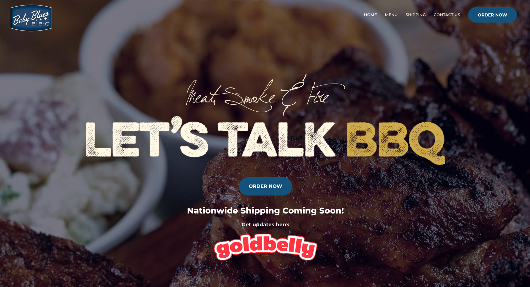
VISUAL DESIGN:
This was the best page out of all evaluated, nice images. Pretty organized and clean design throughout. Existing BBQ websites seem to use a lot of black background on their websites, they could probably use to color to entice customers to spend.
CONTENT:
The order pickup and order delivery menus are different, there are more options on the order delivery menu. High res, non pixilated images look great. Instead of subpages menu on the footer, can use that space for a tagline or a call to action.
“Call to action” on home page:
None.
NAVIGATION:
Easy to make your way around, things seem pretty organized. Naviation doesn’t need to be in the footer, it’s already in the header which is redundant.
FUNCTIONALITY:
The BBQ and catering menu subpage is a PDF which is nice if you want to print out the menu and put it on your fridge, for example. Page and images load quickly, no broken links or glitches.
COMMUNITY BUILDING (SOCIAL MEDIA):
Facebook, Twitter are under-utilized. Instagram is the most used with a following of 17.5k.