Current Website Analysis
For this project, I chose to redesign Cuckoo Rooster's website since their chicken is far too good to have such a lame site.
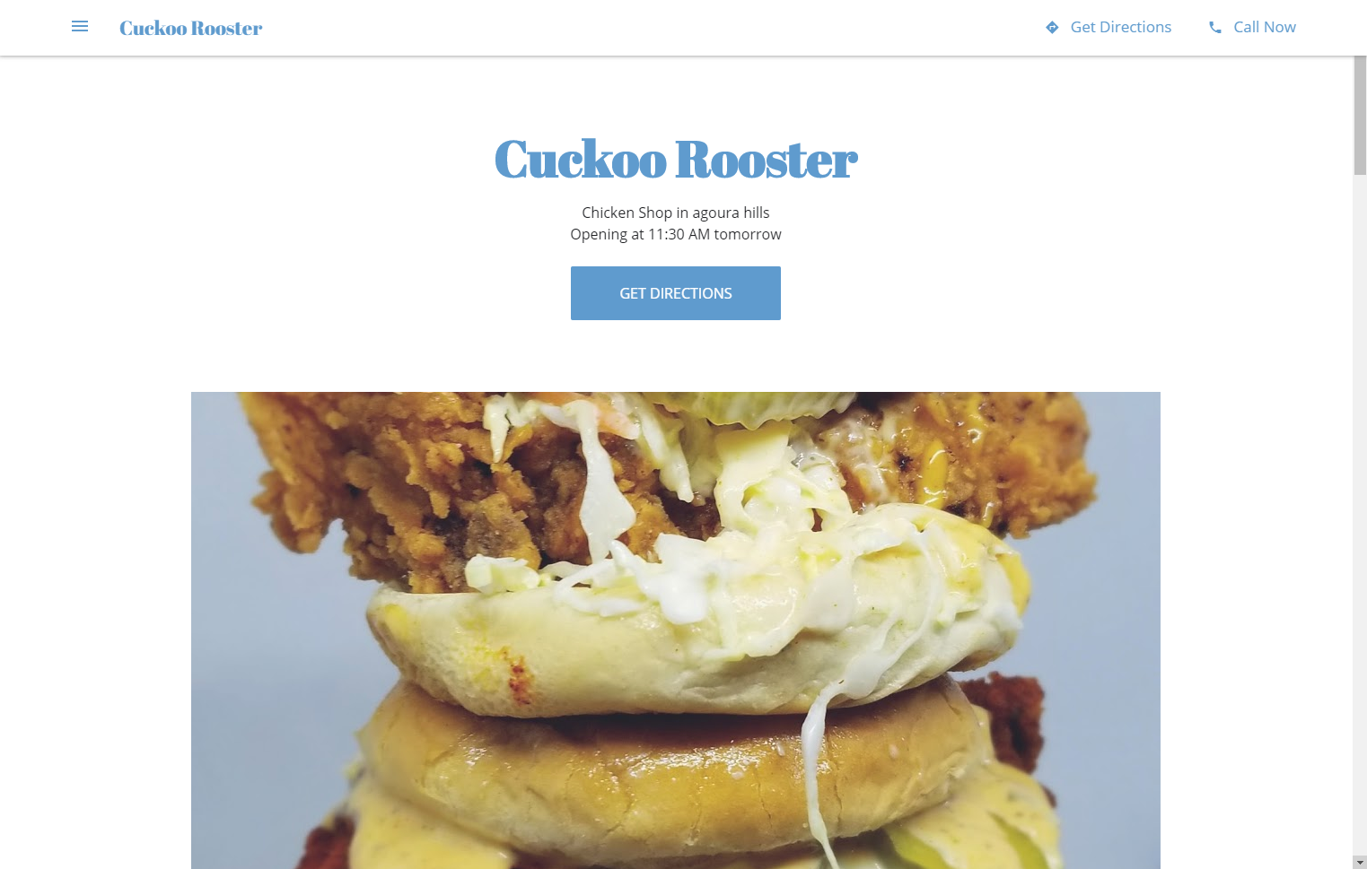
The first thing I noticed is that all the content on the site is put into a single page which is very limiting. Their menu icon simply scrolls down to the section of the page where the corresponding content is located, making the navigation practically useless. The site does a bad job of reflecting the company's food and culture, for example, their logo is nowhere to be seen and their color pallette doesn't match the restaurant's aesthetic (maybe add a red color pallette since their speciality is spicy chicken). Their content is also very bland. We are greeted with a very mediocre photo of their sandwich and a section called 'updates' where there's a single post that doesn't even provide us with any updates. We also immediately see the CTA to 'Get Directions'. The 'about us' section is oddly place inbetween the Testimonials and the Gallery. I've also noted that there is no section for their menu. To access their menu, you must search through their Google gallery, where you'd find a picture of it.
Competetive Analysis
Dave's Hot Chicken
Visual design: Very bright and attention grabbing. Uses a lot of red to create spicy feeling. A good amount of thought was put into the visual design. Images are highly saturated to make the food look more tasty.
Content: The site carries all the content to satisfy any user needs.
CTA: 'Order now!' on their navigation bar
Navigation: Navigation bar has many tabs to the point where the user might feel unmotivated to read through all of them to find what they are looking for.
Functionality: Everything on the site seems to be functional.
Community building: 'Social' tab takes users to a page where they could see all their Instagram posts.
Howlin' Ray's
Visual design: Very appealing to look at. Not too loud but does a great job of representing the brand. High resolution and saturated images to make the food stand out.
Content: Great amount of content that goes beyond user's needs. Sections such as 'our crew' and 'shop'.
CTA:'Set a pre-order' on the homepage since their lines are known for being extremely long.
Navigation: Navigation isn't too long. Perfectly located with 'Howlin' written in the middle for nice little touch. Covers all user needs.
Functionality: Everything on the site seems to be functional.
Community building: Tells their story, talks about the employees, sells merch, and links to social media are provided.
Hotville Chicken
Visual design: Good visual design. Bold lettering to grab attention. Uses red to reflect spicyness. Not overwhelming.
Content: Enough content to satisfy most users. Homapge is filled with updates and press.
CTA:'GET HOTVILLE CHICKEN DELIVERED' on homepage
Navigation: Small navigation bar but still delivers the most essential parts of a restaurant's website.
Functionality: Cart button at the top has no function because there are no products to buy on the site.
Community building: Tells story about their history and links to their social media are provided.
Goals and Target Audience
The goal for the site is to bring more customers through the door and to satisfy users' needs when visiting the website to avoid any potential frustration towards the restaurant. The restaurant does not offer any delivery or catering. The target audience are fried chicken lovers. The site needs to live up to their expectations and needs to feauture an abundance of satisfying images to make visitors crave the food.
What questions need to be answered in order to complete this project?
What parts of the restaurant's website are essential for every user? What content to display on the homepage? What is the best number of navigation tabs? How do we draw users into the restaurant?
What tasks do we need to complete in order to successfully design this website?
Create a logo, come up with visual design aesthetic, get high quality photos of the food, create a menu page.
What issues need to be solved?
Menu needs to be easily accessed, address needs to be displayed at the top of the webpage, Updates page needs more content and real updates.
What is our schedule?
For now, wireframing > visual designing > markup