Project #6: Revised Design Comprehensives
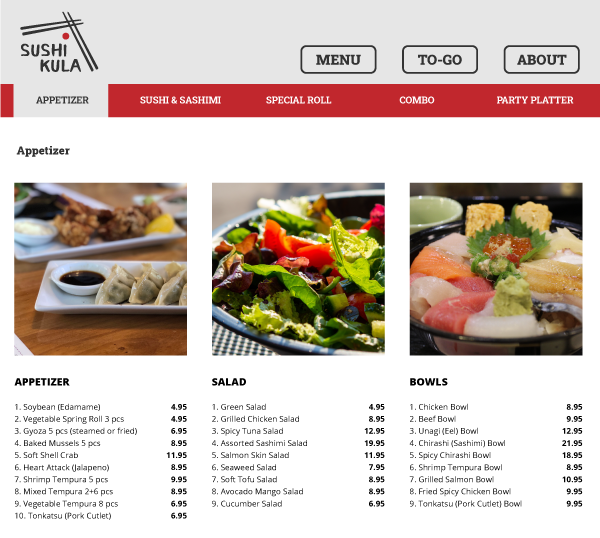
I took the feedback of adjusting the margin of my nav and also added a border around each nav button to give the implication that those are clickable links/pages. Also I took the suggestion of using a slab serif typeface instead of sans serif (which competes with my body copy typeface). I made little adjustments by adding image borders and rearranging the grid. I also have a third color choice that I haven't explored / shown on the comps due, but I might be able to show on the final website.
LANDING PAGE
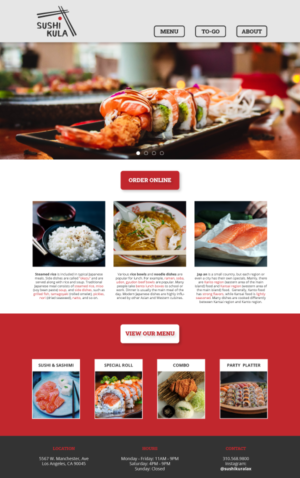
Landing Page: Desktop/Laptop
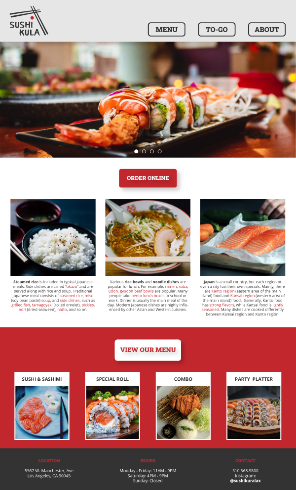
Landing Page: Tablet
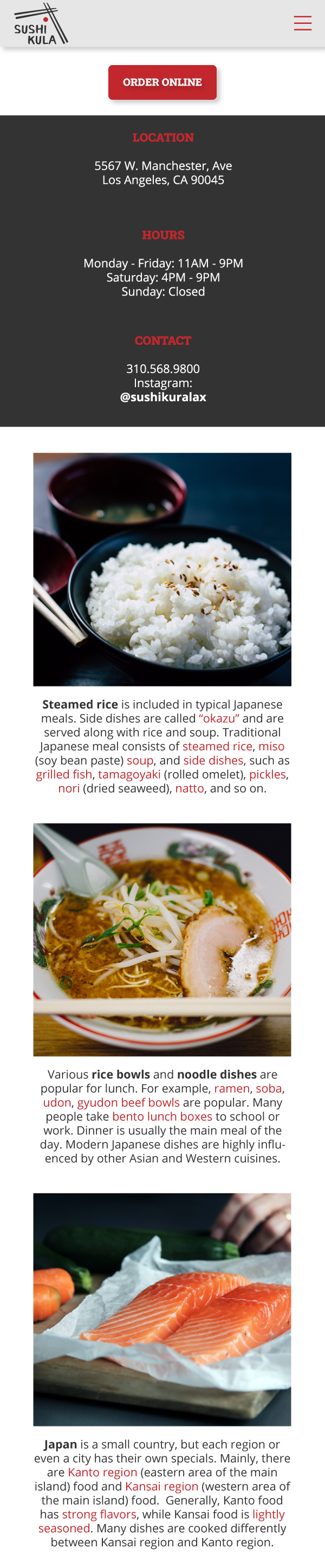
Landing Page: Phone
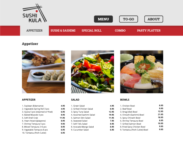
MENU
Menu: Desktop/Laptop
Menu: Tablet
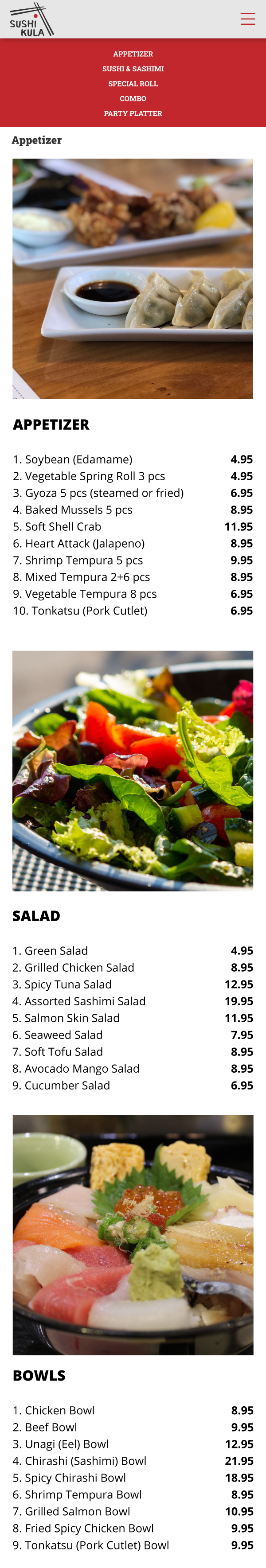
Menu: Phone