Home
Project #1: Market Research
For this assignemnt, I was required to select a restaurant in the L.A
area to take on as a "client". From the restaurant listed to redesign, I chose
Cacao Mexicatessen. I will be analyzing the restaurants presence along with
four of it's competitors (Rubio's, El Torito, Acapulco, and On the Border Grill)
I will also be rebranding the restaurant to avoid trademark and copyright violations.
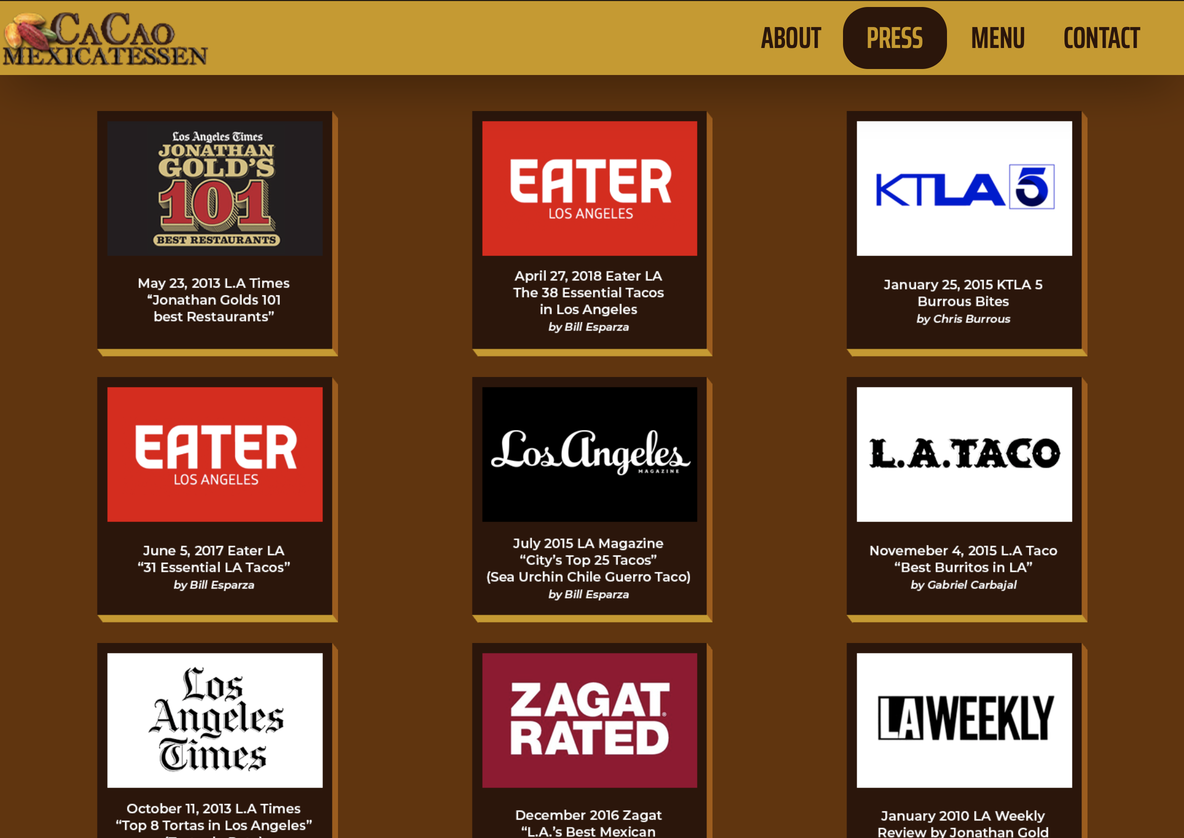
CaoCao Mexicatessen

What works in this webpage
The menu is responsive and the color swatch is appropriate
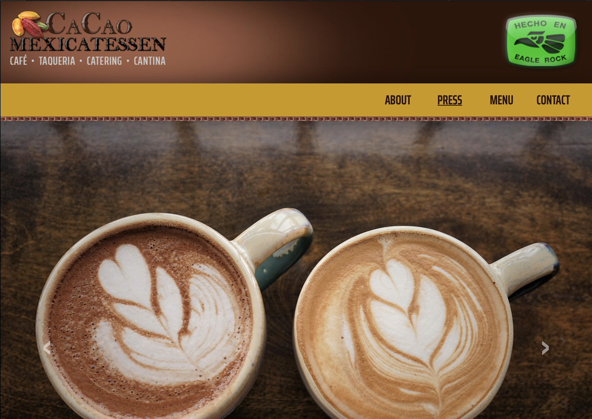 Images are well layed out
 Bootstrap Carrousel is responsive
 Important information is present
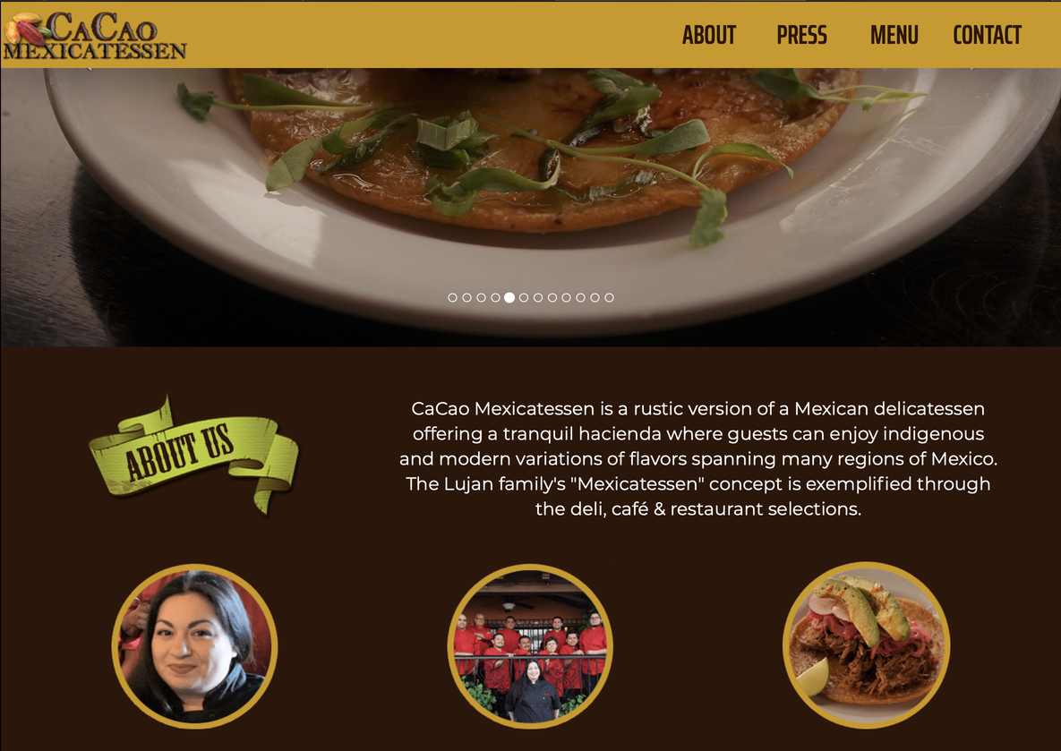
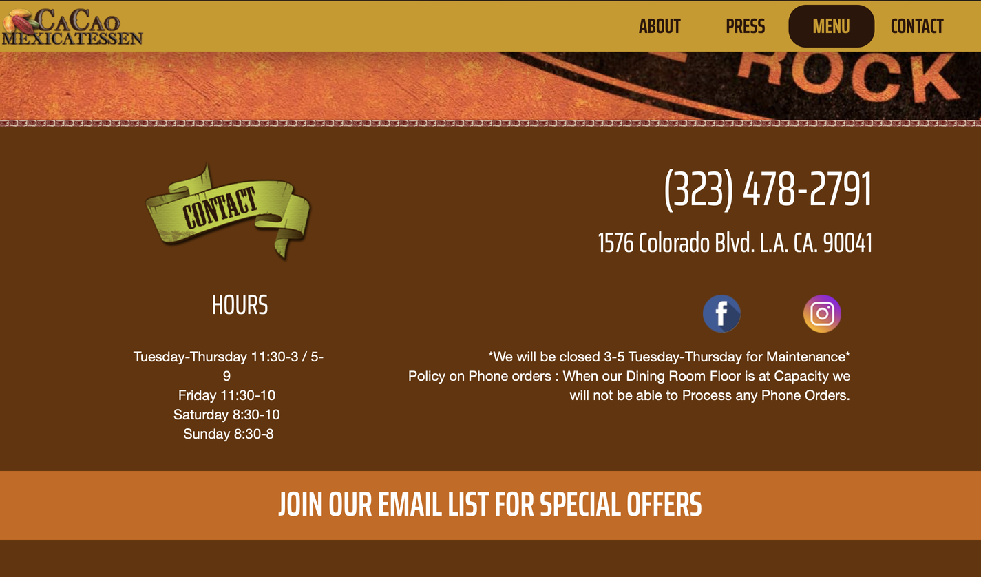
What doesn't work in this webpage
Logo looks cheap
The sizes of letters in the Contact page are out of focus
 The shadows in some shapes are distracting and make the page look cheap
Now we will be doing a competitive analysis between CaoCao Mexicatessen's competitors.
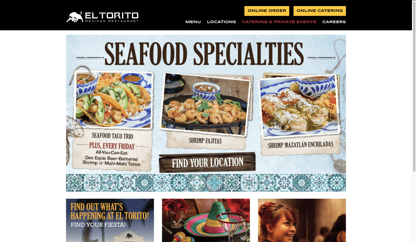
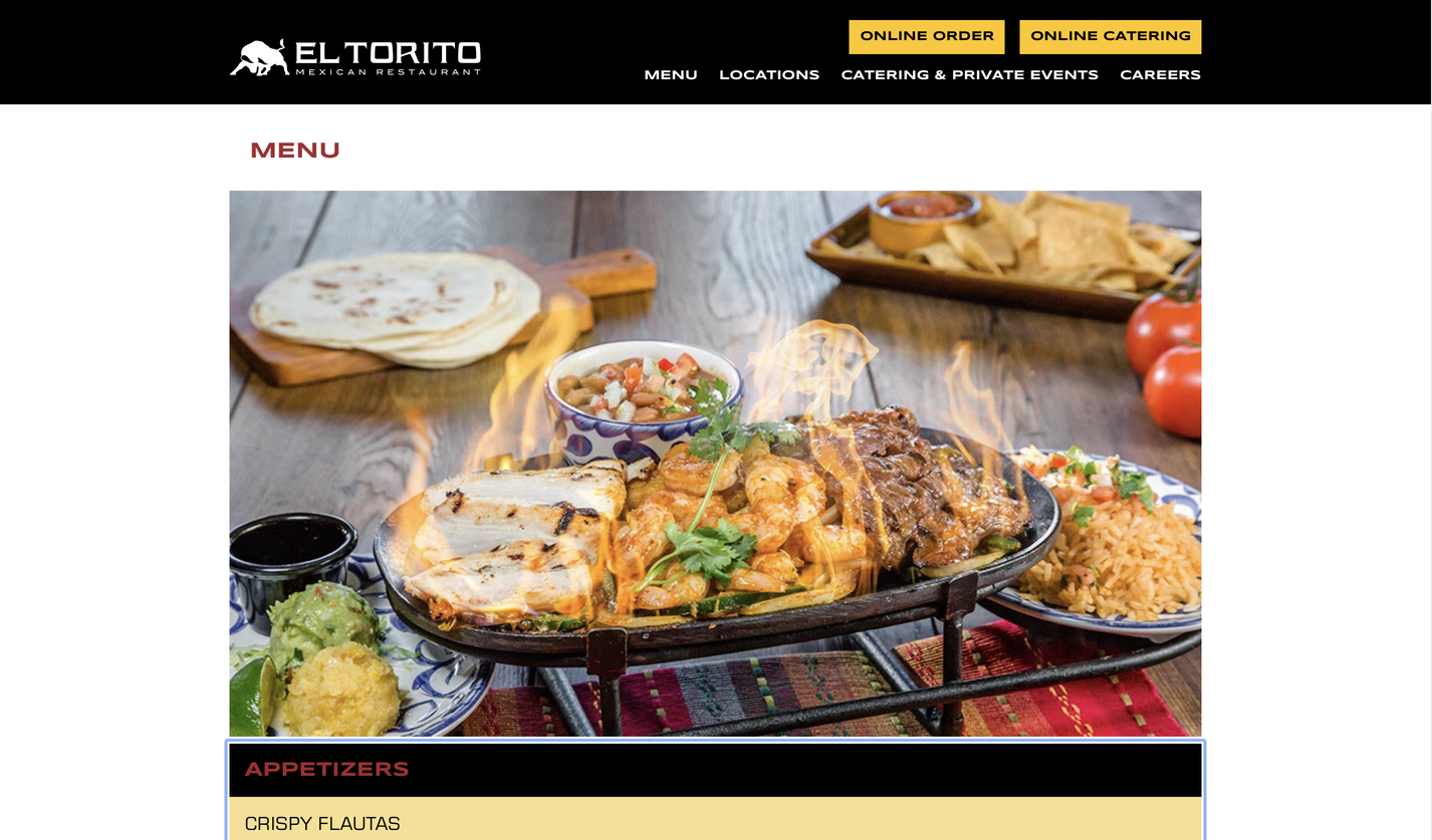
El Torito

Visual Design
The styles and patterns have a consistent palette. Despite all letters being capitalized. Headers and subheaders can be noticed from each other. The look and feel of the site seem to fit the brand, despite the lack of color. The visuals are fresh, simple, and consistent. The visual design supports usability that anyone can use the site.
Content
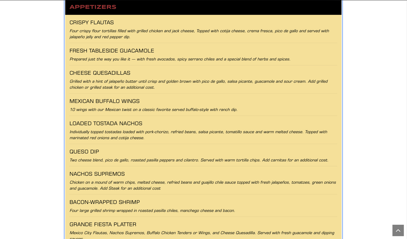
The headings are clear and descriptive, the content is appropriate to read. Anyone can understand it. The content is formal and friendly since they're a service. The audience is general, but it's mostly fro adults sice they have things solely for adults such as alcohol.
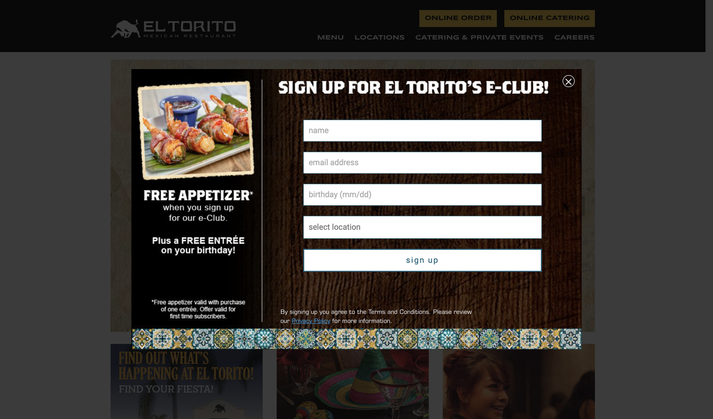
"Call To Action" on Homepage
"Call To Action" pops out seconds after the webpage is loaded.
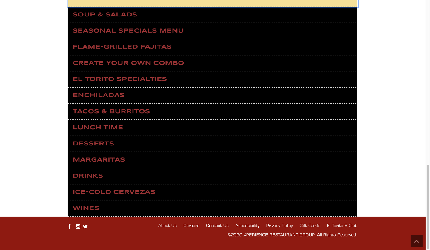
Navigation
Navigating the web is easy, the primary navigation is at the top like every other page. The main and the sublevels are clean and concise since they can tell from each other despite both being capitalized. There are main menu items, but each menu item is different from all others. By hovering on the page there's a difference between what's clickable and what's not, but most of the content is clickable. A site search unfortunately isn't present.
Community Building (Social Media)
Community Building/Social Media is at the bottom of the webpage
Functionality
The only interesting functionality on the page is the hover color change in the main menu, which indicates where you're clicking.

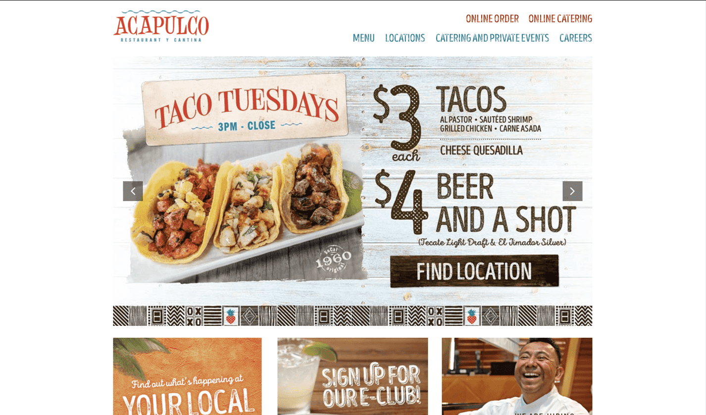
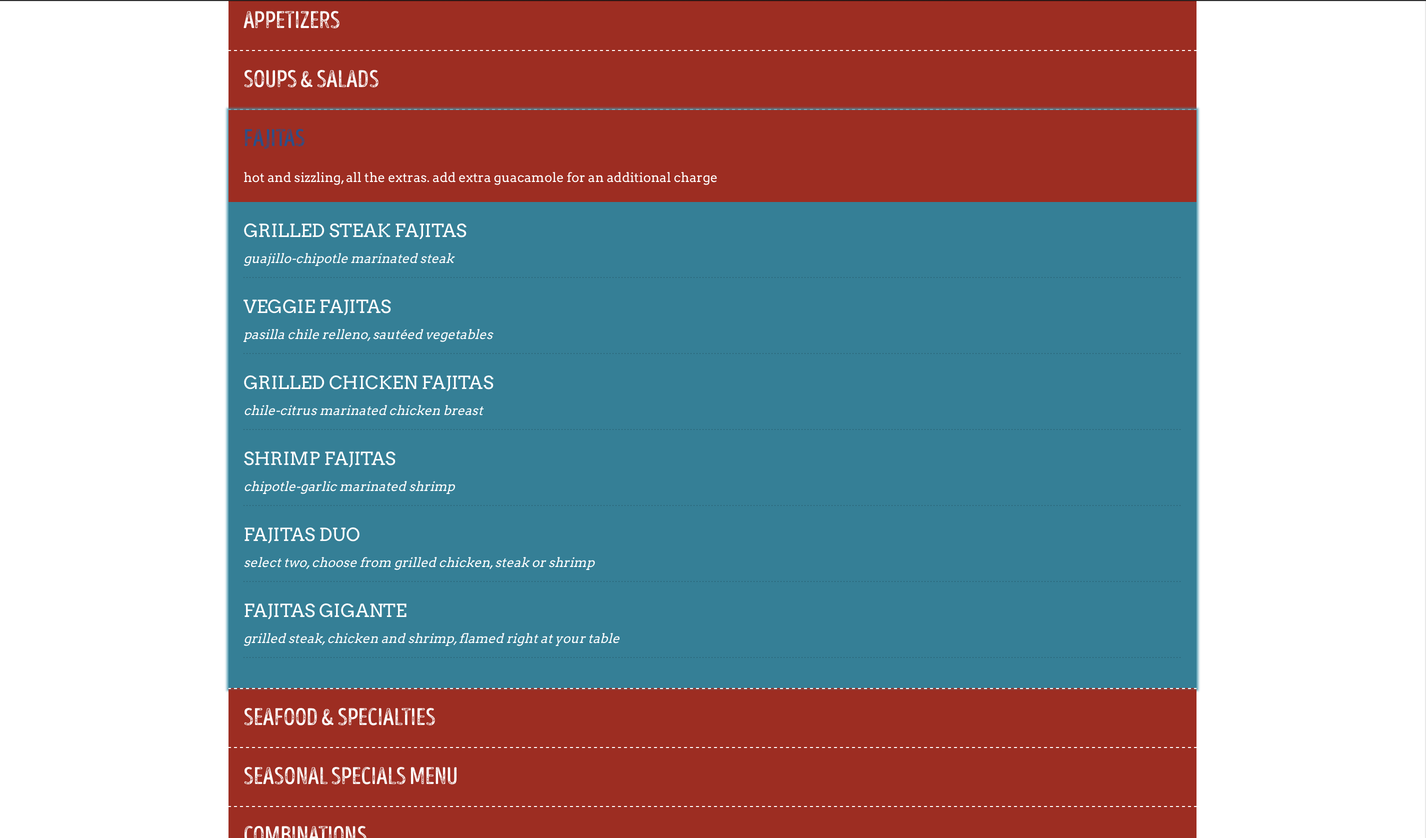
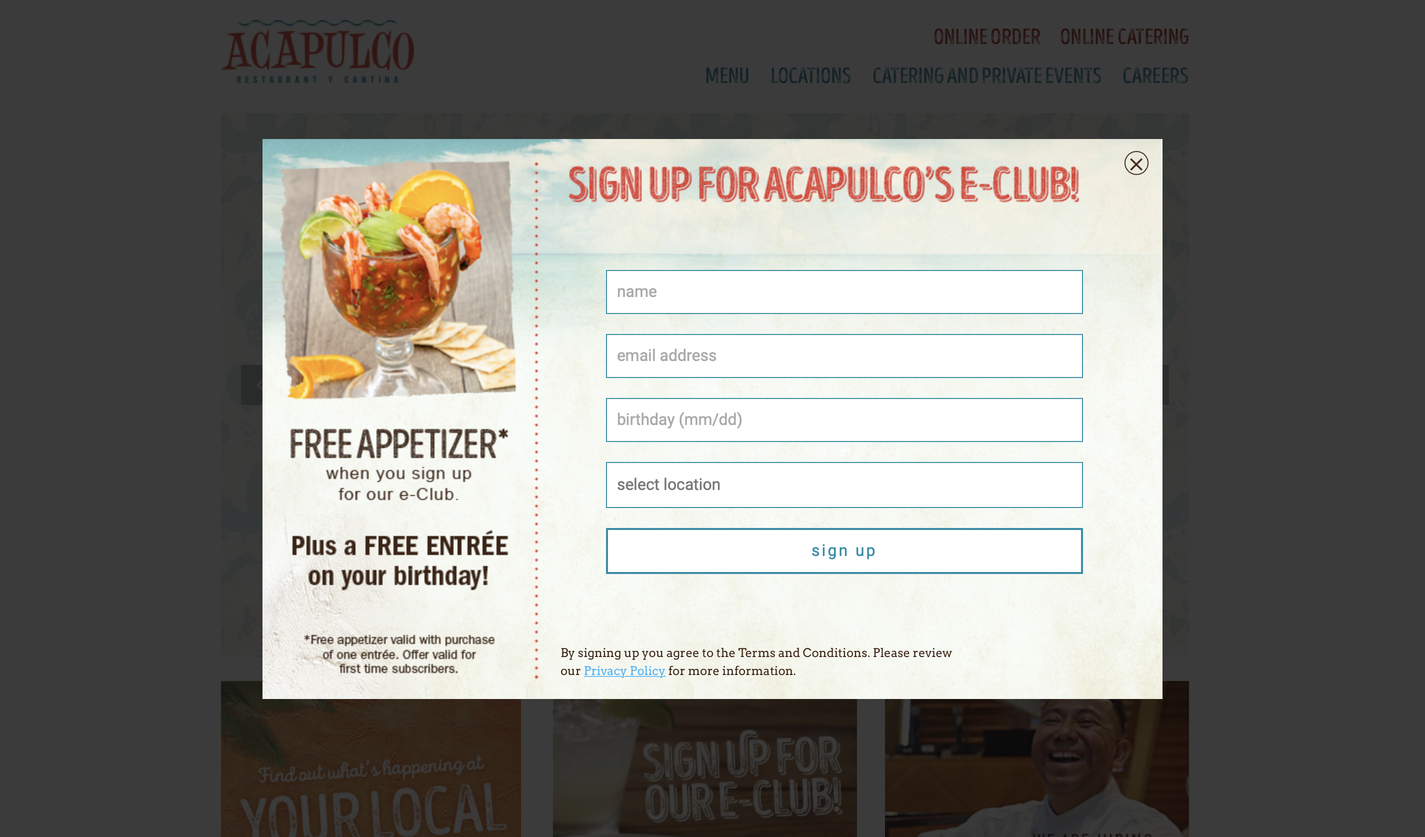
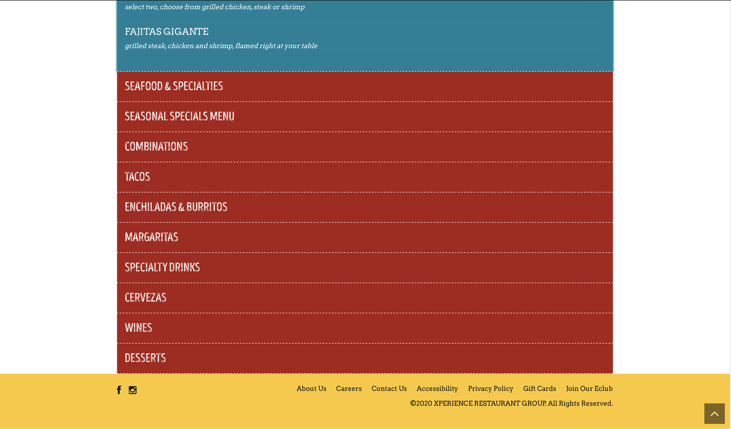
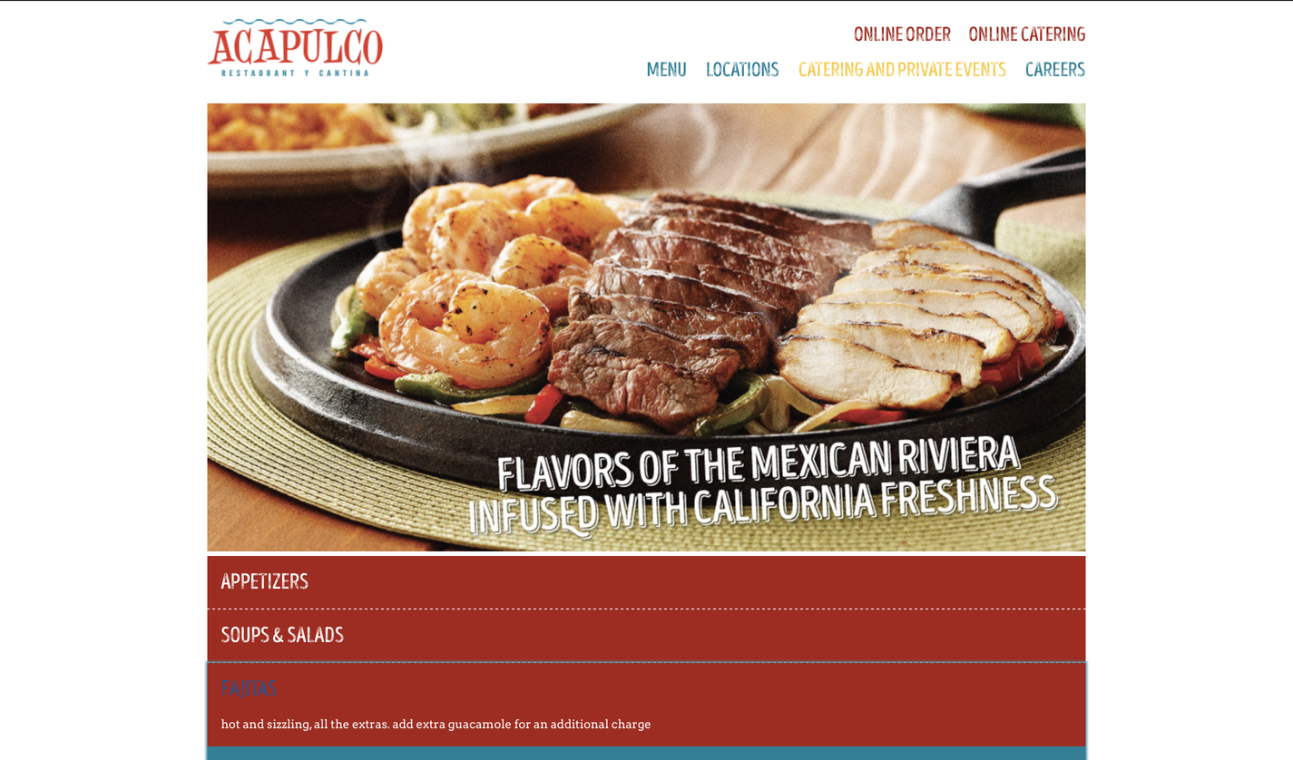
Acapulco Restaurant

Visual Design
The styles and patterns have a very exotic feel especially with palettes of light colors that identify with the sea, since one of their specialties is seafood . The hierarchies are different, the headers are in capitals and in serif and the subheaders are lowercase and in script, which gives it a smooth feel. The look and feel of the site seem to fit the brand, especially since it's a Mexican restaurant, since the culture and food of Mexico is colorful. The visuals are fresh, simple, and consistent. The visual design supports usability that anyone can use the site.
Content
The headings are clear and descriptive, the content is appropriate to read. Anyone can understand it. The content is formal and friendly since they're a service. The audience is everyone, they cater for kids and adults.
"Call To Action" on Homepage
"Call To Action" pops out seconds after the webpage is loaded.
Navigation
Navigating the web is easy, the primary navigation is at the top like every other page. The main and the sublevels are clean and concise since the hierarchy and color of the text and subtext is different. There are main menu items, but each menu item is different from all others. By hovering on the page there's a difference between what's clickable and what's not, but most of the content is clickable. Also on this site search unfortunately isn't present.

Community Building (Social Media)
Community Building/Social Media is at the bottom of the webpage
Functionality
The only interesting functionality on the page is the hover color change in the main menu, which indicates where you're clicking.
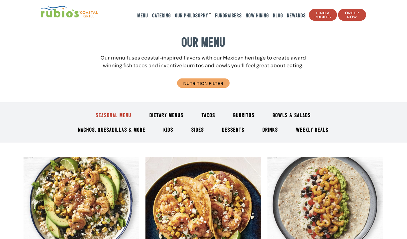
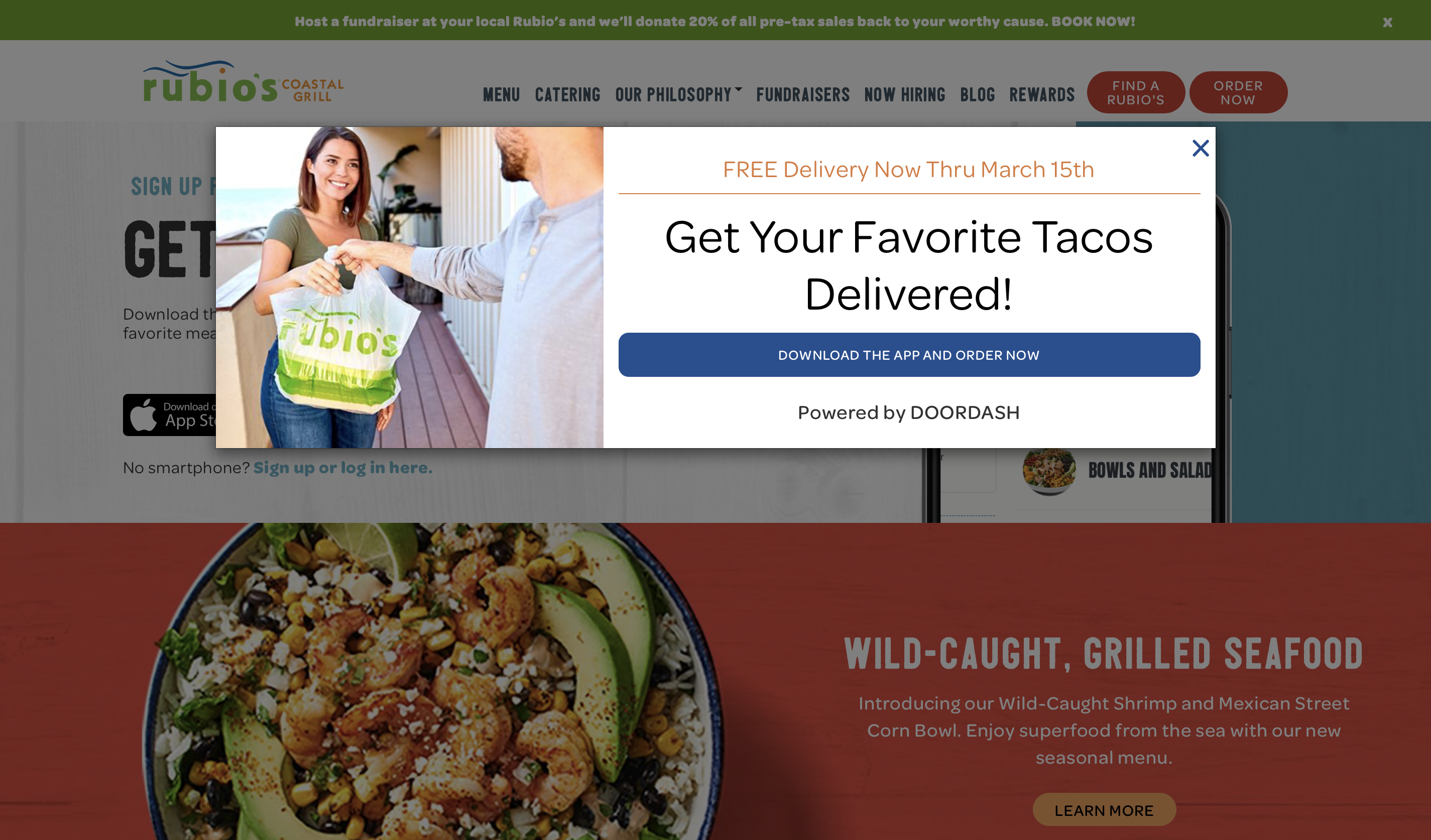
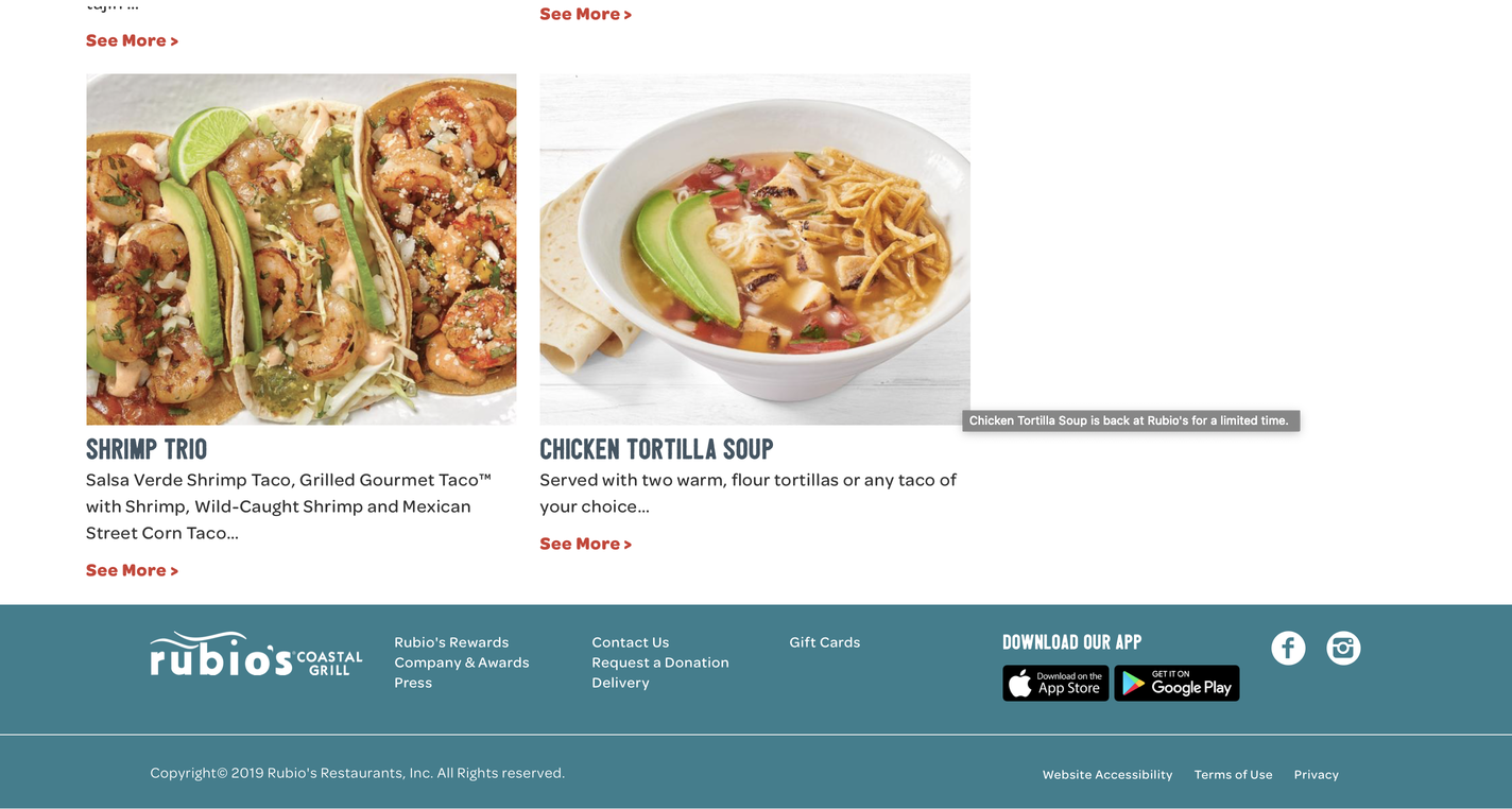
Rubio's Coastal Grill
Visual Design
The styles and patterns have a different shades of color and have one type of shape which is a quadratic shape.. The hierarchies are different, the headers are in capitals and in sans-serif and the subheaders are lowercase and in sans-serif, which gives it a smooth feel. The look and feel of the site seem to fit the brand, especially since there aren't any distracting shapes and patterns, nor typography. The visuals are fresh, simple, and consistent. The visual design supports usability that anyone can use the site.
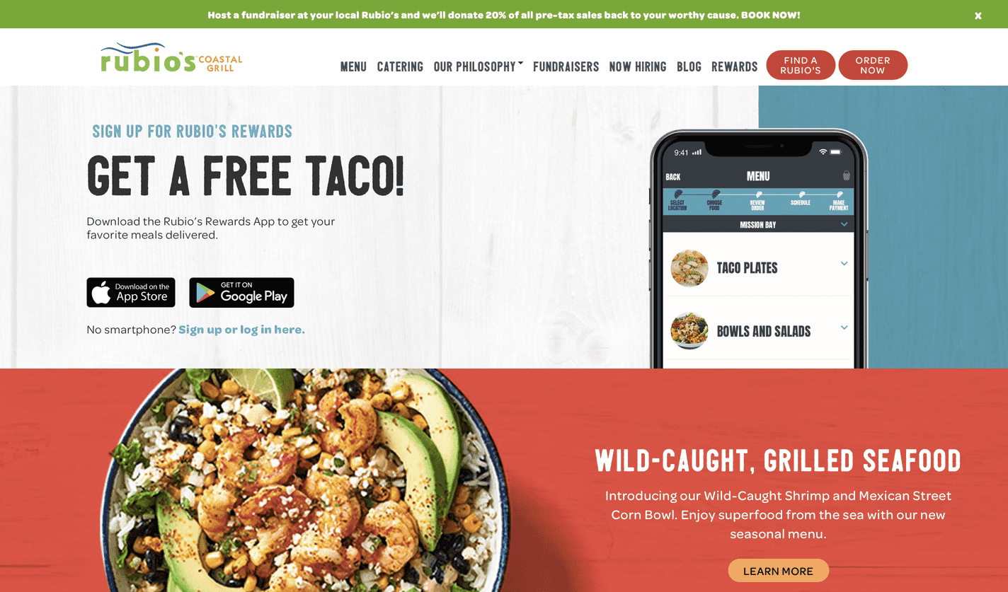
Content
The headings are clear and descriptive, the content is appropriate to read. Anyone can understand it. The content is formal and friendly since they're a service. The audience is everyone, but their main priority is for people who order online.
"Call To Action" on Homepage
"Call To Action" pops out seconds after the webpage is loaded.
Navigation
Navigating the web is easy, the primary navigation is at the top like every other page. The main and the sublevels are clean and concise since the hierarchy and color of the text and subtext is different. There are main menu items, but each menu item is different from all others. By hovering on the page there's a difference between what's clickable and what's not, but most of the content is clickable. Also on this site search unfortunately isn't present.
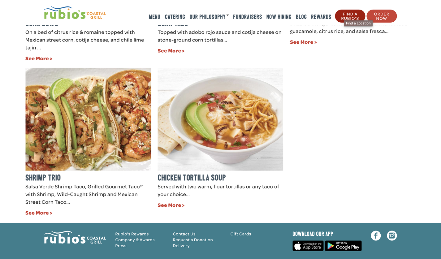
Community Building (Social Media)
Community Building/Social Media is at the bottom of the webpage
Functionality
The only interesting functionality on the page is the hover color change in the main menu, which indicates where you're clicking.
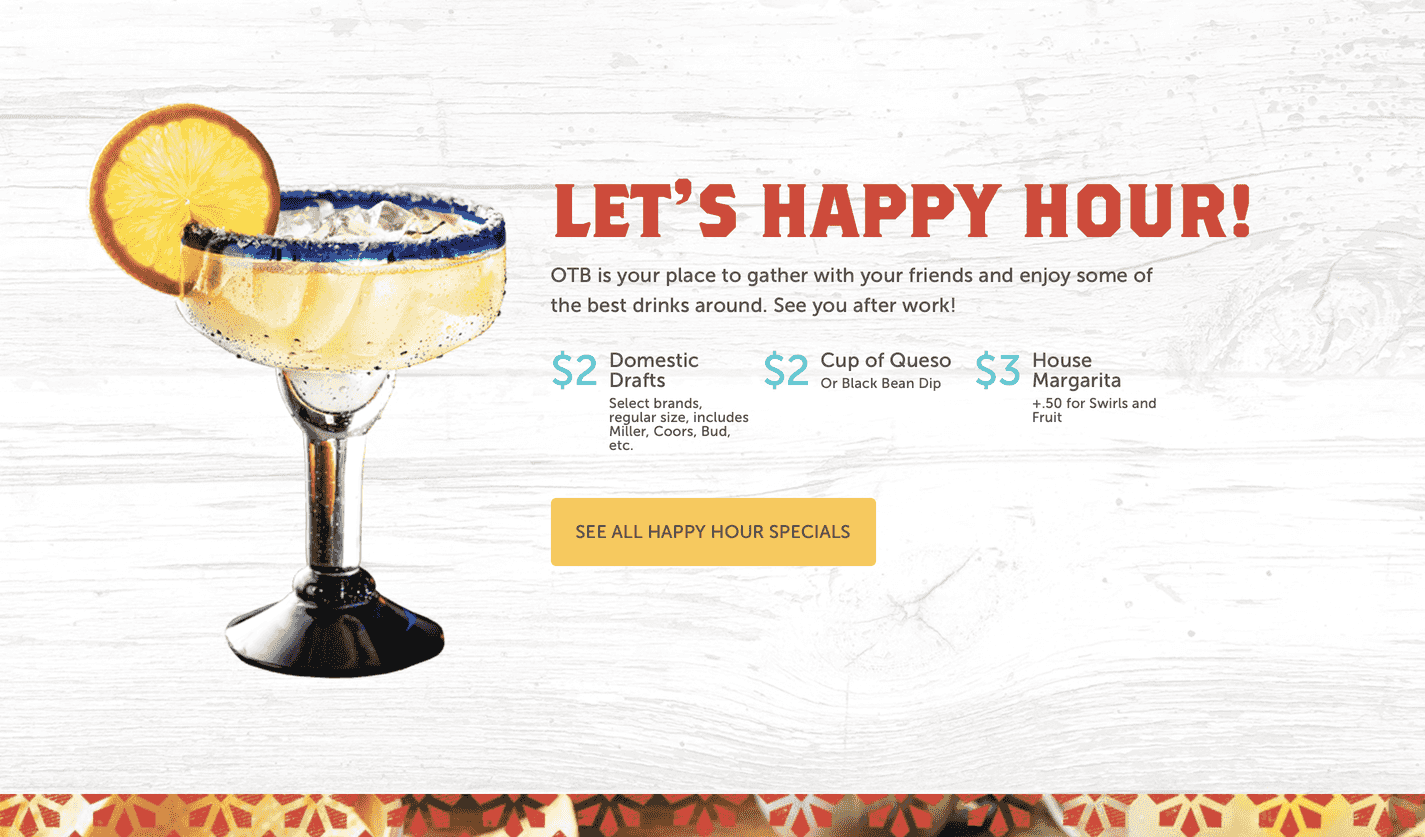
On The Border Grill

Visual Design
The styles and patterns have a different shades of color and have one type of shape which is a quadratic shape.. The hierarchies are different, the headers and subheaders are both in capital letters, but the header is serif and the subheader is sans serif. The body hierarchy is lowercase and sans-serif. That gives it a satisfying feel to it,because there's a variety within hierarchies. The look and feel of the site seem to fit the brand, since the look has a modern look to it. There aren't any distracting shapes and patterns, nor typography. The visuals are fresh, simple, and consistent. The visual design supports usability that anyone can use the site.
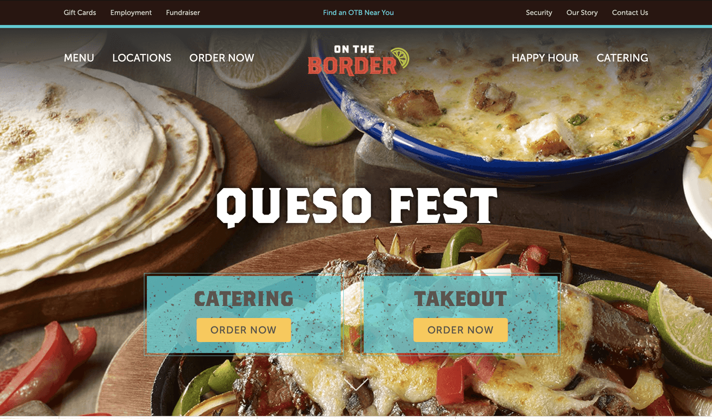
Content
The headings are clear and descriptive, the content is appropriate to read. Anyone can understand it. The content is formal and friendly since they're a service. The audience is everyone.
"Call To Action" on Homepage
After the page was loaded, there was no "Call To Action" to be found.
Navigation
Navigating the web is easy, the primary navigation is at the top like every other page. The main and the sublevels are clean and concise since the hierarchy and color of the text and subtext is different. The main menu is found at the very top of the page. The restaurant logo creates a a barrier between the main menu. There aren't many main menu items, but there are two main menu options that repeat and are found in the middle of the page. By hovering on the page there's a difference between what's clickable and what's not, but most of the content is clickable. Also on this site search unfortunately isn't present.
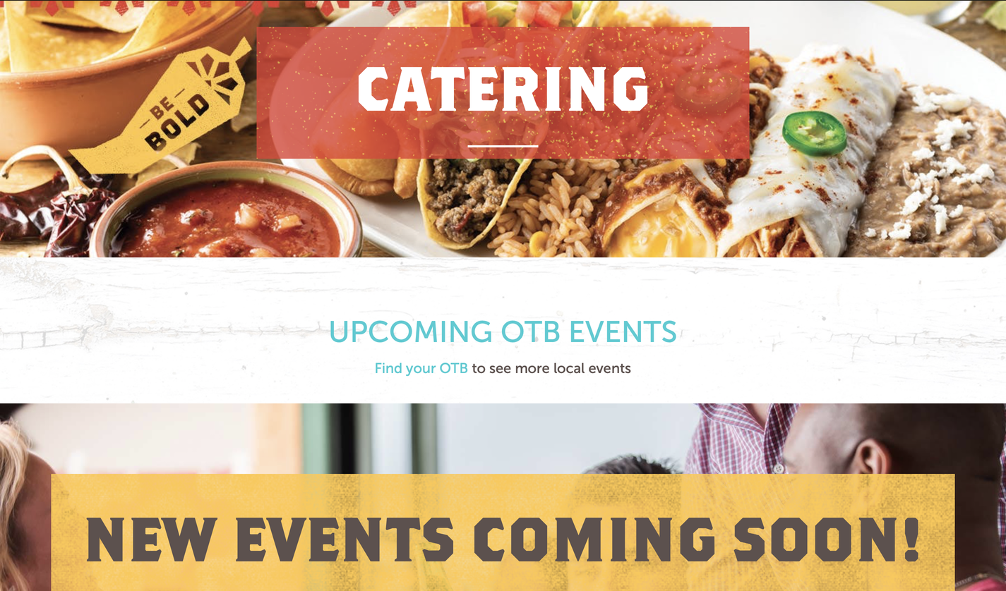
Community Building (Social Media)
Community Building/Social Media is at the bottom of the webpage
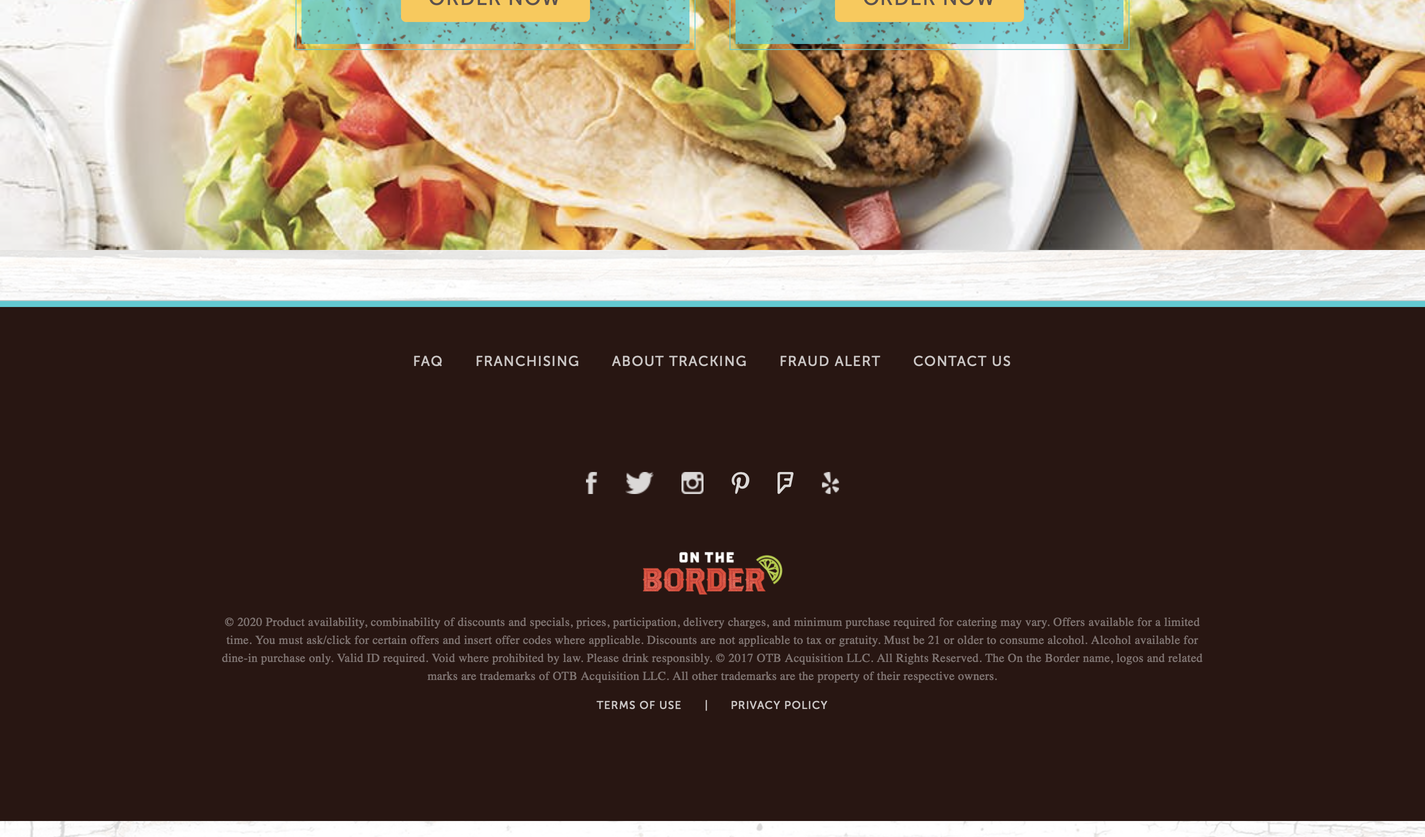
Functionality
The only interesting functionality on the page is the hover color change in the main menu, which indicates where you're clicking.
Goals and Target Audience
Goals
Promote the authentic and traditional Mexican flavor to others
To attract customers to try something different
Create community
Providing satisfaction and great service
Target Audience
Our target audience isn't people of a certain age, gender, or lifestyle. It will simply be people who love Mexican food.
What questions need to be answered in order to complete this project?
What's not working within the website?
What do we have to fix before adding/removing content?
What are important things that aren't in the page?
What attracts Mexican Food lovers?
What tasks do we need to complete in order to successfully design this website?
The tasks we need to complete in order to design this website successfully is by giving a good inspection of what's working and what's not working design wise and navigation wise. Moreover, adding or removing content/features to the website that are/aren't present in the website, and also fixing any issues in the webpage.
What issues need to be solved?
The issues that need to be solved would be distracting colors and shapes, improper hierarchies, unattractive fonts/color palettes and wordy content.
What is our schedule?
We have twelve weeks to complete this project, but it can be less depending how much time we spend creating this project.