Project #1: Market Research
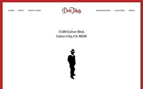
Dear John's Bar : chosen restaurant

What Works
- The "About" page is descriptive. Dear John's has a colorful history.
- The site is adequately responsive
What Doesn't Work
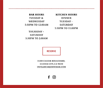
There are many things about this site that could be better:- The site is overly simple with a monochromatic palette and flat, uninspired design
- There is very little photography
- Logo and wordmark are rough
- No gallery or interactive elements
- No breakpoint for Tablets
- Site offers little interest or dynamism
Competitive Analysis
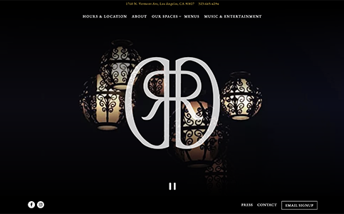
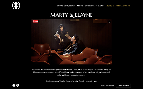
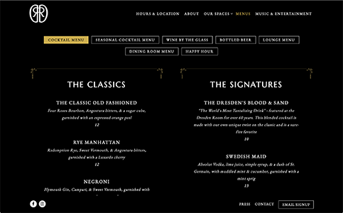
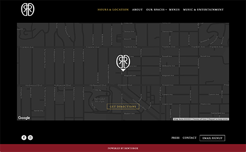
comp study #1 : The Dresden Room

What Works
- The bar has a good logo and branding that illustrates it's "cool, dark bar" vibe.
- The site offers good photography and a photo carousel.
- The site features tasteful dynamic and engaging interactions.
- Information is clear and thoughtful.
- Sticky footer with important information is nice.
- This site is responsive.
What Doesn't Work
- There is no photo gallery.
- The only two social media links (Instagram & Facebook) and IG feels disconnected from the main site.
comp study #2 : Melody Bar & Grill
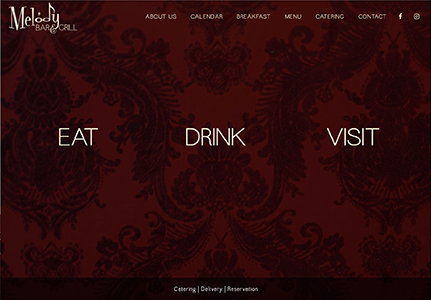
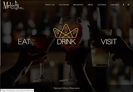

What Works
- The bar has a good logo and branding.
- The home and splash pages are striking and colorful.
- The Home page features engaging interactions and rollover effects.
- This site is responsive.
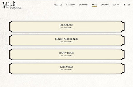
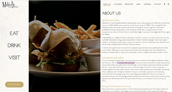
What Doesn't Work
- The site's design flattens and lacks continuity as you go deeper into it.
- There is no photo gallery.
- The social media links are lacking and Instagram feels disconnected from the main site.
- The catering page doesn't offer navigation links to get back to the main site.
comp study #3 : The Arthur J
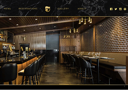
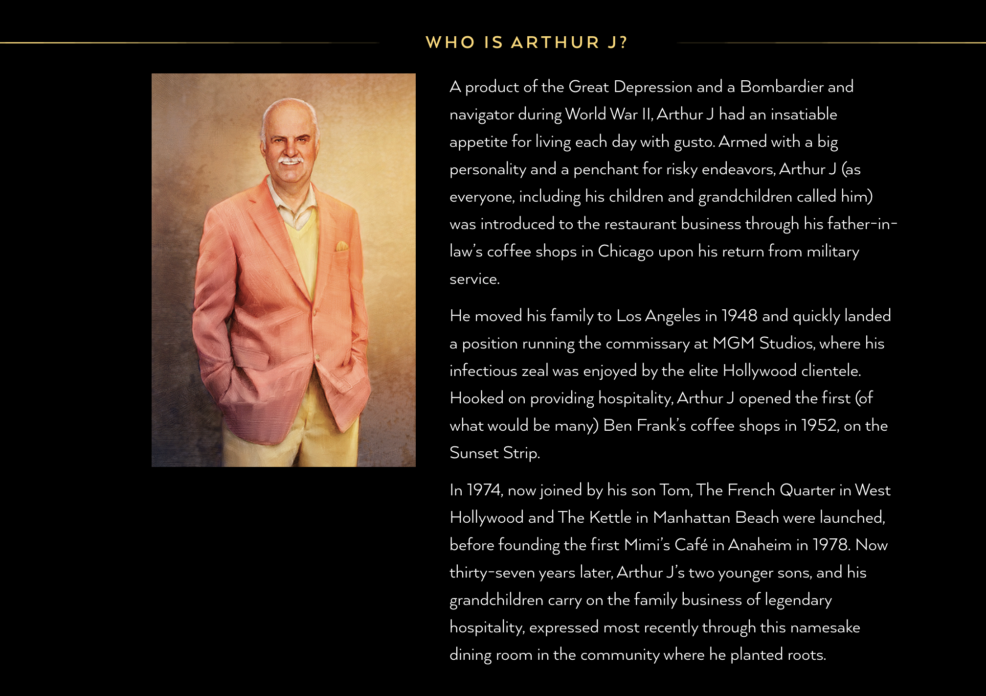
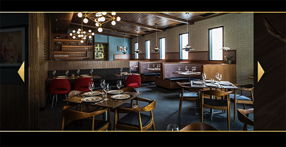
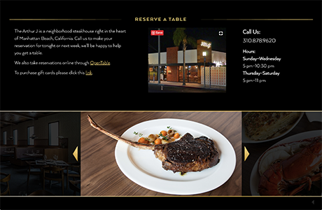
What Works
The Arthur J is a neighborhood steakhouse right in the heart of Manhattan Beach. They offer the best USDA Prime, True Japanese Wagyu, and Black Angus Beef cooked to perfection over a natural wood fire with friendly thoughtful service. Matched with our wine list which caters to a wide variety of wine lovers at both value price-points and the ultra-exclusive.- The bar has an exceptional logo and branding.
- The color palette is rich and luxurious.
- Good photography and gallery that capture the sophistication and elegance of the restaurant.
- Site features a Spotify playlist. Very cool.
- Extensive Soc Med (included Twitter and Spotify)
- This site is responsive.
What Doesn't Work
- The Menu is in PDF format. PDFs are not optimal for mobile users.
- Poor UX on Contact page. Navigation (and thus content) is easy to miss
- Usage of carousels is not the best. They are not automated for easy viewing.
Goals & Target Audience
GOAL: Like many businesses, the goal of this website is to increase interest and exposure for the restaurant and ultimately to increase business. The new site will do this by creating a sense of excitement and energy.
TARGET: The target audience for this restaurant and site is patrons who enjoy classic cocktails and good food in a clubby, nostalgic ambiance. Older patrons will enjoy it as well due to fair pricing, personal service, and a killer jukebox. This will not be a place of hottest and newest trends in food, drink, or music. This is classic only.
COURSE OF ACTION: In order to fully utilize the built-in coolness of this bar and grill, we need to really improve the website. This will take several steps but should be easily done with the existing resources. I propose to do the following:
- Add great photography: photography adds drama, excitement, and visual style. "A Picture is worth 1000 words".
- Create a photo gallery.
- Improve the color palette. Make it classic but warm and inviting.
- Add the soundtrack: Put a Spotify playlist on the site and have it reflect the killer jukebox in the restaurant.
- Create an internal connection to social media, specifically Instagram. Instagram creates "buzz" and greatly influences patronage and visits.
- Use Twitter to broadcast daily tweets about food and drink specials, new playlists, and other special events.
- Add more comprehensive "About Me" information: This restaurant is run by well-known entrepreneurs and chefs and should be celebrated.