Pros
Cons
| The Hive Website
Pros: The imaging on the hive's website is great, their food looks very appetizing. The food color coordinates with the design accents which creates consistency on the page. The subpages are neating layed out on the top and their social handles are found easily on the bottom. Cons: The landing page is fairly busy and there is too much motion happening. There is an slideshow of multiple areas of content that distracts the eye and makes me dizzy. While scrolling down the page is quickly jumps to the bottom, not allowing me to view the middle of the page. |
| Cafe Gratitude Website
Pros: The overall site is calming and nurturing which reflects Cafe Gratitude's culture. The site flows nicely, the scroll is the perfect speed and information is evenly spread out. The subpages are concise and their social platforms are the same weight on top of every page. Cons: The site could have more personality and be more modern like their in person locations. They are one of the hottest & trendiest restaurants in LA but the site doesn't refelct that. They should add more imagery of their food and culture to bring life to the site. |
| True Food Kitchen Website
Pros: I like true food kitchens website more than the atmosphere at their location. The landing page shows a simple video loop that really shows how fresh their food and style is. The subpages doesn't only highlight the menu and locations but also "our story" and "true insider" which is a reward program. Their content and design show they are community centered and people pleasers. The social are big at the bottom. Cons: I wish their menu was embedded on the site instead of being a downloadable pdf. There is a lot of information of each subpage, I would rather they made sub-sub pages to orgaize it better. |
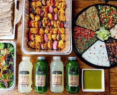
The goal for Kreation's new website is to attract more customers by widening their audience. Their target audience is upper middle class, health conscious individuals. The community attracts a lot of vegans and deters people looking for a more "substantial meal". They do have meat options so I think it is their branding that identifies too strongly with one culture and not the other. Through design and content I can bridge that gap.
What visual design would be more eye catching and modern? Which content could I provide that would bridge the gap of food preferences without insulting either customer.
A rebrand of the logo and color palette, better content for site, imaging. I need to get approved wireframes and a flowchart.
The issue of design needs to be solved. It needs to more up to date and trendy.
We have seven weeks to complete this website. Week 1 rebrand. Week 2 wireframes. Week 3 flowchart. Week 4 basic html & css. Week 5 more html & css and adjustments. Week 6 responsive. Week 7 showcase.