CLIENT: Cabo Cantina

WHAT WORKS:
Their site is responsive.
They have the basic components of a restaurant website; homepage, menu items, hours of business, social media icons/links, and locations.
WHAT DOESN’T WORK:
The red background makes everything hard to read and hurts to even look at.
There are weird color contrasts, like light green text boxes on the homepage, green promotional buttons, and green text sprinkled throughout the site.
They have several different fonts throughout the site, most or all of which are serifs and look even worse against the red background.
Hierarchy is pretty much nonexistent.
The header image on the homepage is pixelated.
Header image says “Find us on Facebook” but there is no icon or link on the homepage.
Social media icons are however found on the pages for individual locations, but it looks like there is no parent social media page for Cabo Cantina, but different social media pages for different locations.
There is a link on the lower part of the homepage that’s supposed to find a location but it’s broken.
Promotional links on pages for different locations do not show you any promotions, only bring you back to the top of the page. Maybe the header image (found on all pages) is the stand in for the promotional items?
Pictures are found on the bottom of some pages instead of the top.
The gallery hurts to look at and is formatted weird.
When you click a picture, the web page shows only that picture; no overlay, no scrolling, you must click the browser back button to escape the picture.
GOALS & TARGET AUDIENCE:
To entice customers, both returning and new.
Rebrand the site to match the restaurant better.
Target audience would be adults 21+ and those who enjoy Mexican cuisine.
REFLECTION PROMPTS:
- • What questions need to be answered in order to complete this project?
- - What should the rebrand look like?
- - What would a user flow look like?
- • What tasks do we need to complete in order to successfully design this website?
- - Create a recognizable brand image
- - Create a sitemap
- - Create a style guide
- - Create wireframes & prototypes
- - Add enough pages and content to match what a typical restaurant site looks like
- • What issues need to be solved?
- - I think the biggest one will be rebranding the site since it pretty much lacks one entirely.
- - Match the information architecture and content to what an average restaurant site looks like.
- • What is our schedule?
- - 9.28 - Sitemap
- - 10.19 - Style Tiles
- - 10.26 - Wireframes
- - 11.9 - Design Comprehensives
- - 11.23 - Redesign Prototype
- - 12.7 - Revised Design Comprehensives
- - 12.21 - Final Restaurant Site due
COMPETITOR #1
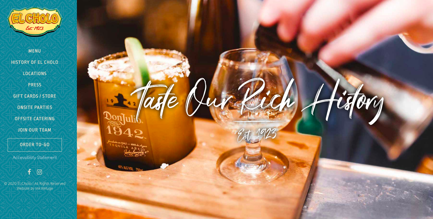
El Cholo

Clear branding
Attractive information architecture
High quality photos
Menu also has icons representing categories
Explains the near 100 year history of the restaurant
COMPETITOR #2
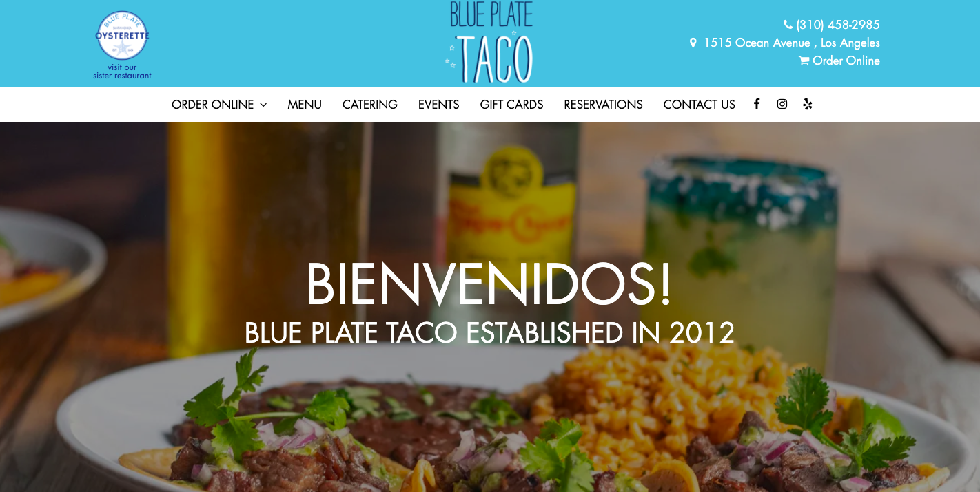
Blue Plate Taco

Clear branding
Smooth animations throughout the site
Easy on the eyes
Menu is easy to navigate
The site is clear & concise
COMPETITOR #3
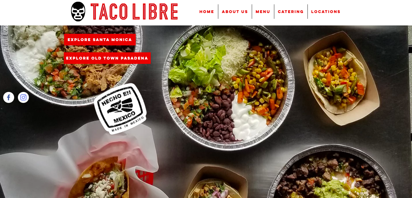
Taco Libre

Clear branding
Homepage is short and to the point
Has a cool “Explore” option where you can get a 360° view of inside and outside the restaurant via panorama, similar to Google Earth
