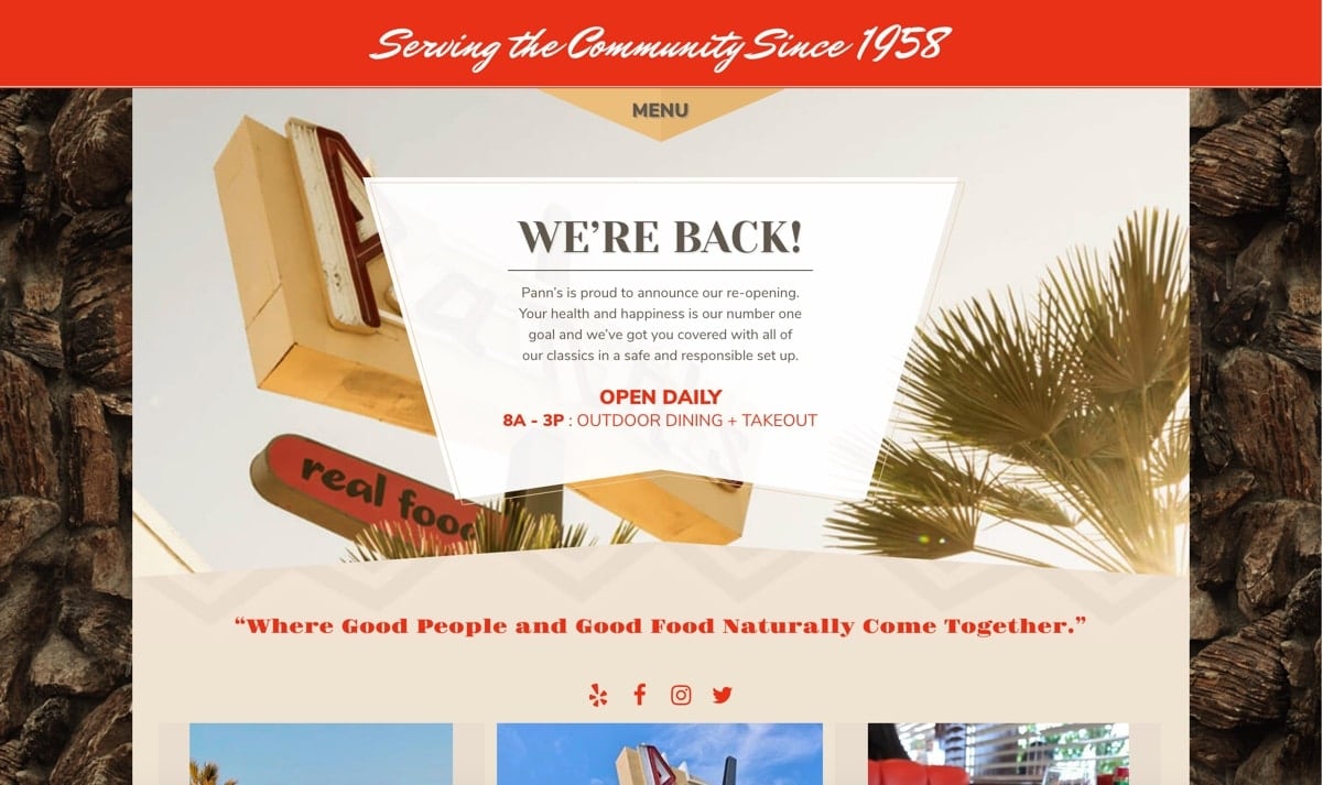
Client: Pann's Restaurant
What's Working
- Their site is responsive.
- Shows content from real people on social media.
- All images linked to social media accounts that goes to the person's post.
- Social media links are working.
What's Not Working
- Not sure what site i'm on since they don't have a logo in the nav.
- Their logo that is in the main image is covered by text on top.
- The "MENU" looks like it would be a nav with other links but when you click on the menu it downloads a pdf of their menu.
- This site needs more content. Right now it feels more like a personal blog filled with instagram images. It's a really simple page.
- Doesn't have an about/info page about the restaurant and I feel like they should tell their story since they have been around for awhile since 1958.
- Their website doesn't fit the old diner theme.
Goals
To attract new customers and returning customers. Also keep the old diner theme on the website that goes with the restaurant. Make an online ordering page and about us page.
Target Audience
Young families with children. Adults 20-30s that like retro themed restaurants. Grandparents remembering the good old days.
Question 1: What questions need to be answered in order to complete this project?
What should the rebrand logo, colors and typography be? What content and subpages to add? What design/layout should it be?
Question 2: What tasks do we need to complete in order to successfully design this website?
To design this website successfully, I need to create a sitemap, style guide, rebrand logo/colors, wireframes, create prototypes, create a menu page, and add more content that tells about the restaurant.
Question 3: What issues need to be solved?
New designs/layout and added content keeping to the retro theme.
Question 4: What is our schedule?
Market Reseach by Sept 14, Sitemap by September 28, Style Tiles by October 19, Wireframes by October 26, Prototypes by November 23, Final responsive website due by December 21.
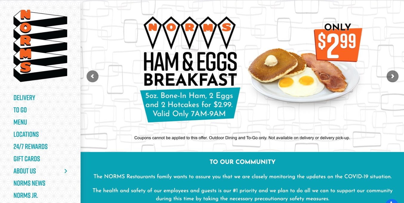
Competitor #1: Norm's
The website responsive and is designed well to fit the retro old diner theme. I like all the graphics they designed. Everything is fit to their theme like all social media links. The site is easy to navigate with their navigation on the left. Their menu is on the site but also had download a pdf. There's a lot of content and images to show what the restaurant is about.
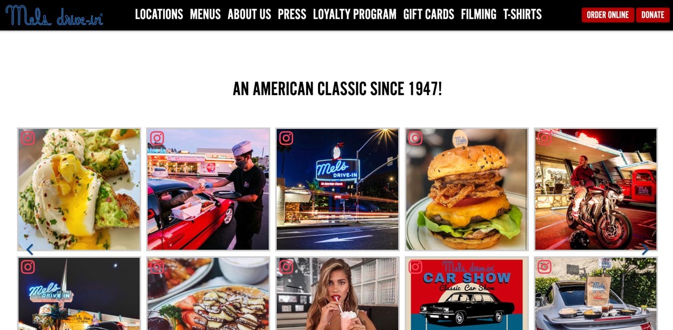
Competitor #2: Mel's Drive In
Their website is responsive. They showcase a lot of images linked from social media. They have quick links at the top to make online ordering easier. I like how they tell their story about the restaurant in the timeline page.
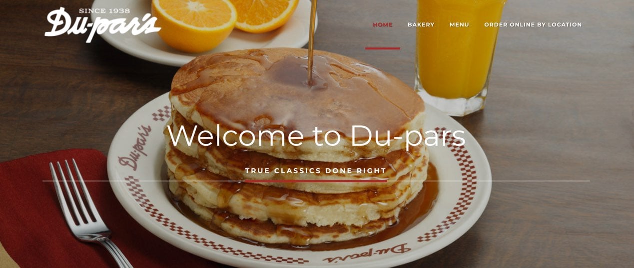
Competitor #3: Du-Par's
Du-par's website is clean and simple. They have big landing page images. Their site resizes well for responsive design. Their menu page is simple sectioning out breakfast, lunch and dinner. They also have a page on online ordering where it takes the user to the ordering site.