Home
Project 1 Research
- Araya’s Place
- www.arayasplace.com
- Project Brief
HEURISTIC ANALYSIS
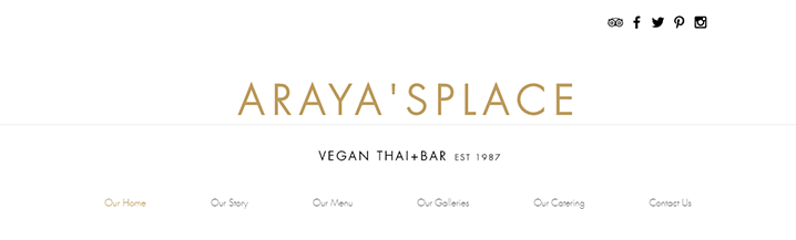
Homepage
Looking at the homepage one can easily tell it is a well-established vegan Thai restaurant. It says “+Bar,” but I’m not getting a bar vibe. It has an upper scale, high quality, chic restaurant tone. The top portion of the website is a big waste of negative space. The social media icons at the top all link over to Wix, promoting wix.com and their free website building, instead of linking us to Araya’s social media. The website contains many clear and good photos. The top nav bar font is a bit too light weight, but active tab does turn color. As one scrolls down, definite technical problems arise as the photos and text blocks travel behind the header and thin font nav bar. Reading becomes text on top of text. This is unacceptable. I like the elegance of the black, white, and gold fonts, however, I’d like another color for spice like a red and/or green. The bottom “join our mailing list…” fill in box is a nice touch. Bottom social icons are nice as well, but they don’t link to anything. “Vegetarian “is in a paragraph and since it is a vegan restaurant, vegan should be consistent throughout. They need to capitalize on the “lunch buffet”! There are no dropdown menus. I am not seeing a logo, unless the title is considered the logo, but it is in big need of kerning! There is no tagline, other than “vegan thai+bar est 1987.” The site is quick to load, which is especially surprising given the number of photos. URLs are meaningful and match nav bar headings. No online ordering feature.
A lot of header negative space
 "
"
Text over text technical issue
Our Story
It’s nice and simple, perhaps could be put on homepage instead of its own page. The artwork is gigantic and could be downsized.
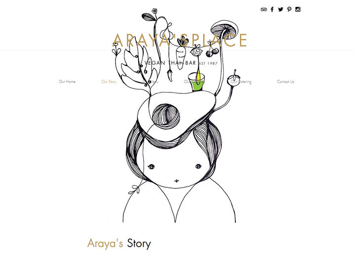
Too large art
Our Menu
Four nice photos of dishes off the menu, however, I’d like to see more photos and something to indicate the dish name. For example, if one hovers over the photo the name of the dish would appear to make it easy to order the item, instead of guessing “what is that item in the photo?” For each category of food, I’d also like a dropdown menu to go directly to that category, instead of one big scrolling down of a single column.
Our Galleries
Very nice and professional photos. I like it that they are clickable to enlarge. However, once clicked on and enlarged, the photos have the file name, for example, “FD_W007.” It would be so much better to indicate what the photo is, i.e., “Yellow Curry” or something else that sells the place.
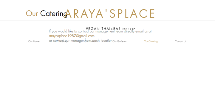
Our Catering
Not enough photos on that page. There are no people in any of the photos. I would like to see some with people having a good time at an event too. I’d like to see under the photos a location of the event and/or for what was the event. Perhaps add a client list. An email address is given at the bottom to contact the management team “or contact our manager from each location.” That seems lame that no links, additional emails, or phone numbers are given. A fill in form with a few simple boxes would be more ideal, i.e., “what date is your event,” “number of people in your party,” “phone number to contact you” etc. I think they could focus more on catering.
Contact Us
This is the first time we see their hours, locations, and phone numbers. I see there are three locations in Washington state and one location in Los Angeles. I’ve been to the Los Angeles location and now realize none of the photos on their website look like they are from Los Angeles. Locations may need its own nav tab with a drop down menu. Then each location could have photos from that location, otherwise I am getting a rather generic feel for the whole website. Of course, food item photos can generically represent all locations. The google maps with pinpoint are nice but are not clickable. “We’d love to hear from you!” fill in box at the bottom is a good touch.
Conclusion
The current website has great photos and a nice tone consistent with the brand. Paragraphs are brief, not wordy. The website suffers from technical issues that need to be fixed. For this class, I would rebrand the website with aforesaid comments and under the “locations” nav dropdown focus on the Los Angeles location. Currently, Los Angeles is sorely not represented. The website is not responsive on desktop and that needs to be addressed. There is a smartphone website that fits the screen, except for the page/restaurant title is broken up with only “E” all by itself on the second line. No text over text problem on smartphone version.
COMPETITIVE ANALYSIS 1 – VEGAN GLORY THAI CUISINE www.veganglory.com
Homepage
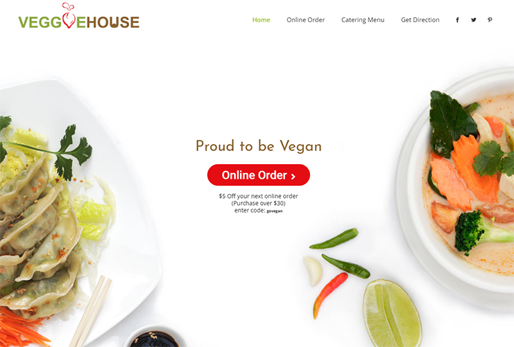
Very good use of top of the page with minimal negative space. First thing user sees is a large green button “Order Online.” Site is responsive on desktop. Very well laid out with hours, delivery information, and parking tips. All to help the user quickly order or get there. Includes their twitter feed, which makes them appear contemporary and casual. Even the font feels friendly. Their header looks more like a logo, but I don’t think it is a logo. Love the hints of green and active nav tab turns green when active. Printable menu .pdfs are a nice feature, although the white text over black is hard to read and they look busy. On the menus we see what appears to be a logo. No tagline. A few very nice, high quality clickable photos – no photo overload. No identifiers about the photos. No social media icons. No dropdown navs. Site is quick to load. Two URLs match the page and two do not. They could use a better photo than a bunch of heads of lettuce for the main top photo. Very generic photos. Top main photo has a slight slide/push down as page loads – not necessary and a bit annoying.
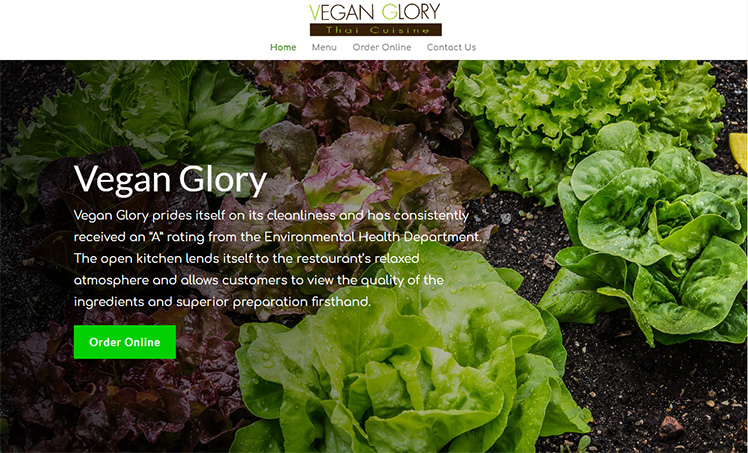
Narrow nav and quick "order online" button on homepage - the lettuce photo!
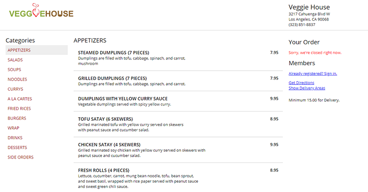
Menu
Very good use of 2 column menu. Clear and easily readable. I would like to see a dropdown nav for the different categories of food as it is a lot of scrolling down. The photos and heading between food categories take up a lot of negative space, could be made vertically shorter. The headers are in a completely different font. They use the same generic bunch of heads of lettuce as the homepage three more times here, including for the header “Gluten Free Pancake.” Wasted opportunities to show better photos and conveys generic and sense of carelessness.
Order Online
Clicking “Order Online” on the nav takes user away from the website to a third party chownow.com ordering website. Only using back arrow gets the user back to the restaurant website. It seems like no matter how deep into ordering user is, one back arrow click returns user to website which is a nice thing.
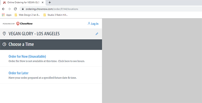
Third party ordering - where are we?
Contact Us
Oh no, the generic photo of the bunch of heads of lettuce appears again bigger than ever. Seems like they are just trying to fill space and not much thought about this page. Tons of negative space – just text over photos – nothing clickable. Here we have yet a third font used for header text. We finally find their address and phone number. The map at the bottom is a big plus and user can zoom in and out – it’s interactive.
Conclusion
Looks great and does have an online ordering feature. Quick and easy access to information. Technically it works but lacks better and a variety of photos. Different fonts for headers on pages very unprofessional. A bit too much negative space when text is on photos. Site is responsive on both desktop and smartphone. We see less of the large photo of the bunch of heads of lettuce on the phone – which is a good thing. Phone site also has a get our app banner at the top.
COMPETITIVE ANALYSIS 2 – VEGGIE HOUSE www.veggie-house-ca.com
Homepage
They have a logo! Not sure if it’s a tagline, but first line is “Proud to be Vegan.” Huge red “Online Order” button that takes user to an amazing super well organized ordering page! The photos of the Thai food look great, however, there is a lot of negative white space which leads to more scrolling down. Site is responsive on desktop. They provide a coupon code. They have social media icons at the top, but they take me to my pages and not their pages. Their text says, “have the cliquey and warm-hearted family dining experience with a delicious meal and cozy environment,” however, the vibe is more like a hospital – sterile with all the white. Easy to find phone, hours, location and a very nice send message fill in boxes. This time the Facebook social media icon at the bottom goes to their Facebook, however the other icons take me to my pages. Interactive google map is a plus. We see the icons again for a third time at the very bottom – still taking me to may pages. No dropdown menus.
A lot of negative white space
Online Order
Although clicking “online order” on the nav takes user to another third party website, the page contains the logo in the same position as the homepage and uses the same fonts so user feels like they did not leave the site – a very nice touch! User needs to click back to get to the home website. Finally, a website with a left side nav of categories of food to get quickly to that category. Top nav has address and phone number. This page is extremely well done, however, it is not desktop responsive.
Fantastic ordering page - the best - and continuity!
Catering Menu
Very simple page. They forgot to use header font and are using body copy font for all fonts in large sizes. Need to proofread “Serves xyz number of people” – one has a random “Z” the end – one is missing the period, needs to be consistent. Need to add contact info and fill in form. They provide four different catering packages.
Get Direction
Probably should have an “S” added to “Direction.” Clicking this takes user directly to google maps with their address already filled in.
Conclusion
Good photos, fantastic online ordering. They need to reduce negative white space and get social media icons linking to their pages. Something needs to be done to give it that family, cozy feeling instead of feeling sterile. Smartphone is responsive including the online ordering.
COMPETITIVE ANALYSIS 3 – VEGAN HOUSE THAI BISTRO www.veganhousethai.com
Homepage
There is a logo. This is an extremely simple website with only two items on the nav bar. Logo shrinks as user scroll downs, not necessary and a bit annoying. Their slideshow only contains two items. Finally, a website that shows the photo and includes a dish name and description – very easy for the user to order it if they see what they want. Unfortunately, only two items are shown. The page is super crisp, clean, and clear. The tone is casual and basic. Hours and location easily available. Location includes a link to google maps with their address already filled in. The only clickable photo is the “menu” photo. No social media icons. No fill in forms. No tagline. Very quick page load.
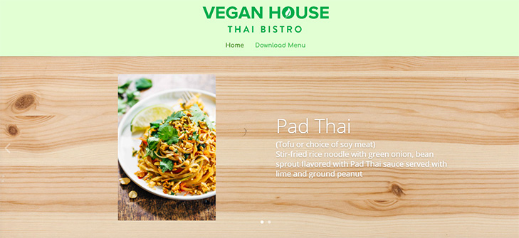
Photo with dish description
Download Menu
The menu is very well done and it is responsive on the desktop. It’s colorful, fun and has a lot more photos with the dish names on the photos – I love this!
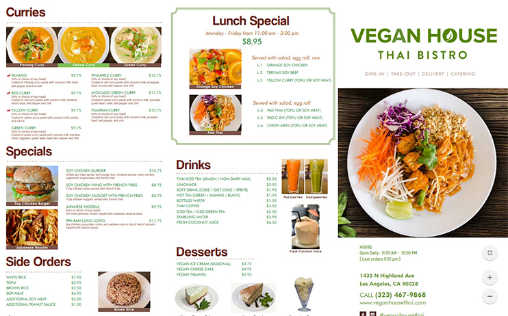
Colorful and more photos with dish names!
Conclusion
As simple as this website is, it really works! They may want to add an online ordering feature. They may want to add social media icons.
GOALS & TARGET AUDIENCE
Questions to be answered:
- Does the restaurant want to expand their catering business?
- What kind of social media presence do they want?
- How do they want social media to be grouped? By Washington and Los Angeles pages or each of the 4 locations to have their own pages?
- Do they want to market the Los Angeles restaurant?
- Do they want to include online ordering?
- Do they want to include any kind of a coupon or special offer or does it go against their tone?
- Do they want to provide set catering packages or a note to the effect custom catering for client’s specific needs?
We have 14 weeks to complete the rebrand.
The target audience is average to above income earners who enjoy going to a friendly fancy and hip place to eat delicious, filling, healthy food with a bit of spice.
![]()