Market Research: Mavro Coffee
The Current Website
Mavro Coffee House is a new restaurant/cafe that just opened up in my home neighborhood of Mar Vista, right where a different hipster Coffee shop used to be a few years ago.
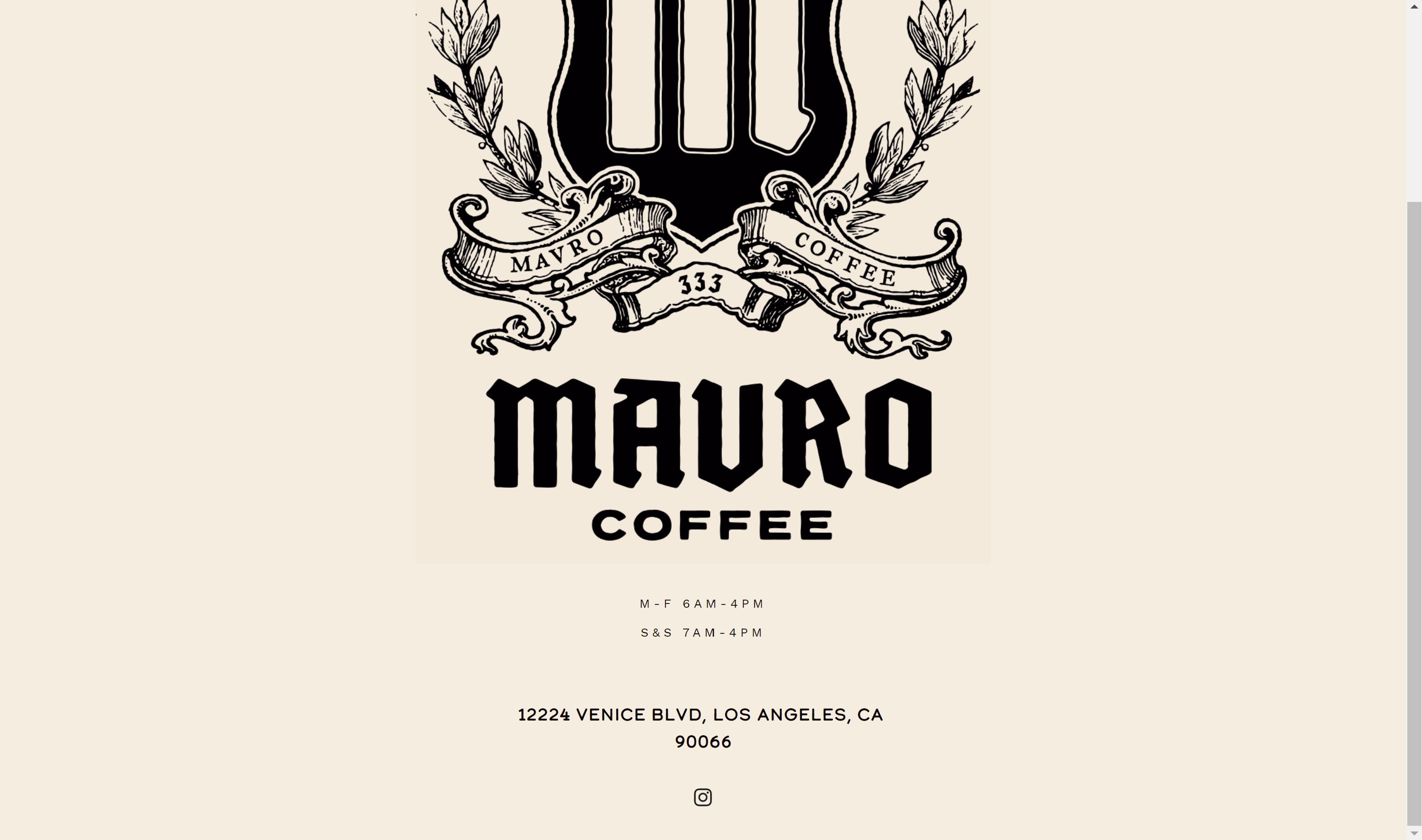
The website so far is pretty sparse, listing opening times, the company's logo, and a link to the company's instagram page.

That's the whole thing. Obviously, there's a lot of room for expansion
Competitive Analysis
Since Mar Vista Already has a wealth of both Mainstream and Hipster Coffee Shops, Mavro's going to need something special if it wants to differentiate itself.
Starbucks
visual design: Modern. There are some patterns in the backgrounds of elements that make the site seem a bit tacky. Also there's so much content that it feels a litttle cluttered. Also some hover effects are poorly designed.
content: A little too much. However, any piece of information a Starbucks customer could ever want, they are likely to find. So Pros and Cons. Images are high resolution and informative.
“call to action": Immediately prompts user to join rewards program or apply for a Starbucks credit card.
navigation: While animated, the animation is a little choppy/inconsistent and again is cluttered.
functionality: A like the addition of a fixed hovering "Start your order" button in the lower right-hand corner, but what perplexes me is that you can only find this button present on the "menu" subpage and nowhere else. This would be a useful addition on the homepage. That aside, any Starbucks service I may want to use, I can, so I consider the website very functional
community building (social media): Starbucks seems to have its tentacles on every major social media platform, but does not place a high priority on showing this aspect of their company. They have a Starbucks Stories blog that I assume is designed to foster a sense of company community and pride.
Alana's Coffee Roasters
visual design: Clean. Where Starbucks is cluttered, Alana's is curated, featuring bright and cheery colors that pop while staying grounded, easy to navigate subpages, and page content that is well prioritized. The result is very coherent.
content: Alana's skillfully uses crisp, high-contrast, well-composed images to its advantage, boosting both the appeal of its coffee and its clothing. The most appealing elements are the buttons, and I wish they would have integrated that aesthetic into more of the rest of the site. Great use of parallax.

“call to action": Immediately display store's products and prompts them to buy with "buy now" button. Home page also features an appealing instagram collage which likely motivates user to view company's instagram.
navigation: The navigation, while simple and to the point, is a little awkward squished into the upper right-hand corner.
functionality: While the store's shop is pretty well put together, it seems to be completely missing the menu, which is a bit of an oversight on their part.
community building (social media): The events page is a good place for getting the community involved. The company also has a strong instagram presence, but little else.
310 Coffee
visual design: Candid. While there isn't much, it feels like everything that needs to be there, is. The minimalism, as well as the high-quality images are a nice touch.
content:
Something interesting I haven't really seen before is the margins used on all sides of the website, which helps contrast the foreground. Almost all the necessary information is there, including the menu and the address, but unfortunately the hours seem to be missing. Also the website is lacking in photos of the actual interior, choosing instead to only feature close-up images of coffee and tea.
“call to action": There is currently no call to action.
navigation:The navigation is split half way between the left and right side of the screen, creating a nice symmetry that Alana's lacks.
functionality: The site is only good for displaying information. Besides this, there are no other interactive features except a contact form.
community building (social media): There are no links to social media, which is unfortunate for the company. There are also no mention of special events or other qualifying events that might motivate me or a user like me to come to the restaurant.
Goals + Target Audience
Goals: To increase customer turnout, create loyal returning customers, generate early business popularity, and eventually turn a profit.
Target Audience:
Local creatives and freelancers who need a spot away from home to get work done while also ideally purchasing high-quality, delicious coffee. These users will likely return multiple times a week if they find the venue satisfying, resulting in increased sales over time.
What questions need to be answered?
How do we maximize the number of customers we attract to the phyiscal store?
Should we implement an online ordering system?
Should we create a merchandise section?
Should we create a community events section?
How much social media do we implement? Are there any other outlets besides Instagram?
Do we implement local delivery via our own service or a third party like Postmates or UberEats?
What tasks need to be completed?
I need to create a nav bar, obtain high quality photos, preferably of the restaurant, obtain a menu from the restaurant, and create a footer.
What issues need to be solved?
I need to avoid the clutter of starbucks while avoiding the sparseness of the current Mavro site. There should be a call to action in the form of a newsletter or rewards program.
What is our schedule?
I need to construct a website by I presume to be the end of the Fall 2019 semester. Since the restaurant is new, the sooner they have an actual website the better.

