cartoonies to attract customers and encourage them
to order online or go to restaurant. Color palette is awful for a restaurant,
typefaces are not suitable and too small. Type grids are too wide.
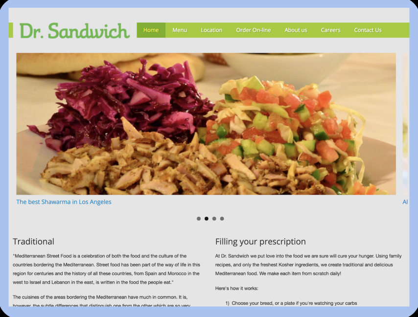
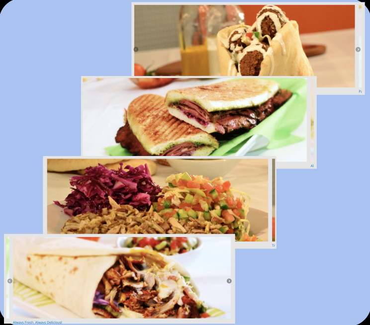
There is only four pictures for all this website.
And also there is no button in all the website.
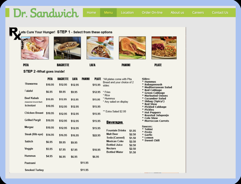
Menu is an image file with low quality,
small images and typeface are too small.
There is no graphic works and grids in this website.
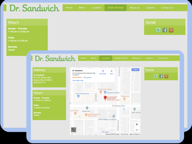
Order online page is out of content!
Most subpages have not enough content either. No grids!
Because of lack of information and content, all pages are not scrollable.
>>>
COMPETITIVE ANALYSIS
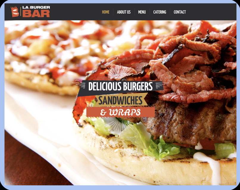
LA BURGER
High quality images,Nice typefaces and colors,
Scrollable pages and enough information and content. Good graphic works and logo
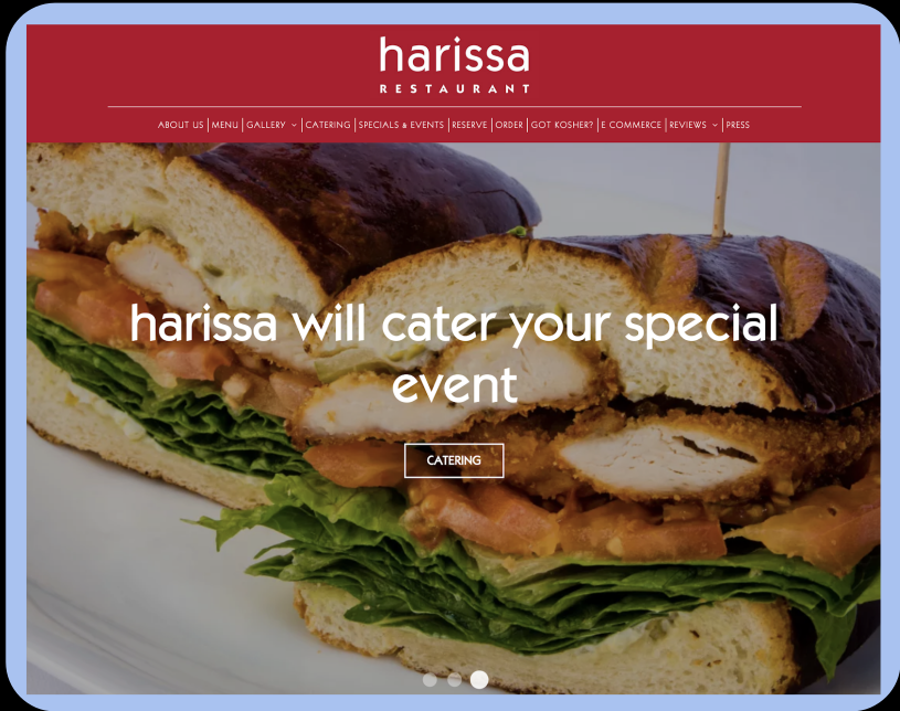
HARRISA
Image gallery and high quality images,special typefaces and good colors,
playful and interactive scrollable pages. Strong graphic works.
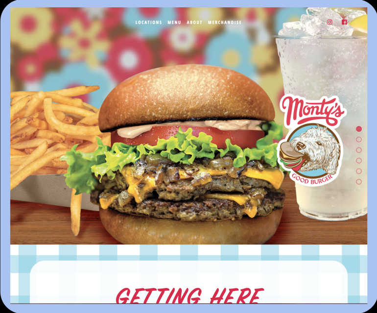
MONTY’S
Good graphic works and design,High quality images,
Nice logo and typefaces.
Good color palette, Scrollable pages and enough content.
>>>