~ Back to welcome page ~
Birdies
Birdies is a fast food restaurant that specializes in fried chicken,donuts,and coffee.
Competitive Analysis
Astro Doughnuts and Fried Chicken,Honeybird,and Cafe Dulce
Website Navigation Bar
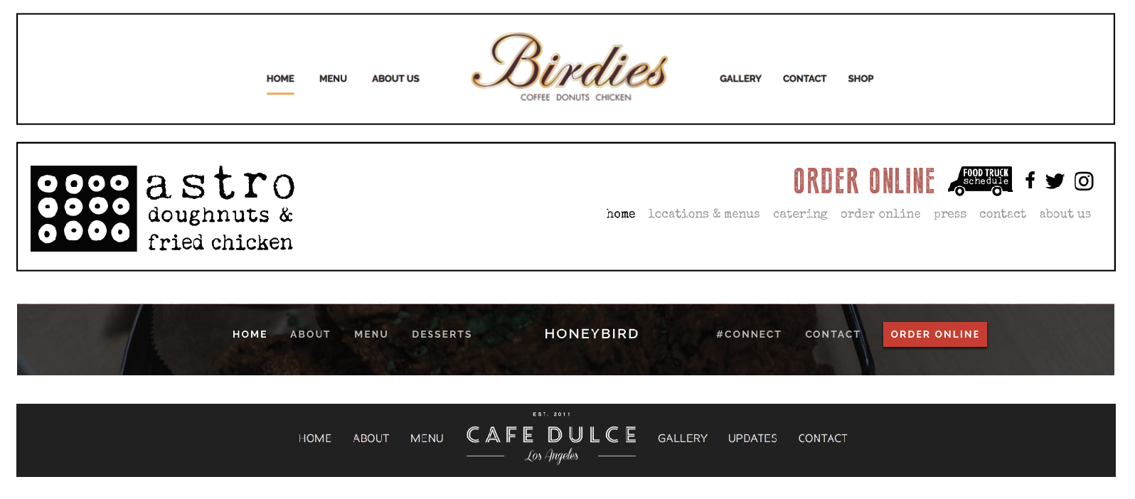
I like that Birdies navigation bar is simple and straightforward but I think the navigation the rest of the websites have look more modern and they also have more character. The other websites do well at representing the company.
Mobile Website and Mobile Navigation Bar
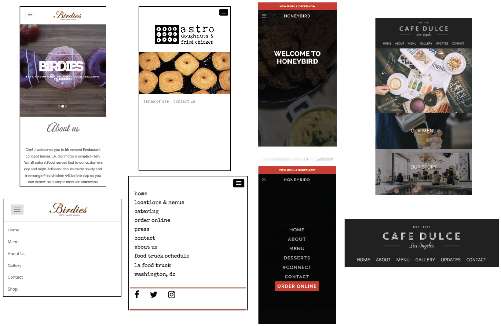
Birdies mobile website looks a bit outdated. I like that it has a hamburger menu but the icon does not look very graphically pleasing. Astors is very simple but its works well since there logo is a graphic element in itself and it corresponds well with the hamburger menu and the type style. Same this with Honeybird. The red bar draws attention well and I like that when you open the menu it fills the whole page. It makes it easy to read all the pages. I really like Cafe Dulce’s navigation bar, the only problem is that the pages are too small and they can be hard to read and press. I think a hamburger menu would have worked well on that website.
Goals & Target Audience
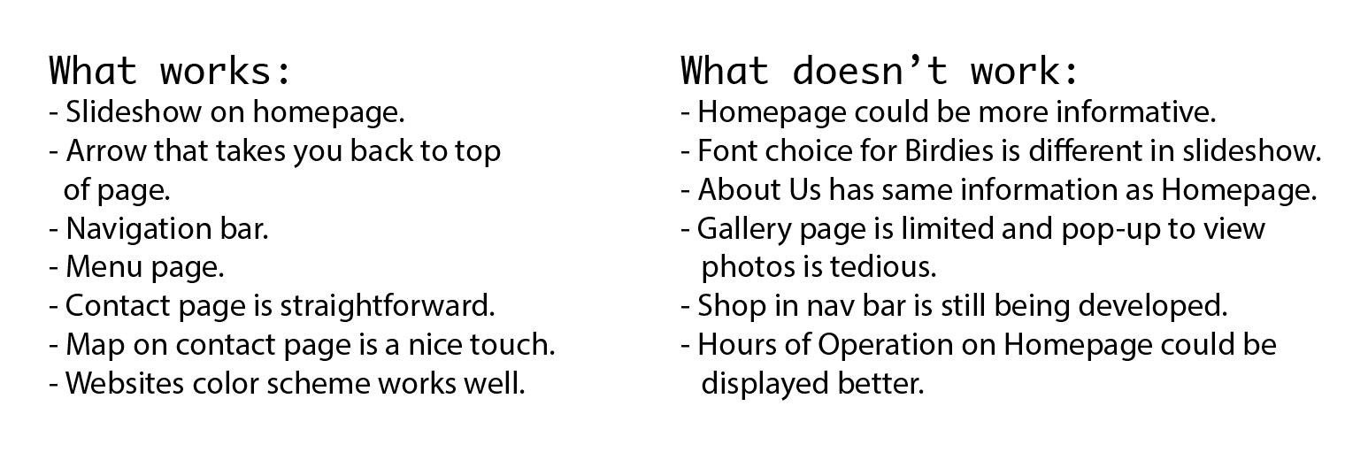
Birdies states that their motto is “Fresh, fun, all natural food, served fast to our customers day and night.” They want to use their website to inform their customers that they can come to Birdies to enjoy great food at their convenience. Although they want an informative website their About Us page is very small. They can add so much more about where they get their produce and about their employees and company.
I would say that their target audience is in the younger demographic, between 16-25 or so. They want to target customers that are looking for quick meal or snack that is fun, fresh, and and instagram worthy.