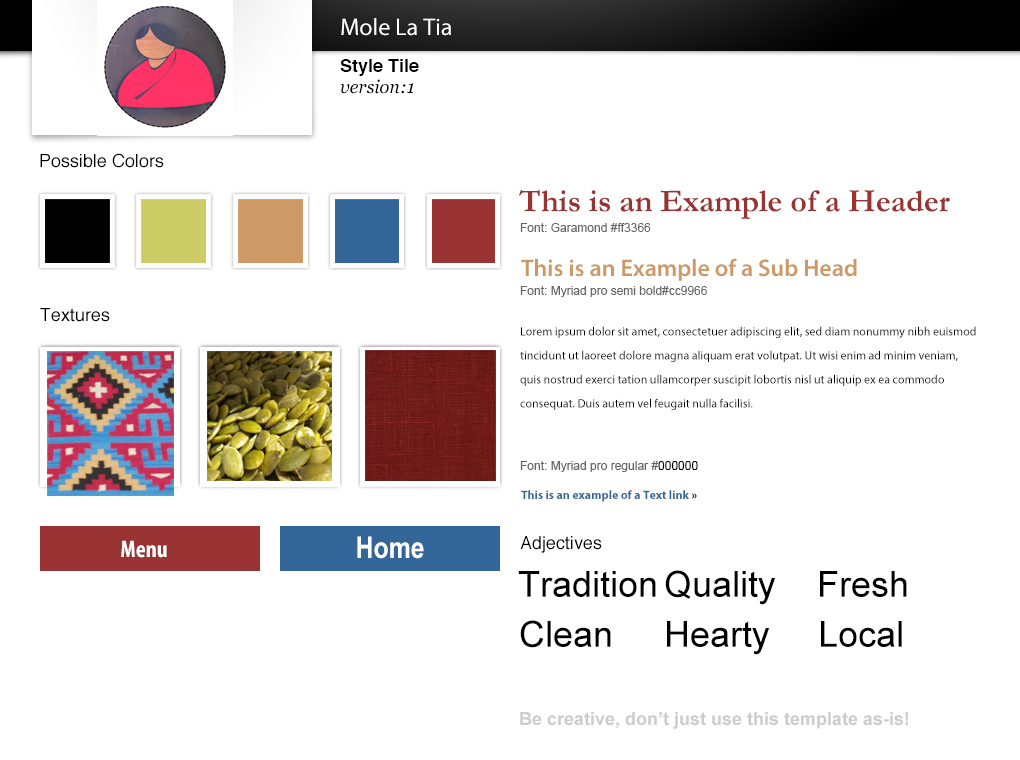
Style tiles #1 positives: They like the first texture, unique. Style gives the impression of a sit down restaurant. Appropriate for evening dining. Colors work well together. Welcoming, add to the rustic home style quality.
Style tiles #1 negatives: Types don't seem to pair well together. Consider the script from the 2nd style tile header instead. Rethink typefaces for buttons. Caslon pro might work for the buttons. Logo color is not as strong as the second stylesheet.
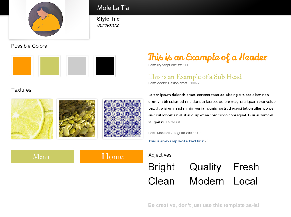
Style tiles #2 Positives: Colors are very reminiscent of a california vibe. Pleasing to the eye overall.Tile texture is unique and works well. Young and modern. Typefaces are stronger then the first stylesheet.
Style tiles #2 Negatives: Change subhead to a Sans serif. Buttons do not seem to fit the modern style, A sans serif would be better suited. Potentially too modern, may alienate their core demographic. Adobe Caslon doesn't seem to fit here, Montserrat is stronger and is already being used for the body copy, re-introducing it in other areas could be a good idea to re-inforce the overall cohesiveness of the design.