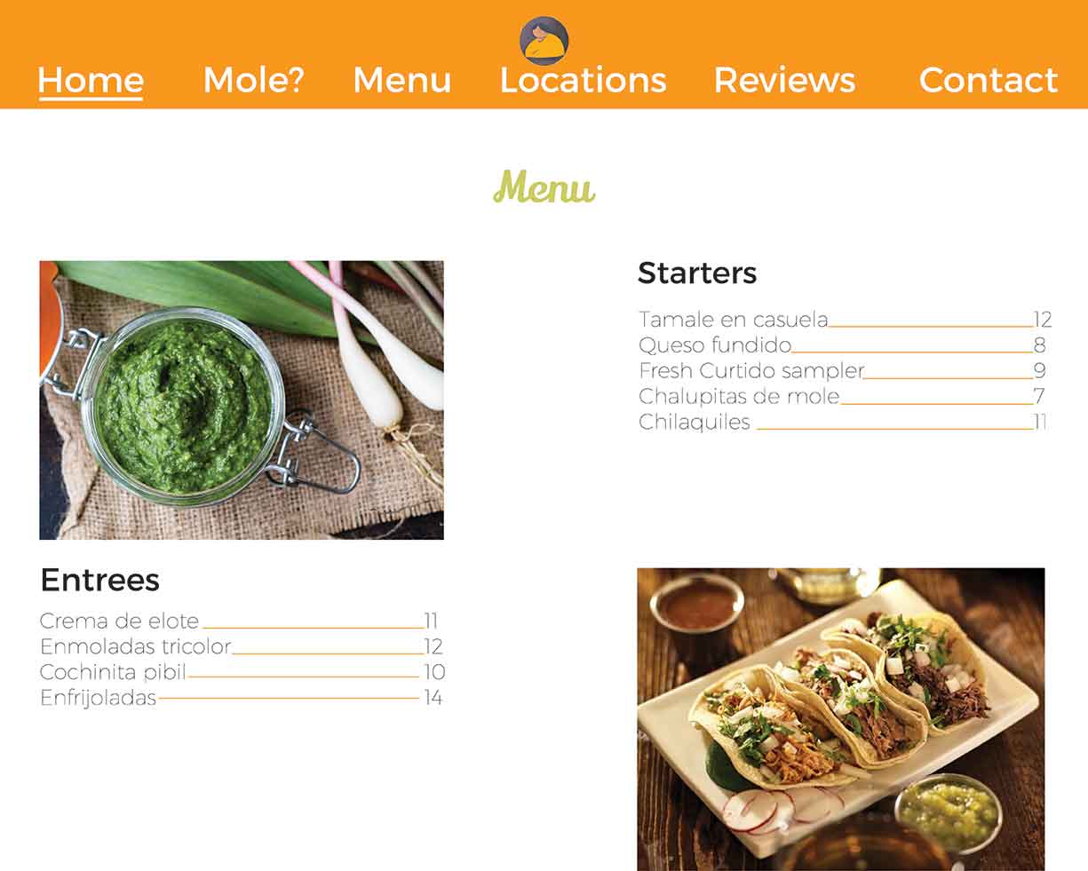
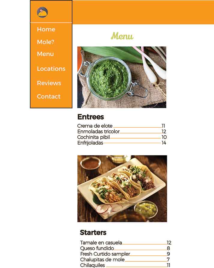

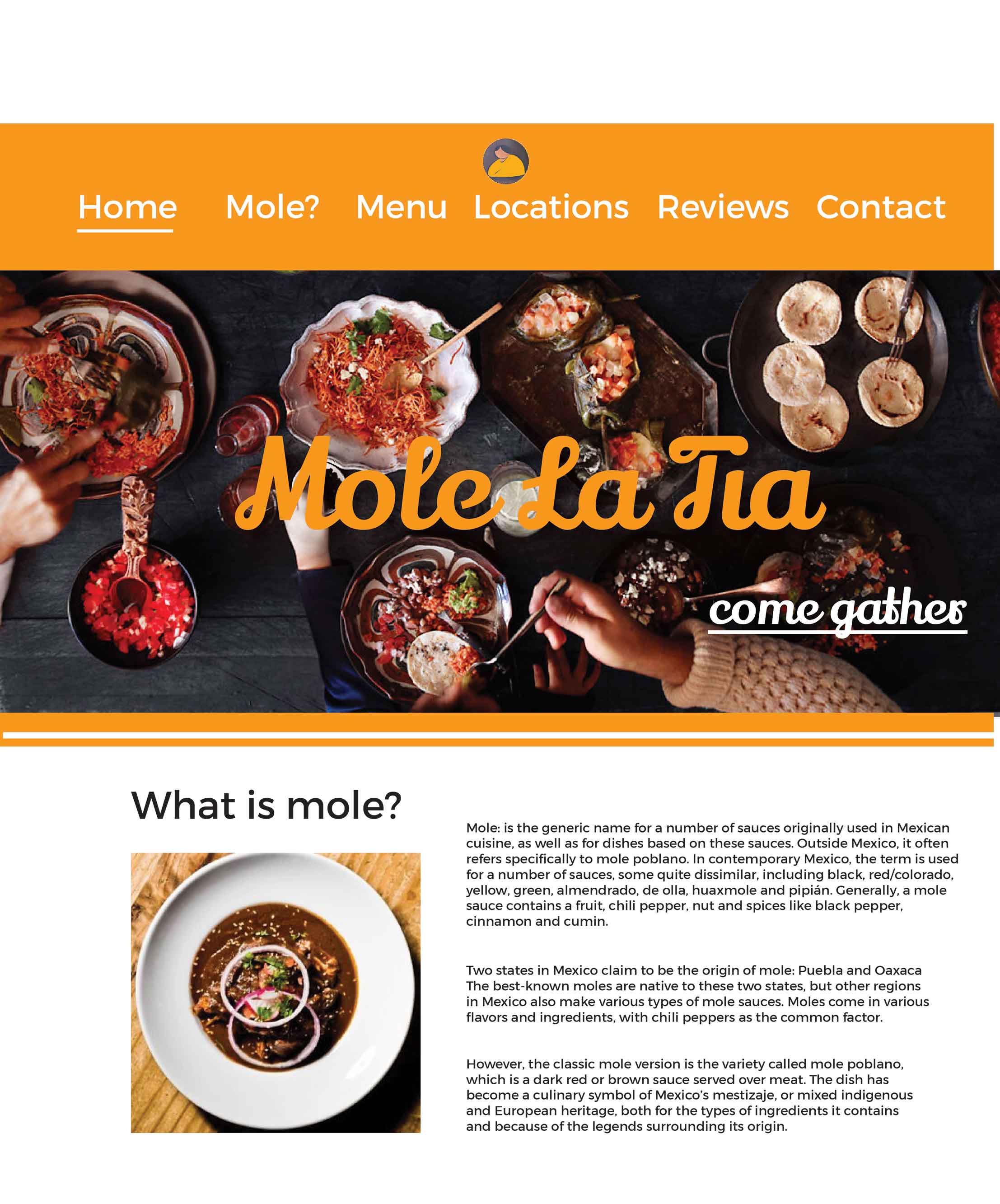
Positive#1: Colors work well
Positive#2: Bright and inviting
Positive#3: Typography selection works well
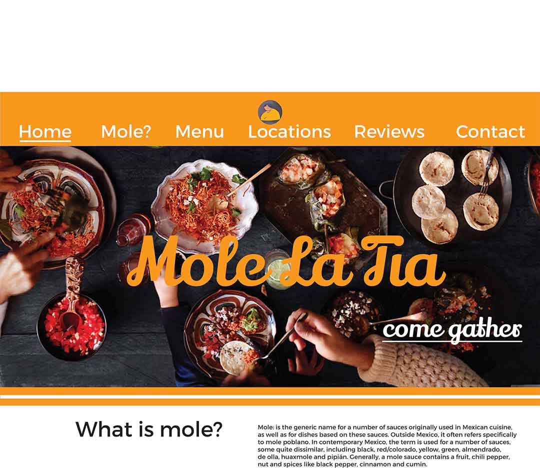
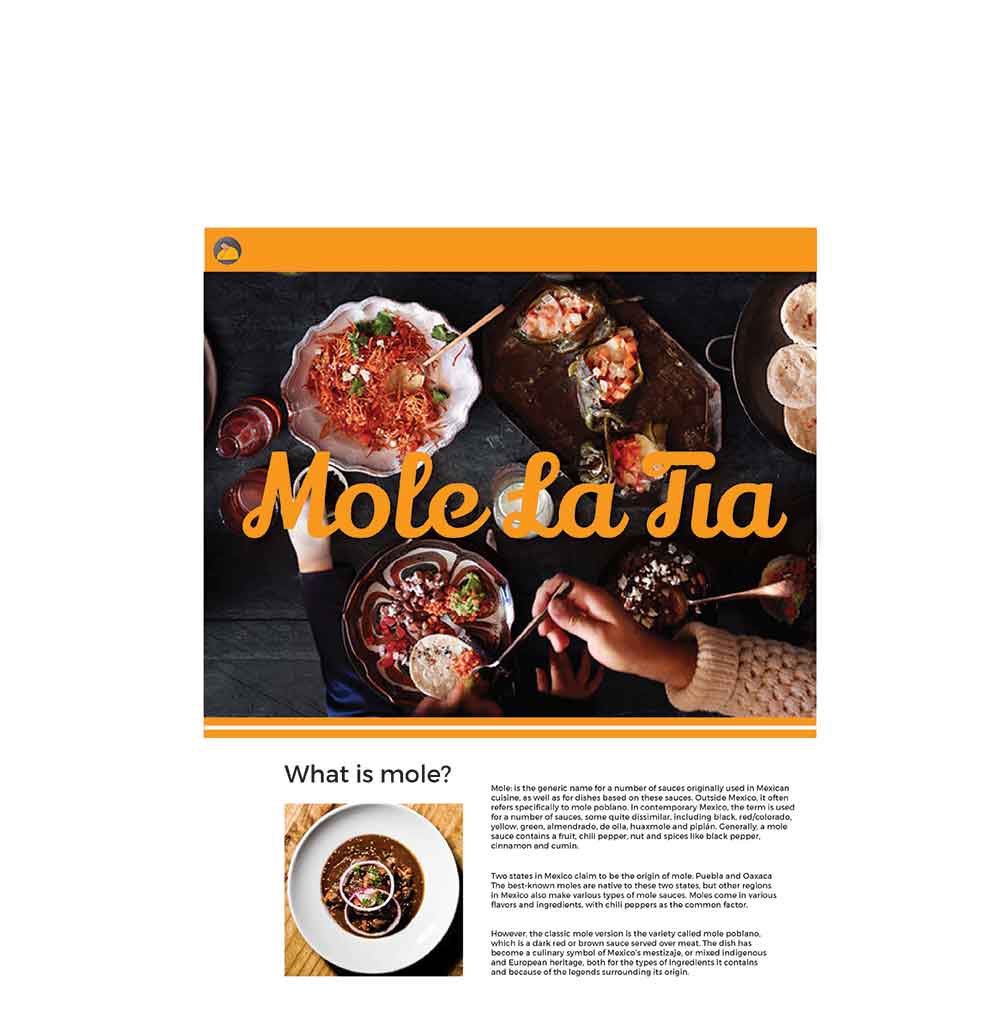
Positive#4: Imagery is very fitting
Positive#5: Laid out well
Positive#6: White band under image works well
Positive#7: message is clearly defined
Positive#8: elevates the cuisine, more upscale
Positive#9: engages the user
Positive#10: clean and neat
Negative#1: add stroke to icon
Negative#2: icon needs to be more defined
Negative#3: weight of text for copy needs to be heavier
Negative#4: size of type for buttons needs to be tweaked
Negative#5: relationship of icon size and buttons is off
Negative#6: make subtext for banner float so that it can be added to mobile and not be cut off
Negative#7: mole? button may not be descriptive enough
Negative#8: copy for "what is mole" is to compacted, break up into more spacious solution
Negative#9: make type consistent throughout all scales
Negative#10: consider an italic font