Project 6: Revised Design Comps
 Home: Mobile
 Home: Tablet
 Home: Web
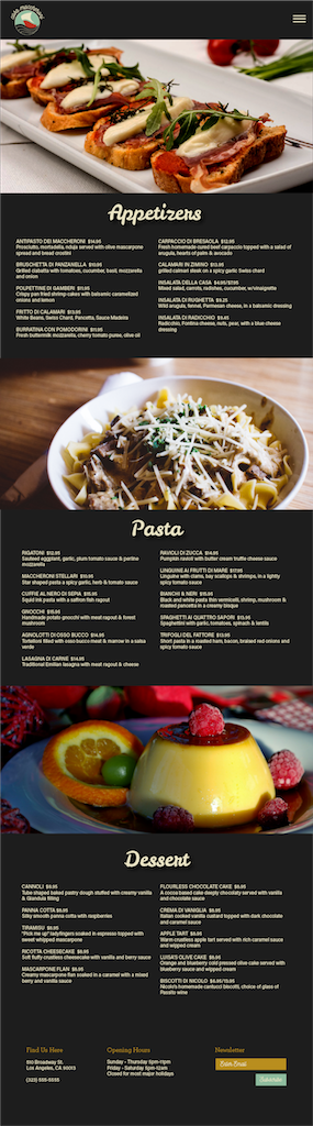
 Menu: Mobile
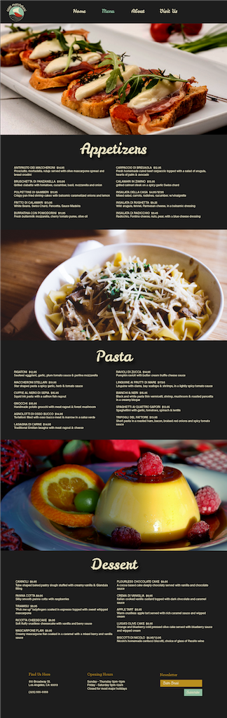
 Menu: Tablet
 Menu: Web
1. Logo is strong
Menu: Web
1. Logo is strong
2. Layout is clear and clean
3. Balanced composition
4. Good accent colors on form and button
5. Good nav menu
6. Good font choice
7. Strong images
8. Better implementation of name over image
9. Good color palette
10. Black makes images pop
1. Implement more of the accent color (try in the nav?)
2. Background image feels dark - food too close up too
3. Try more images of people/location/interior
4. Very dark palette - too broody
5. Try nav bar float right for more balance
6. Body copy too small
7. White on black text hard to read
8. Home image feels too overpowering
9. Menu too dark - lighten images
10. Needs way bigger text on mobile and tablet