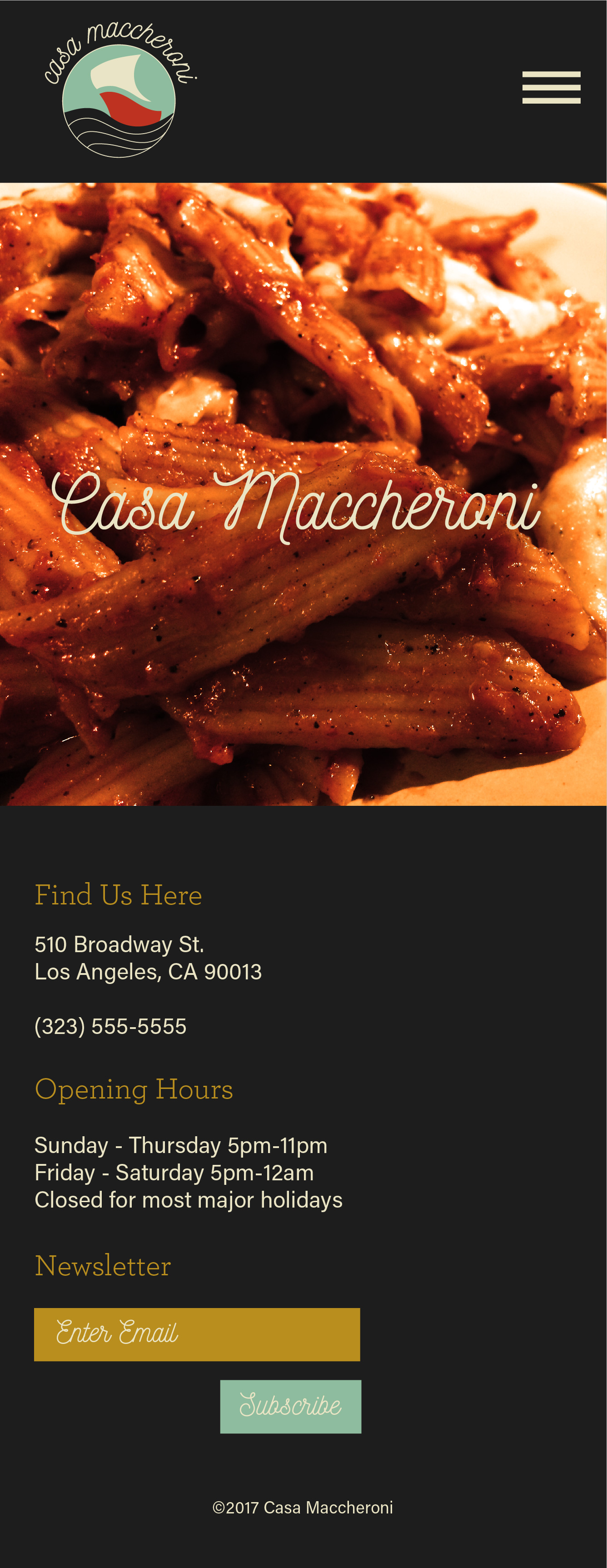
 Home: Mobile
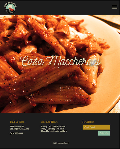 Home: Tablet
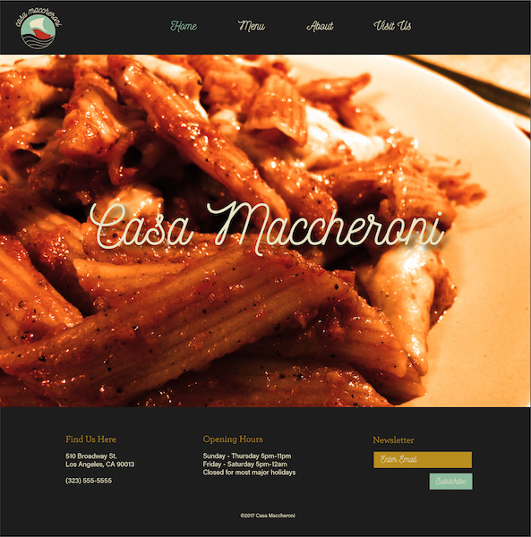 Home: Web
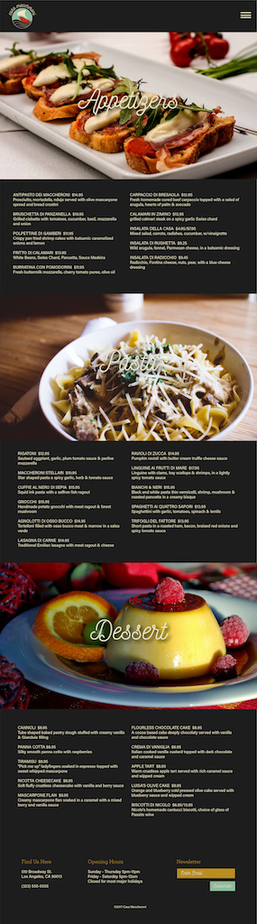
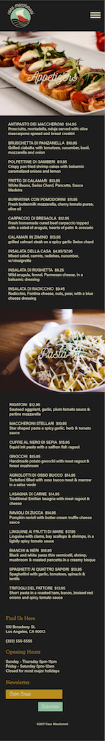 Menu: Mobile
 Menu: Tablet
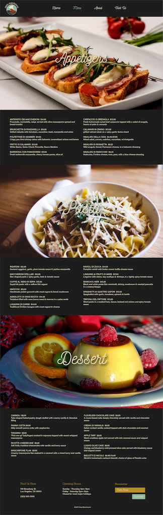 Menu: Web
1. Clean design
Menu: Web
1. Clean design
2. Liked logo
3. Liked typeface choices
4. Liked the light-blue color on the buttons
5. Liked the name of restaurant resting over the image on the home page
6. Especially liked the script choice for the headers and nav links
7. Good use of imagery to break up text in menu
8. Simplistic functionality easy to use
9. Good choice of footer placement on web and tablet
10. Eye-catching home page
1. On Menu page, try moving titles below images so they're easier to read
2. On Menu page, could also try a backlit effect behind the text (try a color similar to colors in photo) so that the text pops a little against image
3. Try a different typeface for the newsletter form and button - a bit hard to read as a smaller font
4. For footer on mobile, try centering everything. Justified left looks like it's incomplete
5. For the footer, try bigger text so it's even more easier to read
6. For font colors, make sure they're legible against black background
7. Try bigger font size for menu so it's easier to read
8. Try making footer bar a little smaller (but font size still bigger)
9. Yellow color on subheaders might be hard to read
10. Try moving submit button next to email form on the newsletter signup form