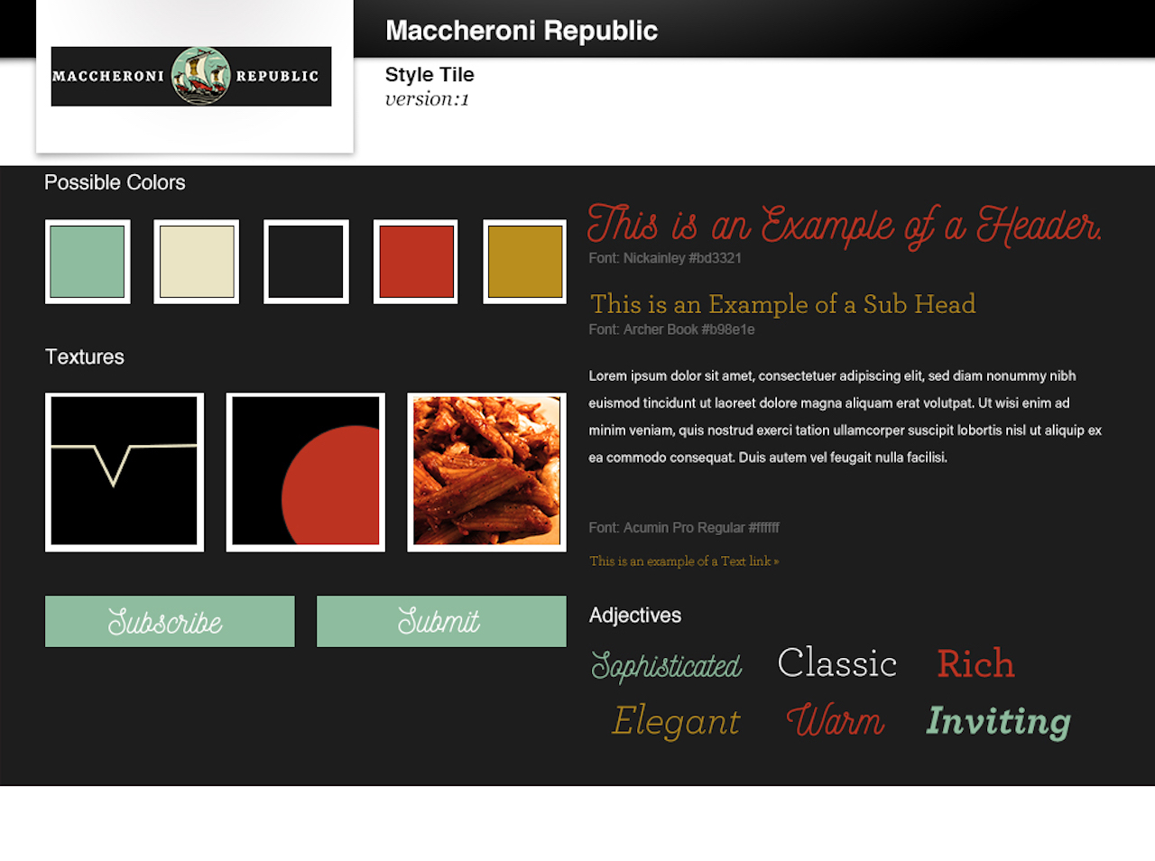
 Style Tile Version 1
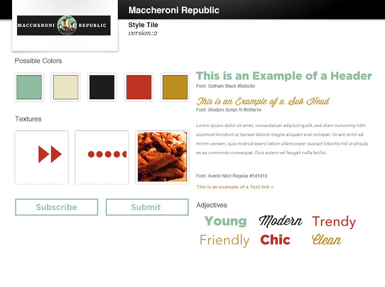 Style Tile Version 2
Overall, Style 1 is warmer and matches the restaurant “brand” more
Style Tile Version 2
Overall, Style 1 is warmer and matches the restaurant “brand” more
Style 1 has a homier feel
Style 1 matches Broadway/Downtown nightlife location better
Adjectives on Style 1 were really good and matched what the restaurant represents
Script typeface was good
On Style 1, maybe subhead typeface can be more bold
Style 2 doesn’t match restaurant brand as well as Style 1
Style 2 is too modern and clean for the restaurant feel
Think about designing with the downtown location (it's the only location - more authentic and homey) and homemade pasta sell in mind
Style 2 doesn’t consider the downtown lifestyle as much either