
THINGS THAT WORK
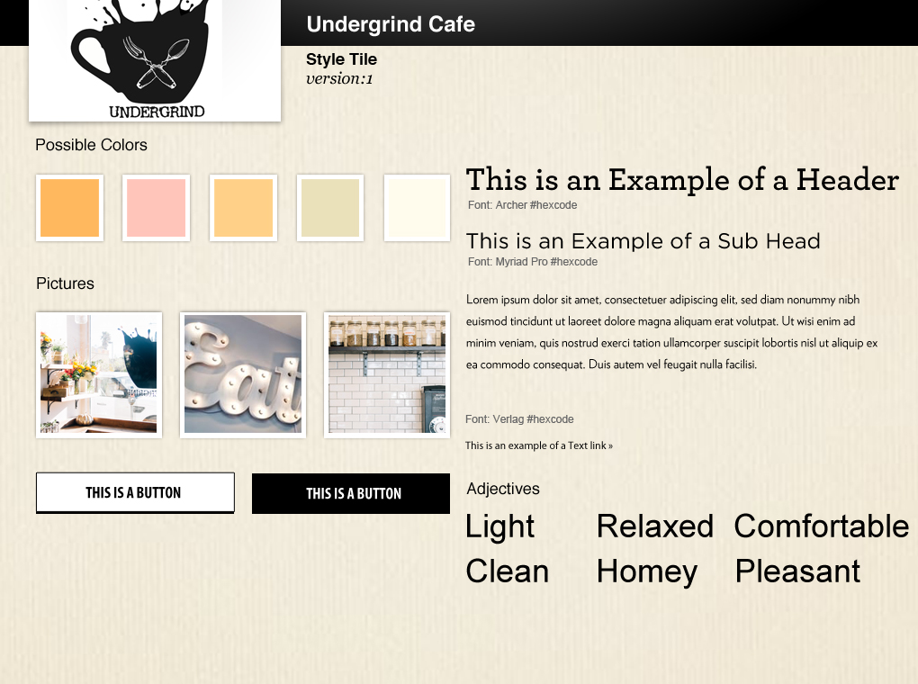
- The color palette in #1.
- The images used in #1.
- The lightly textured background used in #1.
- The title font (Archer) on #1.
- The font choices work in #2.
THINGS THAT DON'T WORK
- The purely black and white color palette on #2.
- The buttons on #1 would look better with color.
- The coffee icon on #2 clashes with the logo.
- The layout on #2 doesn't say "sit down cafe with food."
- The use of a serif typeface on a website may make the text hard to read.